Dark Mode by Default: Engineering Nowah's Pure Black UI
Pure black (#000000) backgrounds, OLED optimization, one accent color, and high-contrast accessibility. The engineering behind dark-first design.
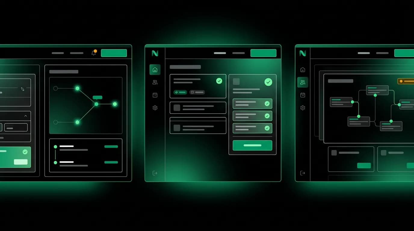
We made a decision early on that Nowah would be dark by default. Not dark gray, not charcoal, not "tasteful slate." Pure black. #000000. This was an engineering and design decision that affects everything from OLED battery savings to accessibility to how our accent color reads on screen.
Why pure black over dark gray
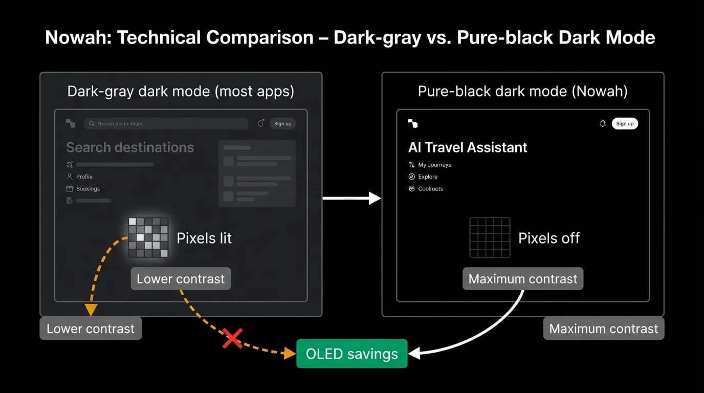
Most "dark mode" apps use a dark gray background, somewhere around #1C1C1E or #121212. The reasoning is that pure black creates too much contrast with white text and can feel harsh. That is a valid concern for text-heavy apps like email clients or note-taking tools.
We chose pure black for three reasons.
First, OLED screens. The majority of modern smartphones use OLED panels where black pixels are literally off. They emit zero light and consume zero power. A pure black background on an OLED screen saves meaningful battery compared to dark gray. For a travel app that users check repeatedly throughout a trip, the battery savings add up.
Second, brand distinction. Most travel apps use light, airy designs with blue skies and white backgrounds. We wanted to look different immediately. The pure black background makes our screens instantly recognizable and gives our green accent color maximum pop.
Third, the chat interface. A dark background makes the conversation feel focused and intimate, like a messaging app at night. Bright travel content (photos, maps, airline logos) stands out more dramatically against black than against gray.
The color system
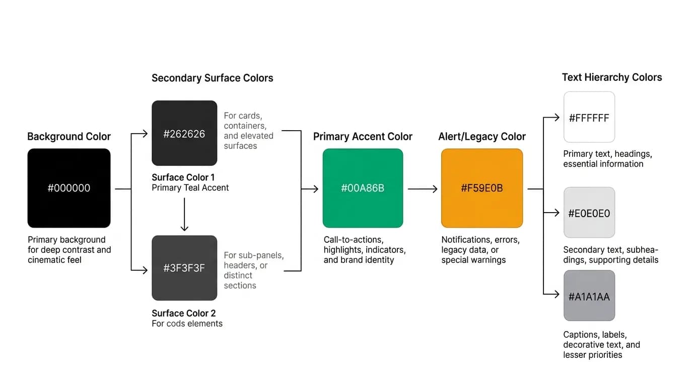
Our palette is intentionally constrained. Pure black (#000000) for backgrounds. A slightly elevated dark surface for cards and interactive elements. Our green (#00A86B) as the single accent color for actions, selections, and brand identity. White and near-white for text at different levels of emphasis.
Having one accent color is a constraint we chose deliberately. It forces consistency. Every interactive element, every call to action, every selection indicator uses the same green. Users learn quickly that green means "something you can tap" or "something the app wants you to notice."
The contrast ratios are important. White text on pure black exceeds WCAG AAA requirements by a wide margin. Our green accent on pure black meets AA for normal text and AAA for large text. We tested this extensively because high contrast is both a brand feature and an accessibility requirement.
Image and media handling
Bright images in a dark UI can be jarring. A hotel photo with a sunny pool scene surrounded by pure black creates an uncomfortable brightness contrast that can cause eye strain.
We handle this by subtly darkening the edges of images with a vignette effect that blends them into the dark surroundings. Full-bleed images get a slight overlay to reduce peak brightness. The effect is subtle enough that the photos still look good but dramatic enough that they do not blow out the user's dark-adapted eyes.
Airline logos present a different challenge. Many airline logos have white or transparent backgrounds designed for light contexts. On our black background, they either look wrong (floating white rectangle) or are unreadable (thin light-colored text disappears). We pre-process logos with dark-appropriate backgrounds or outlines so they render correctly.
Accessibility in dark contexts
Dark mode has accessibility benefits that often go unmentioned. High-contrast dark UIs are easier to read for many users with visual impairments. The reduced overall brightness is more comfortable for users with light sensitivity. And the strong contrast between interactive and non-interactive elements helps users with cognitive disabilities identify what they can interact with.
We test text scaling up to 200% on our dark interface to ensure nothing breaks. Large text on dark backgrounds is easy to read, but scaled-up text can overflow containers or overlap with adjacent elements if the layout is not flexible. We use dynamic sizing that adjusts to text scale settings.
For colorblind users, we ensure that our green accent is never the only indicator of state. Selected items have a checkmark icon. Active states have a border change. Error states use text labels alongside any red indicators. The green is a strong signal but never the only signal.
The consistent design language carries across iOS, Android, and web, which means a user who is comfortable with the app on one platform can immediately use it on another without relearning the visual system.
Nowah is an AI travel agent that searches and books real flights and hotels through conversation — no filters, no thirty open tabs. Plan your next trip.