Measuring Developer Experience: Metrics That Matter
Beyond NPS — concrete DX metrics including time-to-first-call, error resolution time, documentation engagement, SDK adoption rate, and support ticket volume per developer.
A team I know optimized for developer NPS for an entire year. Their score went from 32 to 48. They were celebrating. Then someone pulled the retention data and found that 40% of developers were churning in week two. The NPS survey only went to developers who had been active for a quarter, so it reflected the opinions of survivors, not the full picture.
NPS is a useful signal. It is not a sufficient measurement framework. To understand developer experience, you need metrics that cover the full journey from first contact to long-term engagement. Here are the six we track and why each one matters.
Time to first call (TTFC)

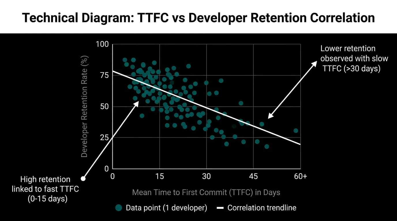
TTFC measures the time from account creation to the first successful API response. It is the single most predictive metric in our developer funnel.
The industry average TTFC for travel APIs is two to five days. That is not because travel APIs are that hard to use. It is because the onboarding paths are that slow: manual account provisioning, sales-assisted setup, documentation that requires hours of reading before anything works.
Our target is under five minutes. We measure it in minutes and seconds, not days. Every second of TTFC above our target is a developer at risk of dropping off.
The measurement is straightforward: timestamp of account creation minus timestamp of first 200 response. We exclude the time between sign-up and email verification because that depends on the developer's email workflow, which we do not control.
TTFC has the strongest correlation with long-term retention of any metric we track. Developers who complete their first call within the first session are about 4x more likely to reach production integration than developers who leave and come back later.
Improving TTFC is a matter of removing steps, not adding features. Every time we cut a step from the quickstart, TTFC drops. Every time someone adds a step (even a useful one), TTFC rises.
Error resolution time
Error resolution time measures the duration from when a developer first encounters an error to when they successfully retry the request. This is a proxy for error message quality.
If the error message clearly explains what went wrong and how to fix it, resolution time is seconds. The developer reads the message, makes the correction, retries, and succeeds. If the error message is vague or missing context, resolution time stretches to minutes (if the developer searches documentation) or hours (if they file a support ticket).
We measure this by looking at sequences of API calls from the same key: error response followed by successful retry. The time gap between them is the resolution time.
A resolution time under 60 seconds indicates that the error message and documentation are doing their job. Resolution time over 10 minutes indicates the developer had to go searching for answers. Resolution time that ends in a support ticket instead of a retry indicates the error was effectively unsolvable through self-serve tools.
We track resolution time by error code. Error codes with high resolution times are the ones that need better messages or better documentation. This metric directly prioritizes DX improvement work.
Documentation engagement
Documentation page views alone are ambiguous. High traffic might mean the docs are popular. Or it might mean the API is so confusing that developers keep coming back to re-read the same page.
We track three documentation metrics: page views, time on page, and the "Was this helpful?" score.
Page views ranked by endpoint reveal which parts of the API need the most documentation attention. Time on page helps distinguish reference lookups (short, focused visits) from confusion-driven reading (long, wandering visits).
The "Was this helpful?" widget provides the most direct signal. Every doc page has a binary feedback option (helpful / not helpful) with an optional comment field. The helpfulness score per page tells us exactly which pages are serving developers and which are failing them.
Our documentation satisfaction target is above 4.5 out of 5. The industry average is around 3.2 out of 5. The gap between those numbers represents the difference between documentation that developers tolerate and documentation they trust.
SDK adoption rate
SDK adoption measures the percentage of developers using our official SDKs versus making raw HTTP calls.
High SDK adoption (above 70%) indicates the SDKs are useful and well-designed. Low adoption (below 30%) indicates developers find the SDKs less convenient than writing HTTP calls directly, which is a damning signal for SDK quality.
We measure adoption by analyzing User-Agent headers. Our SDKs identify themselves with a version string. Raw HTTP calls come from standard HTTP libraries. The ratio tells us adoption.
We also track adoption per language. If a single typed language across the stack SDK adoption is 85% but Python SDK adoption is 40%, the Python SDK needs work. Drilling into the language-specific data reveals which SDKs are pulling their weight and which are not.
Products with SDKs in three or more languages see roughly 40% higher overall developer adoption than those with fewer. The breadth of language support matters because developers choose the SDK in their language or choose not to use an SDK at all. There is no middle ground.
Support ticket volume per 100 developers
This is the metric that encompasses everything else. If TTFC is fast, error messages are clear, documentation is helpful, and SDKs are good, support ticket volume is low. If any of these fail, ticket volume rises.
We measure tickets per 100 active developers per month. The industry average is 15 to 25 tickets. Our target is under 5.
The trend matters more than the absolute number. A month where ticket volume spikes from 4 to 8 triggers an investigation even though 8 is well below the industry average. The spike might indicate a recent API change that confused developers or a documentation gap introduced by a new feature.
We categorize tickets by type (auth, errors, docs, features, bugs) and track the distribution over time. A shift in distribution signals specific DX problems. If error-related tickets suddenly increase from 35% to 50% of total volume, something changed in error message quality.
Onboarding completion rate
Onboarding completion measures the percentage of new developers who complete the quickstart path end-to-end: sign up, verify, sandbox, search, copy key, run locally.
The industry average is 20-30%. Our target is above 60%. The gap between these numbers is the gap between onboarding flows designed for comprehensiveness and flows designed for speed.
We track completion per step. The step with the highest drop-off is the bottleneck to improve. When we fixed the email verification step (switched from code to magic link), drop-off at that step decreased by half and overall completion increased proportionally.
Completion rate multiplied by developer traffic gives us the throughput of our onboarding funnel: how many developers we are successfully converting from sign-up to first call per week. This is the top-line metric for our DX team.
Building the dashboard
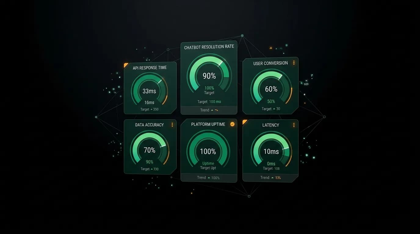
These six metrics live on an internal DX dashboard that the team reviews weekly.
Each metric shows the current value, the target, and the trend. Green if we are meeting or exceeding the target. Yellow if we are within 20% of the target. Red if we are below.
The dashboard does not tell us what to do. It tells us where to look. A red metric triggers an investigation. A yellow metric gets monitored. A green metric gets maintained.
What the dashboard does not include is anything we cannot act on. We do not track vanity metrics (total API calls ever made) or lagging indicators (annual revenue per developer). Every metric on the dashboard connects to a specific DX improvement we can ship.
Measuring developer experience is not about proving that DX matters. If you need convincing, the arguments are elsewhere. Measurement is about finding the specific improvements that will make the biggest difference and verifying that the improvements you ship actually work.
Nowah is an AI travel agent that searches and books real flights and hotels through conversation — no filters, no thirty open tabs. Plan your next trip.