Accessibility in AI Travel: Making Chat Booking Inclusive
Screen readers with streaming text, keyboard navigation in chat, voice as accessibility — how we make AI-first travel booking work for everyone.
Chat-first AI products exist in an accessibility gray area. There are well-established patterns for making forms accessible: label your inputs, manage focus, provide error messages. There are decent patterns for making traditional chat apps accessible: announce new messages, provide keyboard navigation, label participants.
But an AI chat that streams responses token by token, displays interactive flight cards, opens payment modals, and switches between text and voice input? The accessibility patterns for that do not exist yet. We are figuring them out as we go.
A novel UI paradigm without precedent
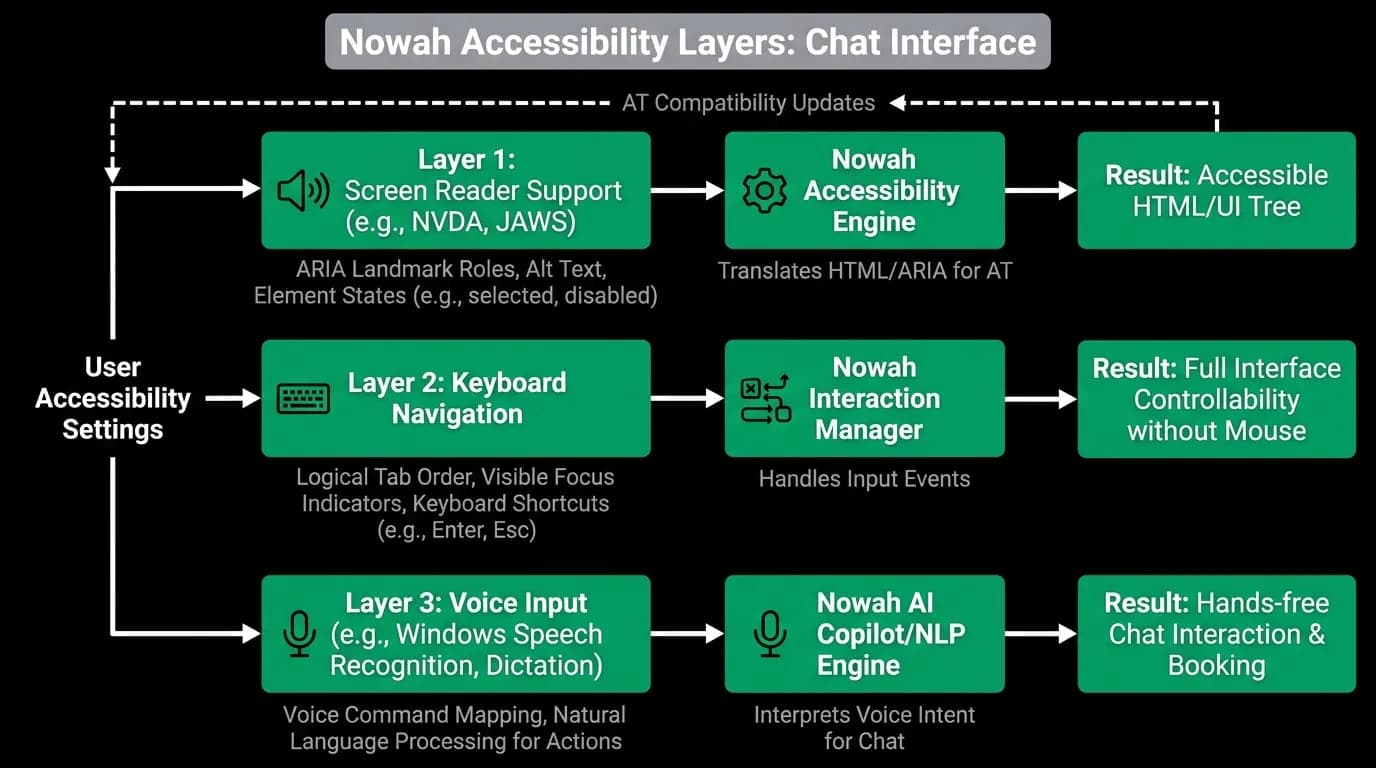
Web Content Accessibility Guidelines (WCAG) are designed around pages with forms, buttons, links, and content sections. Chat interfaces with streaming AI responses and rich interactive cards do not map cleanly to these guidelines.
For example, WCAG says form inputs need labels. Our "form" is a text input where you type natural language. The label is implicit in the conversation context. A user who cannot see the screen needs to understand that this is a chat input, not a search form, and that they can type anything from "find me flights to Tokyo" to "change that to a window seat."
WCAG says live content should be announced by screen readers via ARIA live regions. But if we announce every token as it streams, the screen reader is constantly talking and the user cannot hear themselves think. If we wait for the stream to complete, the user sits in silence for 5-10 seconds wondering if anything is happening.
These are genuinely hard problems without established answers.
Screen reader support for streaming responses
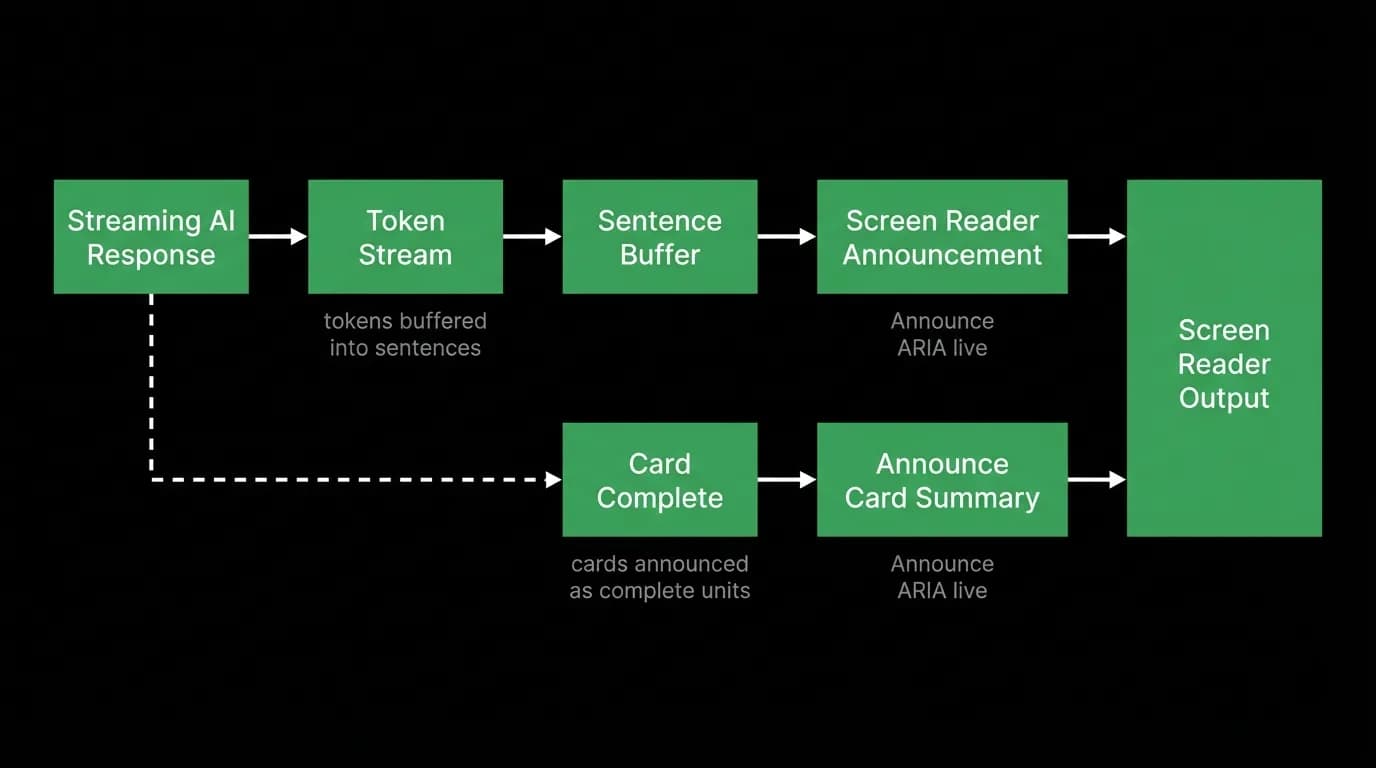
Our approach to streaming accessibility is a compromise that works reasonably well in practice.
When the AI starts responding, we announce a brief status: "Agent is responding." This tells the screen reader user that something is happening. We do not read out individual tokens as they arrive.
When the stream completes, we announce the full response. For text-only responses, the full text is read. For responses with cards (flight options, hotel results), we provide a structured summary: "3 flight options found. Use arrow keys to navigate options."
For long responses, we break the announcement into paragraphs with short pauses between them. This gives the screen reader user time to process each section instead of hearing one continuous wall of text.
The tricky edge case is when the AI response includes both text and cards. We announce the text first, then announce the presence and summary of the cards, then move focus to the first card. This gives the user a natural reading order: hear the explanation, then explore the options.
Keyboard navigation in chat
Keyboard users need a clear focus model for the chat interface. Our focus management works in zones.
The default focus is on the chat input. You type a message and press Enter to send.
When new content arrives (cards, booking options), focus stays on the input unless the user presses Tab to move into the message area. We intentionally do not steal focus from the input because that would interrupt users who are mid-thought.
Within the message area, arrow keys navigate between messages. When focus is on a flight card, Tab moves between the three options within the card. Enter selects an option. Escape returns focus to the chat input.
When a modal opens (booking review, payment), focus moves to the modal. Tab cycles through modal elements. Escape closes the modal and returns focus to the chat. This follows the established modal focus trap pattern.
We test this by doing full booking flows using only a keyboard. Start a conversation, type a request, navigate to the flight cards, select one, tab through the booking review, confirm payment, and verify the confirmation. Every step has to be reachable and operable without a mouse.
Voice input as accessibility
Voice input is primarily a convenience feature, but it doubles as an accessibility feature. Users with motor disabilities who struggle with typing can book travel entirely through voice. "Find me flights from Boston to Rome in April. Direct flights only. Cheapest option."
Voice input is also useful for users who have difficulty with small touch targets. Instead of tapping tiny card buttons on a mobile screen, they can say "select the first option" or "book the Emirates flight."
We designed voice input to work at any point in the booking flow. You can start a conversation by voice, select options by voice, and confirm bookings by voice (with biometric confirmation for payment). The AI agent understands references to previous messages and displayed options, so "book that one" or "the cheaper one" work as expected.
For users who rely on voice input exclusively, we provide feedback through both audio (spoken confirmation) and visual (highlighted selections). This redundancy ensures the user knows their voice command was understood regardless of their ability to see the screen.
High-contrast dark UI as accessibility
Our pure black design has accessibility benefits that we did not fully appreciate when we chose it for aesthetic reasons.
High contrast between text and background improves readability for users with low vision. Our white-on-black text exceeds WCAG AAA contrast requirements. The green accent color on black also passes AA for normal text size.
Reduced overall brightness helps users with light sensitivity or migraine conditions. A travel app that users check frequently throughout the day needs to be comfortable to look at in various lighting conditions. Pure black with controlled accent colors produces less total light output than any light-mode design.
For colorblind users, we ensure our green accent is never the sole indicator of state. Selection states have checkmarks. Error states have explicit text labels. Active elements have border changes in addition to color changes. We test with colorblind simulation tools across protanopia, deuteranopia, and tritanopia modes.
Text scaling is another concern. Our layout accommodates text scaling up to 200% without truncation or overlap. This is harder than it sounds in a chat interface where message bubbles need to resize and cards need to reflow. We use flexible layouts that adapt to text size rather than fixed pixel dimensions.
Testing accessibility for AI-generated content
Here is a challenge that is unique to AI products: the content itself is generated and unpredictable. We cannot manually test every possible AI response for accessibility.
We build accessibility constraints into our response rendering layer. All AI text responses are rendered in proper paragraph elements with appropriate heading levels when structured. All card content has programmatic labels. All interactive elements have ARIA roles and states.
We also test the AI agent's raw text output for accessibility-relevant properties. Does it use formatting that screen readers handle well? Does it avoid excessive use of special characters that might be read awkwardly? Does it provide alternative text descriptions for any visual content it references?
This is an ongoing effort. We ship accessibility improvements in every release, and we actively solicit feedback from users who rely on assistive technology. Chat-first accessibility is new ground, and we learn something with every conversation.
Nowah is an AI travel agent that searches and books real flights and hotels through conversation — no filters, no thirty open tabs. Plan your next trip.