Building a Developer Dashboard That Developers Use
Most developer dashboards get bookmarked and forgotten. Ours gets daily visits. The difference is information hierarchy, real-time data, and actionable metrics.
I have bookmarked dozens of developer dashboards over the years. I visit maybe two of them regularly. The rest sit in a folder labeled "API Stuff" collecting digital dust, because every time I opened them, I spent more time looking for the information I needed than actually getting anything done.
When we built the Nowah developer dashboard, we started with a question that most dashboard projects skip: what would make a developer come back to this page tomorrow? Not what features should it have. Not what data could we show. What would make someone voluntarily open this tab during their morning workflow?
The answer, it turns out, is not more features.
The dashboard with ten thousand features and zero users

The temptation when building a developer dashboard is to show everything. You have access to all this data -- API calls, error rates, latency percentiles, webhook deliveries, billing details, team activity, usage quotas, historical trends -- so you put it all on the screen.
The result is a dashboard that does everything and helps with nothing. The developer logs in, sees a wall of charts and numbers, cannot find their error rate, and closes the tab. They go back to checking their server logs directly because at least there they know where to look.
Feature count kills developer dashboards. Every chart you add competes for attention with every other chart. Every menu item adds cognitive load to navigation. Every configuration option is a decision the developer has to make before they can get to work.
We cut our dashboard down to eight sections. Overview, API Keys, Sandbox, Webhooks, Logs, Analytics, Team, and Billing. That is it. And within each section, we were ruthless about what to show and what to hide.
Information hierarchy: what you need now vs. what you need rarely
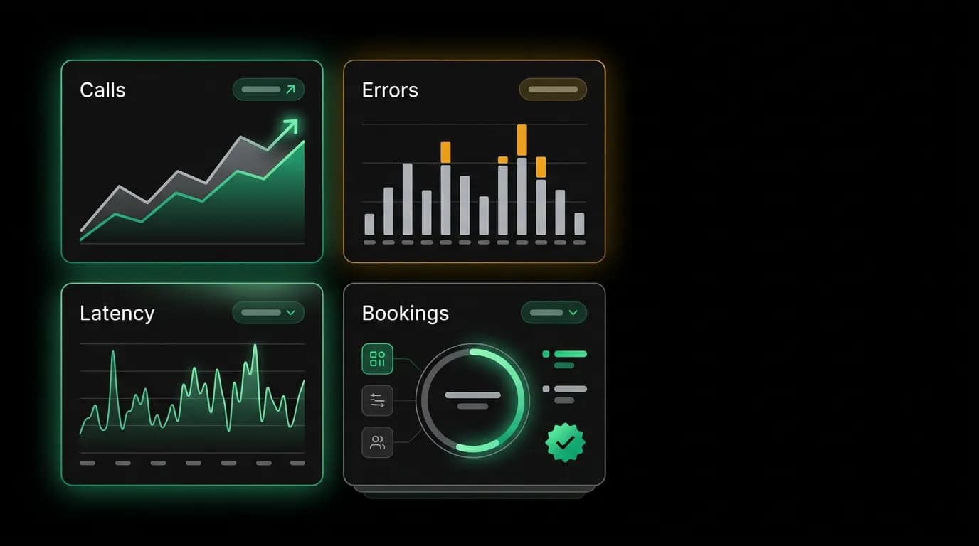
The most important design decision is what appears on the overview page, because that is what developers see on every visit. We show exactly four metrics: API calls today, error rate percentage, p50 and p95 latency, and active bookings.
Four numbers. That is the overview. Each one updates in real time via a bidirectional socket, so you never have to refresh. Each one is clickable -- tap the error rate and you jump to filtered logs showing only errors. Tap latency and you see the latency breakdown by endpoint.
This is the key principle: every number links to something you can do. A metric without an action is trivia. The error rate is not there for decoration. It is there because if it spikes, you need to investigate, and clicking it should take you directly to the investigation.
Below the four metrics, a timeline shows the last 24 hours of activity as a sparkline. Trends matter more than snapshots. An error rate of 2.1% means nothing without knowing it was 0.3% yesterday.
Everything else -- billing details, team management, advanced analytics -- lives in its own section, accessible from navigation but never competing for attention on the overview.
Real-time data changes behavior

When dashboard data refreshes only on page load, developers treat the dashboard as a reference tool. They check it when something goes wrong. When data updates in real time, the dashboard becomes a monitoring tool. They keep it open.
This is not just a UX nicety. It changes how developers interact with their integration. They notice an error spike as it happens, not twenty minutes later when they get an alert. They see latency creep up during a deployment and can correlate immediately.
We use a bidirectional socket connections to push metric updates to the dashboard every few seconds. The update is lightweight -- just the changed numbers, not the entire page state. The sparklines animate smoothly as new data points arrive. It feels alive in a way that polling-based dashboards do not.
The sandbox as the front door
For new developers, the dashboard's default landing page is not the overview. It is the sandbox. This is deliberate.
A new developer does not care about their API call volume yet because they have not made any API calls. The overview page with four zeros is not useful. The sandbox, with pre-filled examples and a big "Run" button, is immediately useful.
The sandbox is where most developers have their first meaningful interaction with our API. It is pre-configured with authentication so there is zero setup. Example queries cover every endpoint with realistic data. The split-pane view shows the request on the left and the response on the right.
After the developer has made their first few calls, created an API key, and started building, the dashboard switches the default landing page to the overview. The system adapts to the developer's stage in the journey.
Actionable metrics, not vanity metrics
There is a difference between metrics that make you feel informed and metrics that help you do something. We optimize for the latter.
Bad example: "Total API calls this month: 47,293." Okay, is that good? Bad? Normal? What should I do with this number?
Good example: "Error rate: 2.1% (up from 0.3% yesterday). Top error: OFFER_EXPIRED on /flights/book. Click to view affected requests." Now I know something is wrong, what the problem is, and exactly where to investigate.
Every metric in the dashboard follows this pattern. The number is contextual (compared to a baseline), specific (broken down to the relevant dimension), and actionable (linked to the next step).
The analytics section takes this further with search-to-booking conversion funnels. Developers can see where their users drop off: how many searches turn into offer views, how many views turn into booking intents, how many intents turn into confirmed bookings. Each step in the funnel links to recommendations for improving conversion.
Team collaboration without team overhead
When multiple engineers share an API account, the dashboard needs to handle collaboration without adding overhead. Our approach is role-based views.
Four roles: Owner, Admin, Developer, Viewer. Each sees a different version of the dashboard. Owners see everything including billing and team management. Developers see keys, logs, and sandbox but not billing. Viewers see read-only metrics.
Each API key belongs to a specific person, not the team. When someone creates a key, it is tagged with their name, the creation date, and a description of its purpose. When that key generates unusual traffic, the audit trail points directly to the responsible person.
This accountability by design eliminates the "shared key that nobody owns" problem. It also makes key rotation and revocation straightforward. When an engineer leaves the team, you revoke their specific keys without affecting anyone else's integration.
The log viewer filters by API key, so each developer can see their own traffic without wading through the team's entire request history. But Admins and Owners can see everything, which is essential for debugging cross-key issues.
Building a dashboard that developers actually use is not about building the most comprehensive dashboard. It is about building one that respects their time, surfaces what matters, and gets out of the way for everything else. Eight sections. Four overview metrics. Real-time updates. Actions attached to every number. That is enough.
Nowah is an AI travel agent that searches and books real flights and hotels through conversation — no filters, no thirty open tabs. Plan your next trip.