Designing for Jet Lag: Cognitive Load in Travel Apps
A jet-lagged brain processes 40% slower. Simplified layouts, prominent primary actions, and an AI that handles complexity keep exhausted travelers on track.
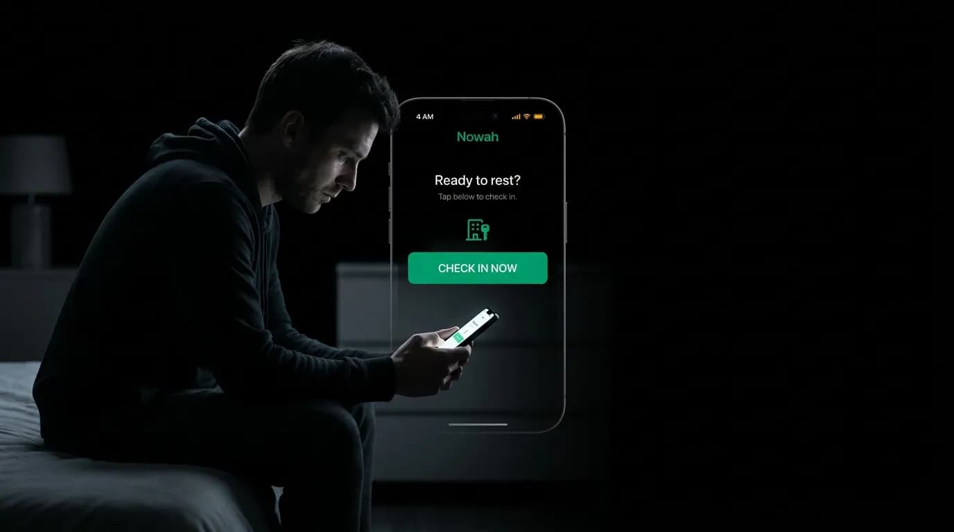
It is 4 AM in Tokyo. You landed six hours ago. Your body thinks it is 2 PM yesterday, which means you are simultaneously exhausted and wired, and your brain is operating at roughly 60% capacity. You need to check into your hotel in eleven hours, but first you need to figure out where the hotel actually is, when check-in starts, and whether you should try to sleep or power through.
You open your travel app. If that app presents you with a dashboard full of options, a notification stack, and three different ways to access your booking information, you are going to stare at it like it is written in a language you do not speak. Because for your jet-lagged brain, it might as well be.
Sleep research suggests that severe jet lag degrades cognitive processing speed by roughly 40%. Your ability to make decisions, parse complex information, and navigate multi-step flows drops dramatically. This is not an edge case for travel apps. This is a core use case. Your users will interact with your product while cognitively impaired, and the design needs to account for it.
One primary action per screen
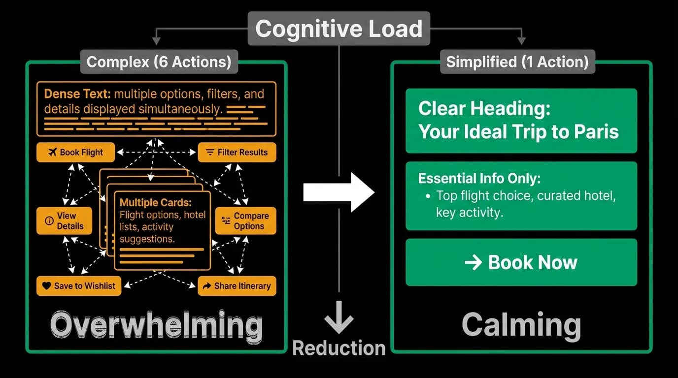
The most effective design principle for cognitively impaired users is also the simplest: show one thing to do, and make it unmissable. When a jet-lagged traveler opens the app, they should see exactly what they need next. Not a menu of possibilities. Not a feed of suggestions. The next action.
"Your hotel check-in is at 3 PM. Here is the address."
That is it. One piece of information. One action. No decisions required. The AI has already figured out what matters right now and surfaced it. The user does not have to navigate, filter, or choose. They just need to read and maybe tap one button.
This is fundamentally different from how most travel apps work. Most present a home screen with equal visual weight given to flights, hotels, activities, and settings. The user has to figure out what is relevant right now. For a fresh, alert user that is a minor cognitive task. For someone running on four hours of fragmented sleep after crossing nine time zones, it is a wall.
Fewer decisions, bigger targets
Hick's Law tells us that decision time increases logarithmically with the number of options. Reduce options from 30 to 3 and you cut decision time by roughly 70%. This is why we present three options instead of thirty when the AI searches for flights or hotels, and it is even more important in post-booking contexts where the user is likely exhausted.
But reducing options is only half the equation. The options that remain need to be visually obvious. Large touch targets, high contrast text, clear labels. No ambiguity about what tapping a button will do. A jet-lagged brain cannot process subtle visual cues or infer meaning from context. Everything needs to be explicit.
We design our primary action buttons to be unmissable. They are the largest interactive element on the screen, they use our green accent color for maximum contrast against the black background, and they are labeled with verbs that describe exactly what will happen. Not "Continue" but "Check in now." Not "View" but "See your booking."
The AI as cognitive offloader
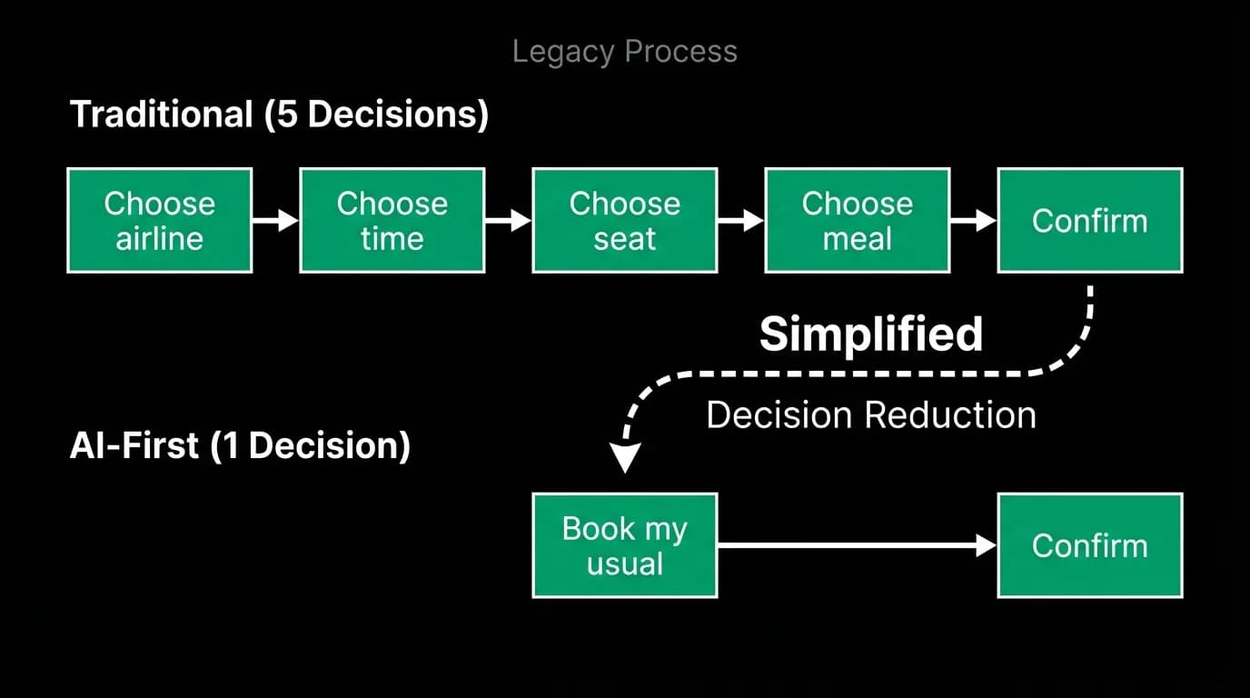
Here is where AI-first design creates an advantage that traditional apps structurally cannot match. In a conventional travel app, the user is the decision-maker at every step. They navigate to the right screen, find the right booking, parse the details, and decide what to do next. Each of those steps consumes cognitive resources.
In a conversation-based interface, the AI handles the cognitive heavy lifting. It knows what time it is in your current timezone. It knows when your hotel check-in starts. It knows whether your flight has a gate assignment yet. It can synthesize all of that context and present exactly what matters right now in plain language.
"Good morning. Your hotel check-in opens in 3 hours. The hotel is a 12-minute taxi ride from your current location. Would you like me to suggest somewhere nearby for breakfast while you wait?"
No navigation required. No screen-hopping. No parsing of times and addresses and maps. The AI did all of that, and the user just needs to say yes or no. For a brain running at 60% capacity, the difference between "figure it out" and "here is what to do" is the difference between a manageable morning and a frustrating one.
Minimal decision requirements
Every decision you ask a jet-lagged user to make should be binary when possible. Yes or no. This or that. Not "choose from these seven options" but "does this work?"
This applies to the AI's conversation design as much as the visual interface. Instead of presenting three hotel options and asking the user to compare them, the AI should present one strong recommendation with a clear reason and ask for a simple confirmation. "I found a hotel 5 minutes from your meeting location with an early check-in option. It is $180 per night. Should I book it?"
If the user wants more options, they can ask. But the default should be the simplest possible path to a completed action. Complexity is available on demand, not imposed by default.
Reduced motion for overwhelmed users
Visual complexity is not just about information density. Motion and animation, which normally add polish and provide helpful feedback, can become overwhelming for users in a degraded cognitive state. A screen full of sliding cards, pulsing indicators, and animated transitions can feel chaotic when your brain is struggling to process static information.
This is why reduced motion mode exists. When enabled, animations are replaced with instant transitions. Cards appear rather than sliding in. Loading indicators are static rather than pulsing. The visual experience becomes calmer, quieter, less demanding of attention.
We do not treat reduced motion as an afterthought or an accessibility checkbox. We treat it as a legitimate interaction mode that a significant portion of our users will benefit from at various points during their travel.
Test your app at 3 AM after 20 hours of travel
Here is the design review process that will teach you more than any usability study. Set an alarm for 3 AM. When it goes off, immediately pick up your phone and try to complete a task in your travel app. Check a booking. Find an address. Change a reservation.
Every moment of confusion, every tap that goes to the wrong place, every piece of information you have to read twice is a design failure for the jet-lag use case. And the jet-lag use case is not marginal. It is one of the most common states your users will be in when they interact with your product.
Design for the 60% brain, and the 100% brain will thank you too. Simplicity is not dumbing down. It is clearing away everything that does not matter so the thing that does can be found instantly.
Nowah is an AI travel agent that searches and books real flights and hotels through conversation — no filters, no thirty open tabs. Plan your next trip.