Real-Time API Metrics: What to Show and What to Hide
Developers care about latency, error rates, and usage. They do not care about internal queue depth. Choosing the right metrics and charts makes your dashboard genuinely useful.
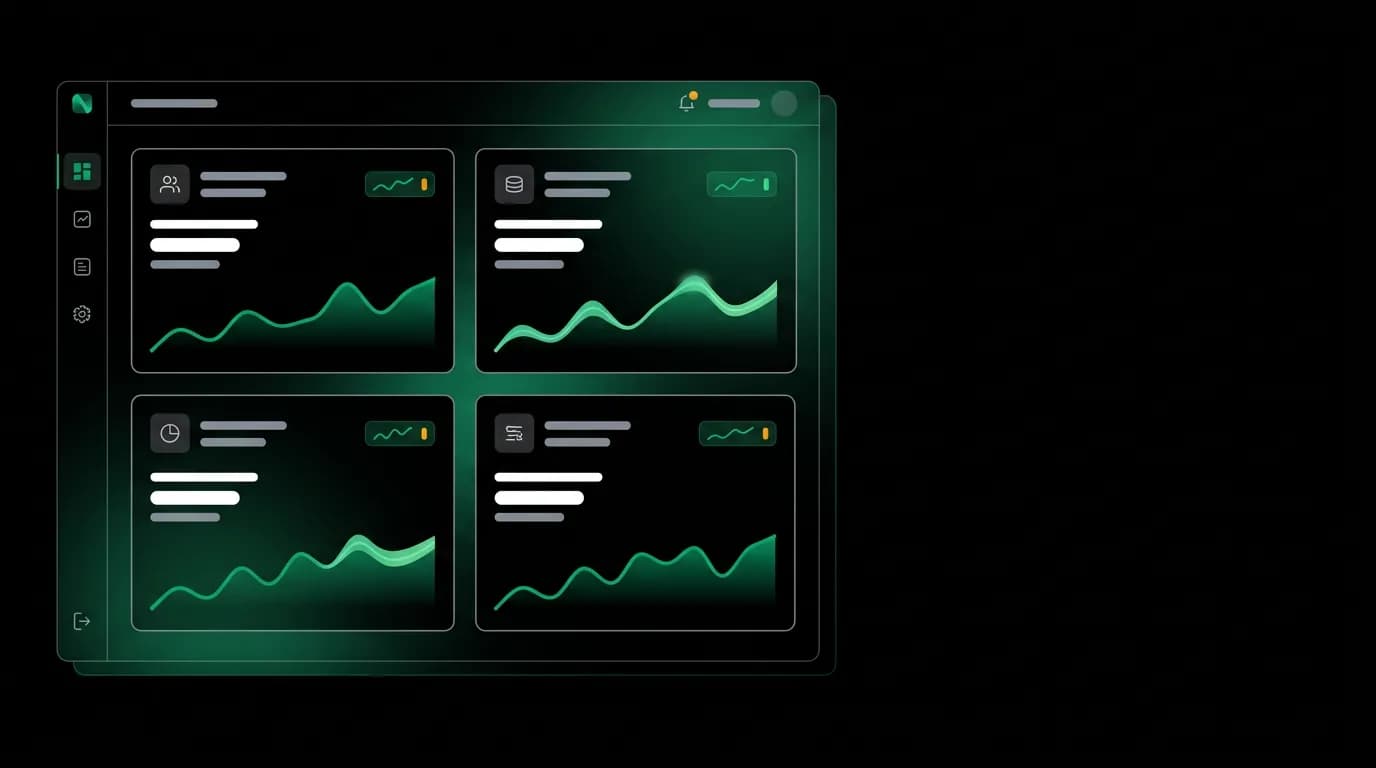
We once shipped a dashboard with 47 metrics on the overview page. Charts everywhere. Gauges, sparklines, bar charts, heat maps. It looked impressive in the design review. Then a developer told us they could not find their error rate.
Forty-seven metrics, and the one number they actually needed was buried between "webhook delivery p99 latency" and "search result cache hit ratio." Neither of those numbers had ever prompted a developer to take a single action.
That feedback led to a complete rethink of what belongs on a developer metrics dashboard.
The four metrics that belong on every overview

After watching how developers actually use dashboards -- not how we imagined they would -- we landed on four overview metrics. Just four.
API calls today. A simple counter showing how many requests this API key has made since midnight UTC. This is the heartbeat metric. If it is zero when it should not be, something is down. If it spikes unexpectedly, something is running away. The sparkline below it shows the last 24 hours so you can see the pattern.
Error rate. Percentage of requests returning 4xx or 5xx status codes over the last hour. This is the single most actionable metric in the entire dashboard. When it goes up, you need to investigate. We default to the last-hour window because developers want to know "is something wrong right now," not "was something wrong last Tuesday."
Latency: p50 and p95. Two numbers that tell you very different things. The p50 (median) is what most requests experience. Our target for flight search is under 800 milliseconds at p50. The p95 tells you what the slowest 5% of requests experience, and our target is under 2,000 milliseconds. If p50 is fine but p95 is high, you have a tail latency problem. If both are high, something systemic is wrong.
Active bookings. The number of bookings currently in progress (created but not yet confirmed or expired). This matters for travel APIs specifically because bookings are stateful, multi-step processes. A sudden drop in active bookings might mean the booking flow is broken. A sudden spike might mean a batch job is running.
Each of these four metrics is a single number with a trend indicator (up/down arrow and percentage change from yesterday). Below each, a small sparkline shows the recent history. Click any of them to drill into details.
Chart types that work for developer dashboards
Not every metric needs the same visualization. We learned this the hard way by initially using line charts for everything.
Sparklines for trends. Small, inline charts without axes or labels that show the shape of change over time. Perfect for the overview cards where you want a developer to glance and understand "going up" or "stable" without studying axis labels.
Counters for current state. Big bold numbers. API calls today. Active bookings. Current rate limit usage. These should dominate visually because they answer the most common question: "what is happening right now?"
Bar charts for comparisons. Error breakdown by category (validation, auth, provider, booking) renders well as a horizontal bar chart. You immediately see which category dominates. Same for latency breakdown by endpoint.
Gauges for limits. Rate limit usage as a percentage of quota. Uptime as a percentage of SLA. These have natural boundaries (0% to 100%) that gauges communicate intuitively. We show our availability target of 99.95% monthly alongside the actual uptime, and the gauge makes the gap (or lack thereof) immediately visible.
What we do not use: pie charts (hard to compare small segments), area charts (they obscure the actual values), and stacked line charts (impossible to read when the series overlap).
Time range controls matter more than you think

The default time range sets the tone for how developers interpret their metrics. We default to "last hour" for the overview because developer dashboards are primarily about "is everything okay right now?"
But we provide one-click switching between five ranges: 1 hour, 6 hours, 24 hours, 7 days, and 30 days. Each range tells a different story.
Last hour reveals real-time issues. A spike in errors that started ten minutes ago is immediately visible. Last 24 hours reveals daily patterns. Maybe your error rate always spikes at 3 AM when a batch job runs. Last 7 days reveals weekly patterns and lets you compare this Tuesday to last Tuesday. Last 30 days is for trend analysis and capacity planning.
The key insight is that the same metric at different time scales answers different questions. A 2.1% error rate in the last hour is potentially an incident. A 2.1% error rate over the last 30 days might be normal for your integration. Comparison views -- this week vs. last week, this endpoint vs. that endpoint -- make these contextual judgments possible.
When to surface alerts vs. letting developers discover issues
We draw a line between passive metrics display and active alerting. The dashboard shows metrics. It does not scream at you.
Alerting thresholds exist, but they appear as subtle visual cues, not modal pop-ups. When the error rate crosses a threshold, the metric card turns from its default color to a muted amber. If it crosses a higher threshold, it shifts to red. The numbers update, the sparkline shows the spike, and the developer notices because they glance at the overview page during their normal workflow.
We do not auto-open alert modals. We do not send push notifications for every metric threshold (though developers can configure those separately). The dashboard is a monitoring tool, not an incident management tool. The moment you make it noisy, developers stop looking at it.
The exception is rate limit warnings. When a developer is approaching their rate limit, a banner appears at the top of the dashboard with their current usage, time until reset, and a link to upgrade if needed. Running into a rate limit without warning is one of the most frustrating developer experiences, and a proactive warning prevents that.
What to hide
This is the harder list, because every metric feels important to someone on the team.
Internal queue depth. Developers do not control this and cannot act on it. If queues back up, that is our problem to solve.
Cache hit ratios. Interesting for our operations team. Meaningless to a developer wondering why their search is slow.
Provider-level latency breakdown. We show overall API latency. How that decomposes across our internal services and upstream providers is implementation detail that adds complexity without adding value.
Individual request traces. The log viewer handles this. The metrics overview is not the place to surface individual request details.
Historical data beyond 30 days. For compliance or analysis, developers can export data. But the dashboard view beyond 30 days creates scale problems with chart rendering and rarely provides actionable insight for day-to-day work.
The general principle: if a metric does not help a developer decide whether to investigate something or change something about their integration, it does not belong on the dashboard. Show it somewhere else or do not show it at all.
Restraint in metric design is harder than generosity. But a dashboard with four clear metrics that a developer checks daily is worth infinitely more than one with 47 metrics that nobody opens.
Nowah is an AI travel agent that searches and books real flights and hotels through conversation — no filters, no thirty open tabs. Plan your next trip.