Designing Rich Message Cards for AI Travel Chat
Flight cards, hotel cards, booking confirmations — interactive rich content embedded in a conversation. Here is how we design and build them.
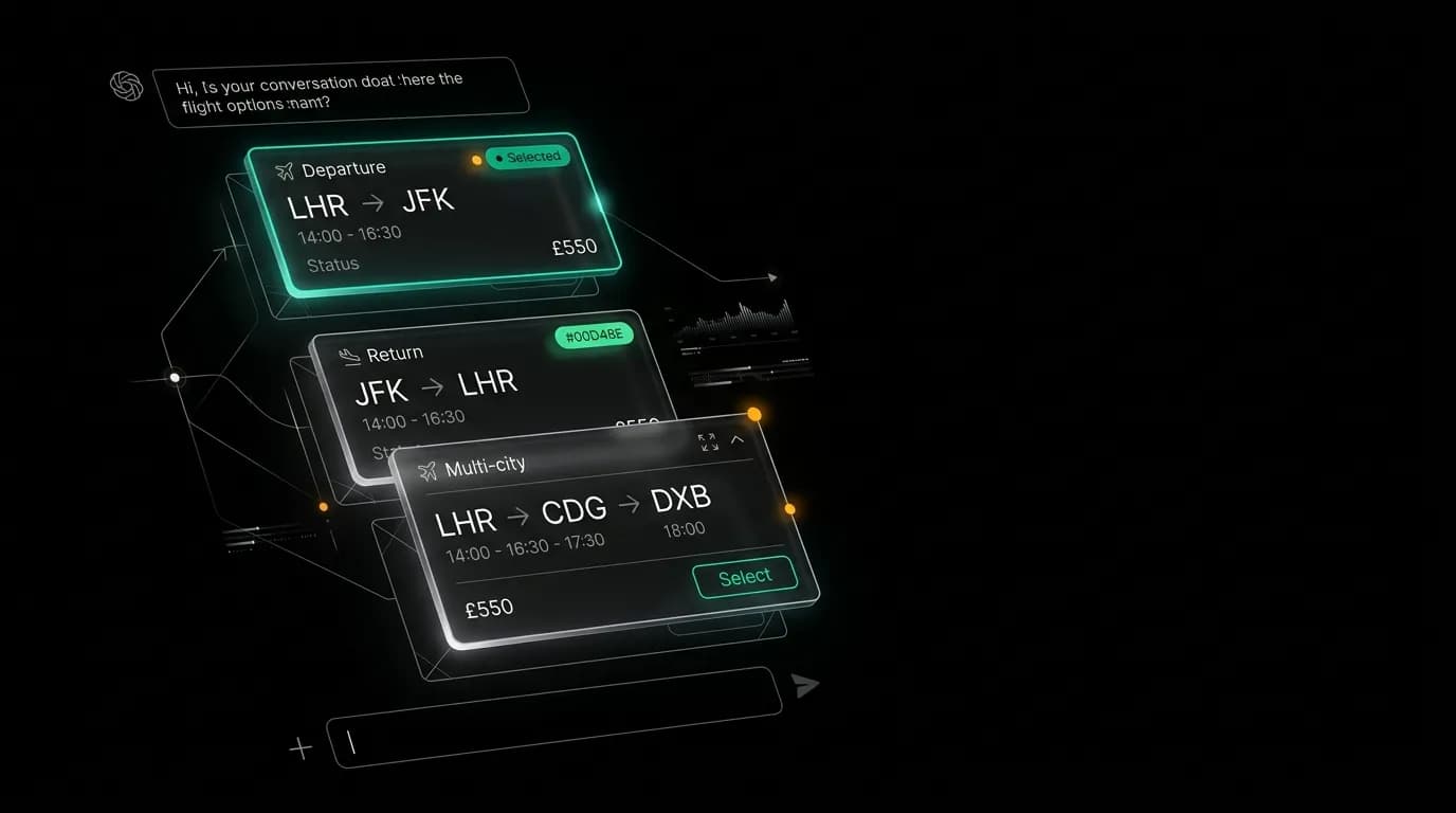
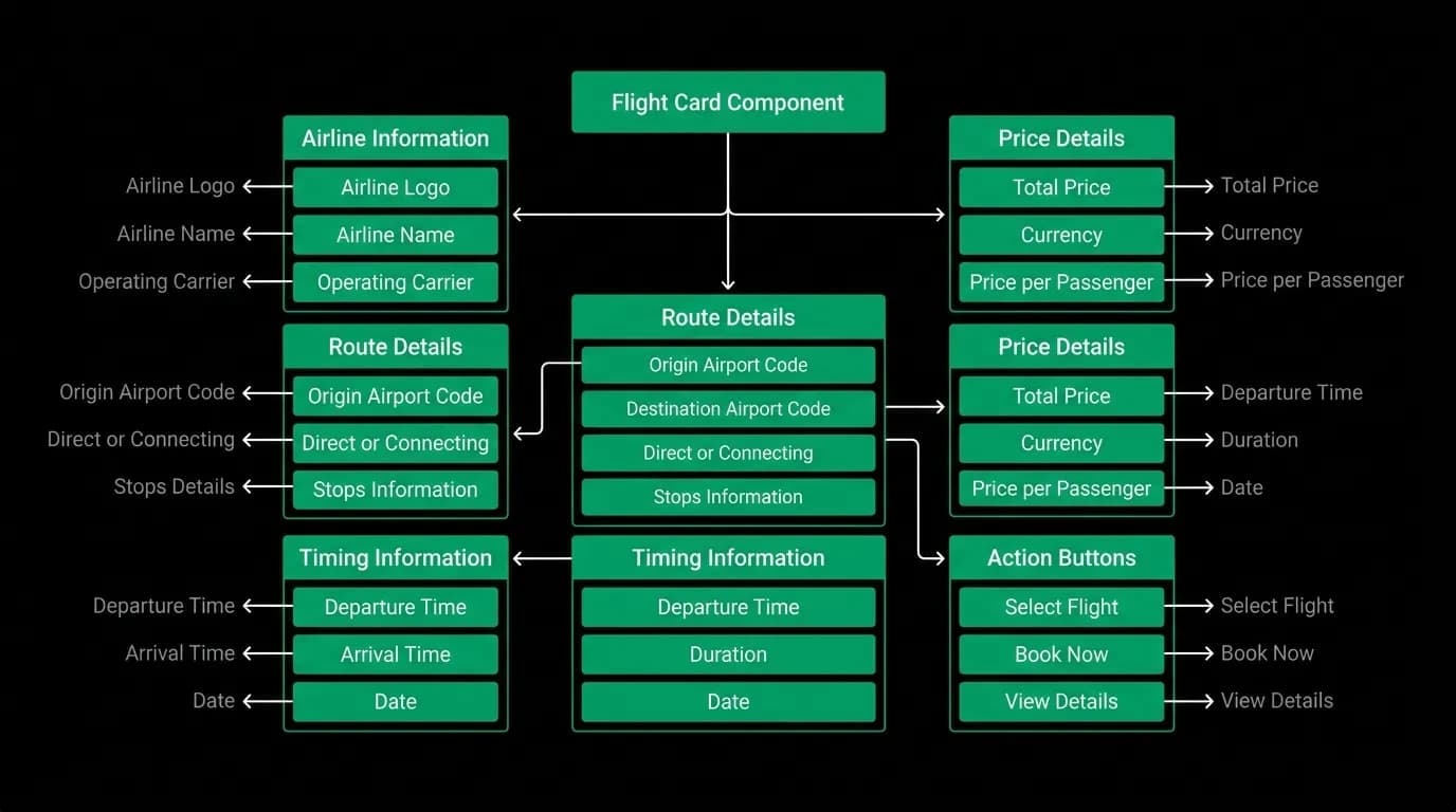
When our AI agent finds flights for you, the results do not appear as a wall of text. They appear as interactive cards embedded in the conversation. Each card shows the airline, route, times, duration, stops, and price. You can tap to select, expand for details, or ask the agent for different options. The card is part of the chat, not a link to somewhere else.
Building these cards is one of the more interesting frontend challenges we have tackled. They need to feel like natural parts of a conversation while being interactive enough to replace the multi-page flows of traditional travel booking.
Cards that feel like conversation
The first principle of our card design is that cards must feel like they belong in the chat. They are not embedded web pages or iframes. They are messages from the agent that happen to be visual and interactive.
This means cards follow the same visual rhythm as text messages. They have similar padding, corner radius, and spacing. The background is a slightly elevated surface, not a jarring white rectangle on our black background. The typography matches the chat. They feel like rich messages, not foreign widgets.
We present exactly 3 options when the agent searches for flights or hotels. Not 10. Not 50. Three. This is a deliberate design choice backed by research on decision fatigue. Three options are enough to give the user meaningful choice without overwhelming them. The agent has already done the hard work of filtering 200+ results down to the best 3 based on the user's preferences, constraints, and price sensitivity.
Each card replaces 3-4 separate pages in a traditional OTA flow. The card shows the information a user needs to make a decision: the key details at a glance, expandable sections for more depth, and an action button to select. There is no detail page, no "see full itinerary" link, no back button to navigate.
Interactive elements within chat
Our cards support several interaction types, all without leaving the conversation thread.
Selection. Tapping a flight card marks it as selected with a visual indicator. The agent acknowledges the selection and moves to the next step.
Expansion. Cards have a compact default state and an expanded state. The compact state shows the essentials: airline, times, price. Expanding shows additional details like baggage allowance, aircraft type, fare class, and layover information. On mobile, expansion happens inline. On web, it can show a side panel for larger content.
Comparison. When three flight options are visible, the user can scan and compare them directly. We align information vertically so price, duration, and stops are easy to compare at a glance. This is easier than flipping between browser tabs on a traditional OTA.
Actions. Each card has action buttons that trigger flows. "Select" starts the booking review. "Show more like this" asks the agent to search with adjusted criteria. "Change dates" triggers a date refinement conversation.
All of these interactions keep the user in the chat. The conversation is always visible behind any modal or expanded view. You never lose your place.
Responsive card layouts
The same flight card needs to work on a 375px-wide iPhone screen and a 1400px-wide desktop browser. The information is identical, but the layout adapts.
On mobile, cards stack information vertically. Departure city and time on one line, arrival on the next, duration and stops below, price at the bottom. It is scannable with a thumb scroll.
On desktop, cards use a horizontal layout with departure on the left, a visual flight path in the middle, and arrival on the right. Price and actions sit on the far right. This uses the wider viewport to show more at a glance.
We do not just scale the mobile card up for desktop. The layouts are different components that share the same data and interaction logic. A mobile flight card and a desktop flight card consume the same props and fire the same events, but they render different JSX.
Information hierarchy
Travel data is dense. A single flight has dozens of data points: airline, flight number, aircraft, departure airport, departure time, arrival airport, arrival time, duration, stops, layover duration, layover airport, fare class, baggage allowance, seat selection availability, cancellation policy, price, taxes, and more.
We organize this into three tiers:
Immediate (visible at first glance): airline name, departure and arrival times, total duration, number of stops, and price. This is enough to make a quick comparison.
On expand: layover details, baggage allowance, fare class, aircraft type, cancellation policy. This is the information you check before committing.
On demand: full fare rules, airport terminal information, seat map availability. This is available through the agent conversation ("what's the cancellation policy on that Emirates flight?").
This hierarchy respects the user's attention. Most decisions are made from tier-one information. Tier two confirms the decision. Tier three is for edge cases.
Accessibility for interactive cards
Rich cards in a chat present accessibility challenges that neither standard chat nor standard web pages fully address.
Screen readers need to announce cards in a logical order. When three flight cards appear, the screen reader should say something like "3 flight options found. Option 1: Emirates, New York to Dubai, departing 8:15 AM, arriving 7:30 PM, direct flight, $849. Option 2..." Each card is a labelled group with structured content.
Keyboard navigation requires focus management. When cards appear, focus moves to the first card. Tab moves between cards. Enter expands or selects. Escape collapses expanded content and returns focus to the chat input. This tab order has to work even when cards appear mid-conversation with text messages above and below.
Color and contrast are important because our cards sit on a dark background. Price text needs to be high-contrast for readability. Action buttons need clear affordance. Selected states need to be distinguishable by more than just color for colorblind users.
We test our cards regularly with VoiceOver on iOS, TalkBack on Android, and various screen readers on web. The cards are complex enough that accessibility is not something you bolt on at the end. It has to be part of the component design from the start.
Cards versus traditional OTA listings
Traditional OTA result pages show a long list of options. You scroll, you scan, you click one, you go to a detail page, you come back, you scroll again. The cognitive load is high and the interaction cost is expensive because every comparison requires navigation.
Our card-based approach inverts this. The AI does the comparison work. You see 3 options, all visible at once (or with minimal scrolling on small screens). The information density per card is higher than a list item because we do not need to worry about list performance with hundreds of items. When you only have 3, each one can be richer.
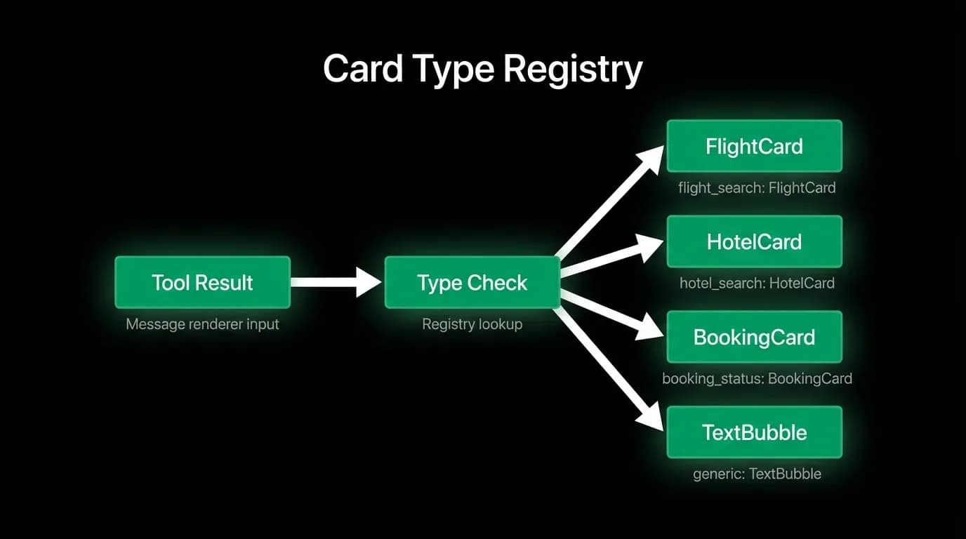
The result is that cards render within our sub-second streaming UI pipeline. They appear in the conversation as naturally as text responses. And they give users enough information to make decisions without ever leaving the chat.
Nowah is an AI travel agent that searches and books real flights and hotels through conversation — no filters, no thirty open tabs. Plan your next trip.