The Agent as Interface — Post-GUI Product Design
CLI gave way to GUI. GUI is giving way to NUI. When the AI agent IS the interface, everything about product design changes.
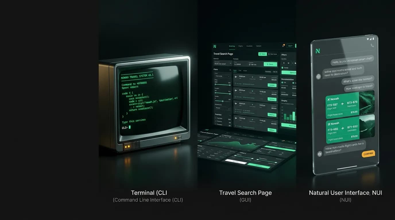
Every few decades, the dominant computing interface paradigm shifts. Command-line interfaces gave way to graphical user interfaces in the 1980s. We are now in the early stages of the next shift: from GUIs to what I will call natural user interfaces, or NUI, where the AI agent is the interface.
Travel booking is one of the first domains where this shift is visible. And the transition reveals things about product design that apply far beyond travel.
The interface evolution
CLI (1970s-1980s): You typed commands. The computer executed them. You needed to know the command syntax. Power users loved it. Everyone else was locked out. The barrier to entry was knowledge of the command language.
GUI (1984-present): You pointed and clicked. Menus, buttons, forms, and visual feedback made computers accessible to everyone. The barrier shifted from knowing commands to navigating visual interfaces. GUIs democratized computing.
NUI (2024-present): You speak or type natural language. The AI understands and acts. No commands to memorize. No menus to navigate. The barrier is almost zero. If you can describe what you want, you can use the product.
Each transition eliminated something. CLI to GUI eliminated the need to memorize commands. GUI to NUI eliminates the need to navigate interfaces. Each transition also expanded the user base by an order of magnitude.
Why travel is the ideal test case
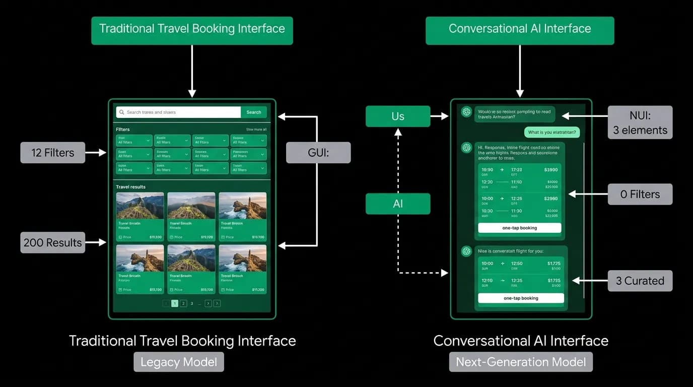
Travel booking GUIs are among the most complex consumer interfaces that exist. A typical flight search page has:
- A multi-field search form (origin, destination, dates, travelers, cabin class)
- A filter sidebar (stops, airlines, times, price range, duration)
- A sort control
- A results grid showing 20-50+ options per page
- Pagination
- Expandable details for each option
- A comparison feature
- A booking flow with passenger forms, seat selection, payment, and confirmation
Traditional booking requires 15 to 20 discrete decisions spread across 45 to 90 minutes. Each decision point is a potential abandonment point. The GUI is complex because the problem is complex, but the complexity is not something users want to engage with. They want a flight. The interface is scaffolding.
When the AI agent is the interface, most of this scaffolding vanishes. You describe what you want. The agent handles search, filtering, sorting, and comparison. It presents 3 curated options. You pick one. The agent handles passenger data collection, seat selection, and payment.
Two decisions instead of twenty. Three to five minutes instead of forty-five to ninety. The 67% of travelers who find booking stressful are stressed by the GUI. Remove the GUI, remove the stress.
Designing for conversation, not navigation
Post-GUI product design requires rethinking fundamental assumptions.
No pages. In a GUI, information is organized into pages. A search results page. A flight details page. A booking confirmation page. Navigation between pages is a core interaction. In a conversational interface, there are no pages. All information lives in the conversation thread. Flight details appear inline. Booking confirmations appear inline. The user never navigates. They scroll.
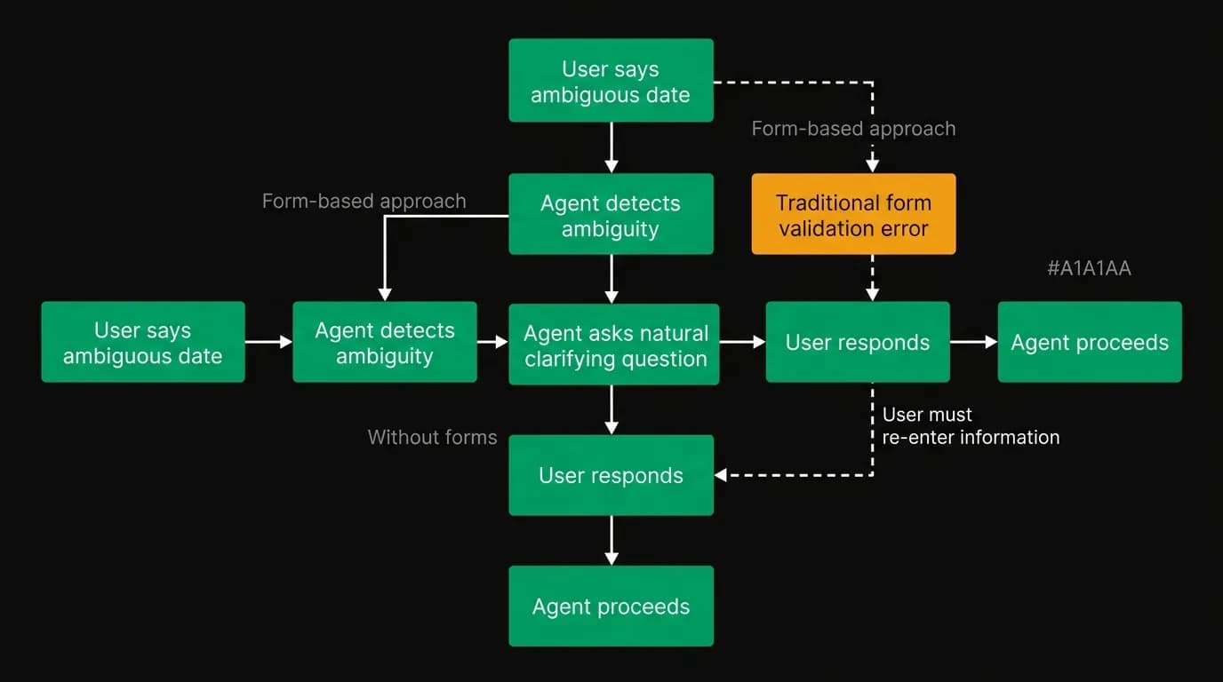
No forms. GUIs collect structured data through forms. Name. Email. Date of birth. Passport number. In a conversation, the agent collects this data through dialogue. "I'll need the passenger's full name as it appears on their passport." The user types "Maria Garcia Hernandez." No form field. No label. No validation error popup. If the agent needs clarification, it asks naturally: "Is that the name exactly as it appears on the passport, including both surnames?"
No menus. GUIs organize functionality into menus and navigation bars. Flights. Hotels. My Trips. Settings. In a conversational interface, functionality is accessed by stating what you want. "Show me my trips." "Find a hotel in Rome." "Change my seat preference to window." The agent routes to the right functionality based on intent.
No onboarding tutorial. GUIs often need tutorials or guided tours to teach users where things are. A conversation does not need a tutorial. The user types what they want. The agent responds. The interaction model is self-evident because it is the same interaction model as texting a friend.
Rich inline components
Going post-GUI does not mean going text-only. It means embedding rich components inside the conversation rather than on separate pages.
When our agent finds flights, it renders interactive flight cards directly in the chat. Each card shows airline, times, duration, stops, and price. The user can tap a card to select it. The booking flow happens inline.
Hotel results appear as hotel cards with images, prices, ratings, and neighborhood information. Maps appear inline when location context is helpful. Itineraries render as structured timelines within the conversation.
These components are not separate screens. They are part of the conversation flow. The agent says "here are your top options" and the options appear right there, between messages. The user can discuss them: "the first one looks good but I'd prefer a direct flight." The agent adjusts without the user navigating anywhere.
Mobile bookings account for over 60% of all travel transactions. On a phone screen, conversational interfaces with inline components feel natural. They fit the device. A complex GUI with filter sidebars and comparison grids does not translate well to 6 inches of screen.
Edge case handling without forms
In GUI design, edge cases are handled through form validation. You enter an invalid date and a red error appears. You leave a required field empty and the form will not submit.
In conversational design, edge cases are handled through dialogue.
The user says: "I want to fly on the 31st." But it is February, and February has no 31st. A form would show a red border on the date picker. The agent says: "February has 28 days this year. Did you mean February 28th, or March 1st?"
The user says: "Book for me and my wife." The agent needs full legal names for both passengers. "I'll need both passengers' full names as they appear on their passports. What is yours?" Then: "And your wife's name?" Natural. Sequential. No form.
The user enters an ambiguous destination: "I want to go to Portland." Oregon or Maine? A form might show a dropdown with both options. The agent asks: "Portland, Oregon or Portland, Maine?"
Every GUI edge case has a conversational equivalent that feels more natural and less punitive. Forms tell you that you made an error. Conversations ask you for clarification. The emotional register is different.
What we lose and what we gain
I want to be honest about the tradeoffs.
We lose visual scanning. A results grid lets power users scan 50 options in seconds. A conversational interface presents 3 options in a linear flow. Users who want to browse extensively lose efficiency. We mitigate this by letting users request more options, but the browsing experience is inherently more constrained.
We lose spatial memory. In a GUI, users remember where things are. The booking button is in the top right. The filter sidebar is on the left. In a conversation, there is no spatial layout to memorize. Users rely on the agent to surface the right functionality. This is freeing but also means the user cannot navigate independently if the agent misunderstands.
We lose parallel comparison. Side-by-side comparison of two flights requires spatial layout. In a conversation, the agent has to narrate the comparison: "Option A is $100 cheaper but has a connection. Option B is direct." We compensate by rendering comparison cards that show options side by side within the conversation.
We gain universal accessibility. Voice input and text input are the most inclusive interaction modalities. Users with motor impairments can use voice. Users with visual impairments can use screen readers that work naturally with text conversations. Voice queries are growing 40% or more per year. The conversational interface is the accessible interface.
We gain zero learning curve. Everyone knows how to have a conversation. Nobody needs to learn where the filter sidebar is.
We gain natural complexity handling. "I need two rooms in the same hotel, one for my partner and me and one for my parents, but they have mobility issues so they need ground floor access." Try expressing that in a form. In conversation, it is one sentence.
Designing for discovery
One criticism of conversational interfaces is that they are bad for discovery. A GUI lets you browse. A menu shows you what is possible. A conversation only shows you what you ask for.
This is a real concern, and we address it through proactive agent behavior. The agent does not just respond to requests. It surfaces opportunities.
"You mentioned wanting to try Japanese food. I noticed there is a highly-rated ramen district near your hotel in Tokyo. Want me to add it to your itinerary?"
"Your flight has a 4-hour layover at Changi Airport. They have a free city tour program for transit passengers. Interested?"
"Based on your past trips, you might enjoy the Trastevere neighborhood for dinner tonight. It's a 10-minute walk from your hotel."
These proactive suggestions replace the browsing function of a GUI. Instead of the user scanning a menu of options, the agent surfaces relevant possibilities based on context and preferences. The discovery is personalized rather than generic.
We also support explicit discovery queries. "What can you help me with?" produces a concise list of capabilities. "What else should I know about my trip?" triggers a context-aware briefing. The agent can guide discovery through conversation in ways that a static menu cannot.
The trust requirement
Post-GUI design places more trust in the agent. In a GUI, the user can see all options and make independent judgments. In a conversation, the user sees what the agent shows them. This is a responsibility we take seriously.
If the agent only shows 3 curated flight options, the user trusts that those 3 are genuinely the best. If the agent filtered out a cheap option because it assumed the user would not want a red-eye, but the user would have happily taken the red-eye, the curation failed.
This is why transparency matters more in agent-as-interface design than in GUI design. The agent must explain what it searched, how it filtered, why it ranked, and what it excluded. "I excluded red-eye flights because you've never booked one. Want me to include them?"
The user should always be able to expand the scope of what the agent shows them. "Show me all options" overrides curation. "Why did you pick these?" triggers explanation. The agent is not hiding information. It is organizing information with the user's consent.
The mobile advantage
Over 60% of travel bookings happen on mobile devices. This matters for the GUI-to-NUI transition because mobile is where traditional GUIs suffer most.
A desktop flight search page with filter sidebars, comparison grids, and multi-column layouts translates poorly to a 6-inch screen. Mobile travel apps are essentially compromised desktop experiences. The filters get collapsed into drawers. The comparison grid becomes a scrollable list. The booking flow requires more taps across more screens because there is less space per screen.
Conversational interfaces have no translation problem. A chat thread looks and works the same on desktop and mobile. The interaction model is texting, which is the most natural thing people do on their phones. Flight cards rendered inline in a conversation look better on mobile than they do on desktop because the vertical flow matches how people use their phones.
Voice input amplifies this further. Voice queries are growing 40% or more per year, driven by improved speech recognition and comfort with voice assistants. A traveler walking through an airport can say "find me a hotel near my meeting tomorrow" without stopping to type. The agent processes the voice input, queries hotel availability near the meeting location (which it knows from the calendar), and presents options. No typing. No navigation. No forms.
We think about mobile-first design differently from traditional app teams. For them, mobile-first means making the GUI work on smaller screens. For us, mobile-first means the conversation is the product, and the screen is just where the conversation happens to be rendered.
Accessibility as a first-class feature
Conversational interfaces are inherently more accessible than GUIs. This is not a marketing claim. It is a structural property of the interface paradigm.
Screen readers work naturally with text conversations. The entire interaction is already text. There is no complex visual layout to navigate, no hover states to miss, no drag-and-drop to struggle with.
Voice input makes the product usable for people with motor impairments who cannot easily use touchscreens or keyboards. The barrier to entry is the ability to speak or type text. For GUIs, the barrier is the ability to navigate a complex visual interface with precise inputs.
Cognitive accessibility is perhaps the biggest gain. A flight search page with 12 filters, 50 results, and 15 decision points creates high cognitive load. A conversation that asks one question at a time and presents 3 options reduces that load dramatically. Users with attention differences, learning disabilities, or simply limited patience benefit from the simpler interaction model.
We did not build a conversational interface for accessibility reasons. We built it because it is a better product. But the accessibility benefits are real and significant, and they expand the addressable market to users who were effectively excluded by complex GUIs.
The hybrid interface question
A question we get asked frequently: should the interface be purely conversational, or should it combine conversation with traditional GUI elements?
Our answer is hybrid, but conversation-primary. The conversation is the main interaction mode. Rich inline components (flight cards, hotel cards, maps, itineraries) appear within the conversation. These components are interactive. You can tap a flight card to select it. You can swipe between hotel options. You can expand a map.
But we do not have a separate search page, a separate results page, or a separate booking form. Everything lives in the conversation. The inline components are enhancements to the conversation, not replacements for it.
We tried a hybrid where users could switch between a chat view and a traditional search view. Usage data was clear: once users got comfortable with the conversational flow, they stopped using the traditional view. The switching option created confusion rather than flexibility. Most users preferred to stay in one mode, and the mode they preferred was conversation.
The one exception is the trip detail screen. After a booking is confirmed, users want to see their full itinerary in a structured layout: flights, hotels, activities, documents, all organized by date. This is a GUI that serves reference purposes, not decision-making purposes. The conversation handles the decisions. The structured view handles the reference.
The metrics of post-GUI design
Traditional product metrics (page views, time on site, click-through rates) do not apply to conversational products. We use different measures.
Task completion rate. Did the user accomplish what they came to do? This replaces conversion rate.
Turns to completion. How efficient was the conversation? This replaces time on site (where more was considered better in GUI design, less is better in conversational design).
User-initiated expansion rate. How often do users ask to see more options or explore beyond the agent's initial suggestions? High rates might indicate under-curation. Very low rates might indicate over-curation or lack of user engagement.
Return rate. The ultimate measure. Users come back when the product works. This is amplified in conversational products because memory makes each return more valuable than the last.
[Error recovery](/blog/error-recovery-agentic-systems) rate. How gracefully does the agent handle misunderstandings? In a GUI, error recovery is a back button. In a conversation, error recovery is a natural correction: "No, I meant Portland, Oregon." The rate at which users successfully recover from errors without abandoning the conversation measures the robustness of the conversational design.
The transition period
We are in a transition period. GUIs are not disappearing overnight. Some users prefer them. Some tasks suit them. The question is not "GUI or NUI?" It is "what is the right default, and how do you handle users who want the other mode?"
Our answer is conversation-default with GUI escape hatches. The primary interaction is conversational. But if a user wants to see all their trips in a structured list, they can. If they want to view their itinerary as a timeline, that exists. These structured views are reference tools, not decision-making tools. The decisions happen in the conversation.
Over time, we expect the ratio to shift further toward conversation. As memory improves and the agent's recommendations get better, the need for manual exploration decreases. The user who currently checks the trip detail page after every booking will eventually trust the agent's confirmation message and skip the page entirely.
The transition matters because it affects how you invest engineering resources. A product team that bets entirely on conversation today alienates users who are not ready. A team that maintains a full GUI alongside the conversation is paying double the engineering cost. The right approach is a lean GUI that handles reference and verification while the conversation handles everything else.
The best travel app in 2026 is a conversational agent with inline rich components and minimal traditional UI. The best travel app in 2030 might be purely conversational. We are building for the trajectory, not just the current moment. The companies that figure out post-GUI design now will have a significant head start when the rest of the industry catches up.
The agent as interface is not perfect. But for complex, personalization-heavy, high-stakes domains like travel booking, it is a better paradigm than the GUI. The shift is happening, and the products built for this paradigm will define the next generation of travel technology. We are betting on it, and every week the evidence strengthens.
Nowah is an AI travel agent that searches and books real flights and hotels through conversation — no filters, no thirty open tabs. Plan your next trip.