Airline On-Time Performance Data: Who Delivers?
Airlines and routes ranked by punctuality. See how delay data is collected, who is most reliable, and how the AI factors on-time performance into ranking.

The airline that consistently arrives 20 minutes behind schedule is not "on time" just because it says so on its website. On-time performance data tells a different story than airline marketing, and the gap between the most reliable and least reliable major carriers is larger than most travelers expect. The difference is 20 to 30 percentage points between the best and worst performers, which translates directly into your probability of making a connection, arriving for a meeting on time, or starting your vacation on schedule.
How on-time data is collected
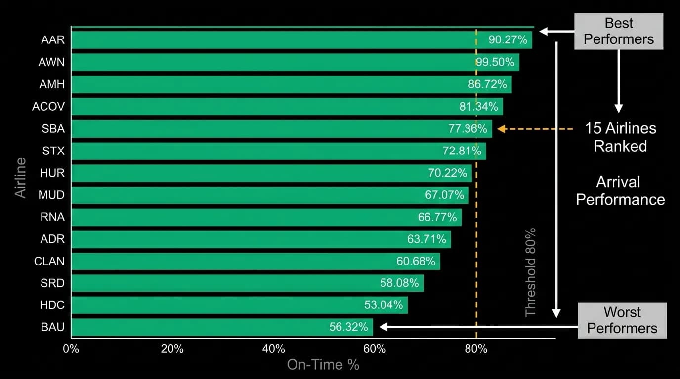
In the United States, the Department of Transportation publishes monthly on-time performance data for all domestic carriers above a certain size. A flight is considered "on time" if it arrives within 15 minutes of its scheduled arrival time. This threshold is generous — most travelers would not consider a 14-minute delay "on time" — but it is the industry standard and provides a consistent basis for comparison.
The data captures arrival delay, departure delay, taxi time, cancellation rates, and the reason for delays (carrier fault, weather, air traffic control, security, late-arriving aircraft). This level of granularity allows analysis that goes beyond simple "what percentage of flights were on time" to understand why a carrier's performance looks the way it does.
International on-time data is less standardized. Different countries publish delay statistics with different methodologies and thresholds, making cross-country airline comparisons more difficult. The AI normalizes these differences when comparing carriers across regions, but the data is inherently less precise for international routes than for domestic ones.
Who performs best
Across US domestic operations, on-time arrival performance ranges from roughly 70% for the least reliable major carriers to over 85% for the most reliable. That 15-plus percentage point gap means that on a route served by both carriers, you are roughly twice as likely to experience a significant delay on the less reliable airline.
The picture shifts when you look at specific routes rather than system-wide averages. An airline with mediocre overall on-time performance might be highly reliable on routes from its primary hub, where it controls gate assignments, has spare aircraft, and operates the densest schedule. The same airline might perform poorly on routes where it has a thin presence and less operational flexibility.
Airport-specific delay patterns compound with airline-specific patterns. Some airports have chronic delay issues due to capacity constraints, weather exposure, or air traffic control limitations. An airline operating through a delay-prone airport will have worse on-time statistics on those routes regardless of its operational quality. The AI accounts for this by evaluating airline performance on the specific route being considered, not just the system-wide average.
Route-specific reliability
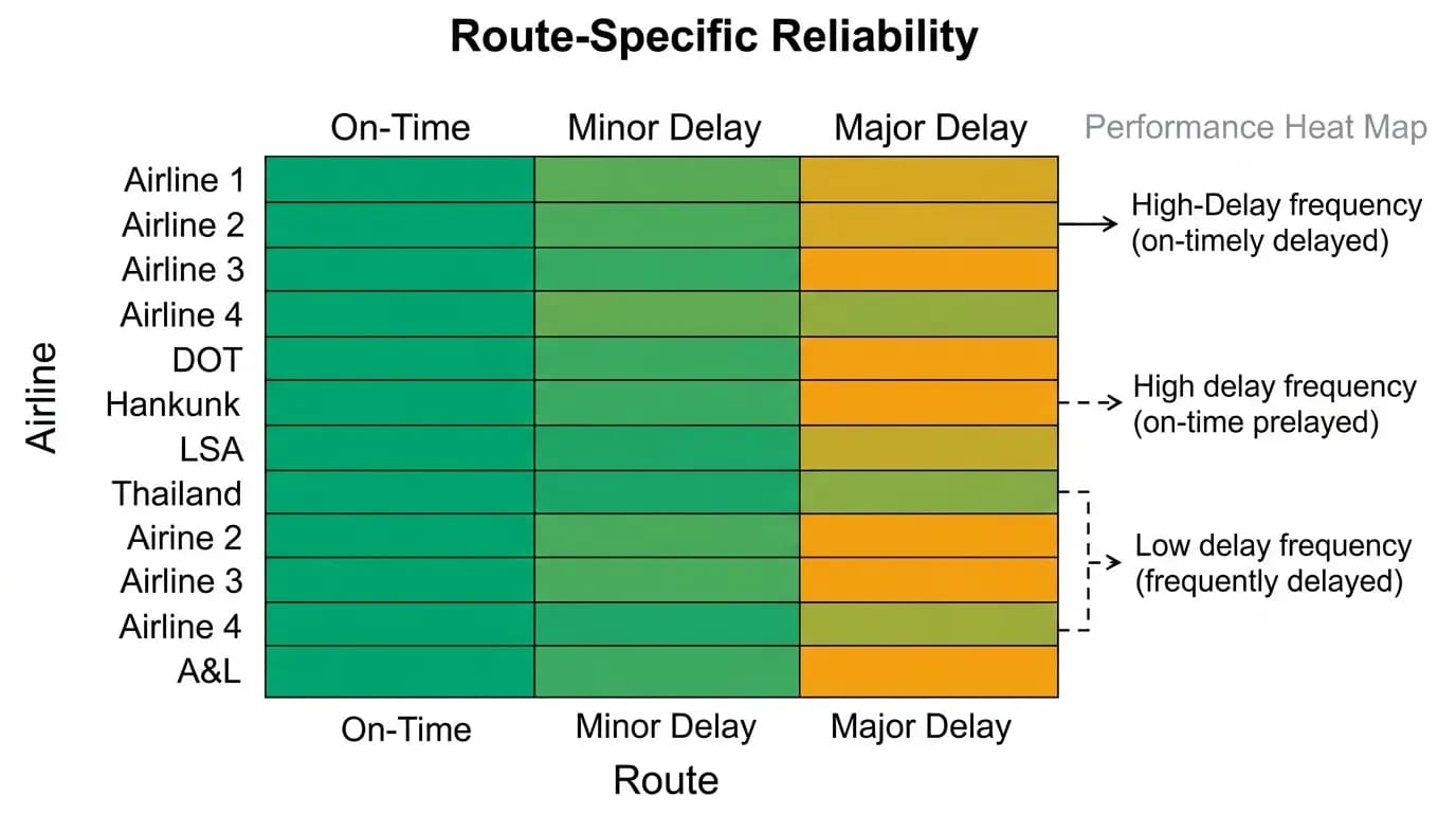
This is where the data gets most useful for travelers. Knowing that an airline has 82% system-wide on-time performance is interesting but not actionable for your specific flight. What matters is how that airline performs on the route you are booking.
Some carriers have significant performance variation by route. They might deliver 90% on-time performance on their bread-and-butter hub routes and 70% on routes where they compete with limited frequency. This variation can be 15 to 20 percentage points within a single airline's network.
The AI incorporates route-specific performance data into its ranking. When two flights on the same route have similar prices and schedules, the carrier with better route-specific reliability gets a scoring boost. This is especially important for connecting itineraries, where a delay on the first leg can cascade into a missed connection.
Airport delay patterns
Some airports are structurally prone to delays. Capacity-constrained airports in areas with frequent weather disruptions (thunderstorms, fog, winter storms) have higher baseline delay rates than airports in favorable climates with excess capacity.
The data shows that airport-level delay rates explain a significant portion of flight-level delay variance. A reliably run airline operating through a delay-prone airport will still experience more delays than a comparably run airline operating through a smooth-running hub. The traveler's practical question is not "which airline is best" in the abstract but "which combination of airline and routing gives me the best probability of arriving on time."
The AI handles this by scoring on-time performance as a function of both airline and route, not either one in isolation. This composite score reflects the real-world probability that your specific flight will arrive as scheduled.
How on-time data factors into ranking
Airline quality signals, including on-time performance, account for approximately 10% of the ranking weight in the AI's scoring model. This might sound modest, but on routes where multiple options have similar prices and schedules, the reliability dimension becomes the tiebreaker.
The weight increases for connecting itineraries, where on-time performance directly affects the probability of making the connection. A 30-minute delay on a nonstop flight is an inconvenience. A 30-minute delay on the first leg of a tight connection can turn into a rebooking and a lost evening.
Search on Nowah and see on-time data reflected in your flight recommendations. The AI factors punctuality into every ranking, ensuring that reliability is part of the recommendation — not an afterthought you discover at the gate.
Nowah is an AI travel agent that searches and books real flights and hotels through conversation — no filters, no thirty open tabs. Plan your next trip.