Designing AI-First Mobile Experiences
Conversation is the UI. Flight cards live inside chat bubbles. One-tap booking replaces multi-page forms. This is AI-first mobile design.

Open any major travel app on your phone. You will see a search bar at the top, some promotional banners, a row of filter icons, and eventually a grid of results. Scroll down. Tap into a listing. Read the details. Go back. Try another. Open the map. Close the map. Adjust the filters. Start over.
Now open a messaging app. Type something. Get a response. Done.
The gap between these two interaction models is the opportunity for AI-first mobile design. Over 60% of travel bookings happen on mobile devices, but most travel apps are desktop interfaces squeezed onto a 6-inch screen. The best travel app is not a smaller version of a website. It is a conversation.
Conversation as the main screen
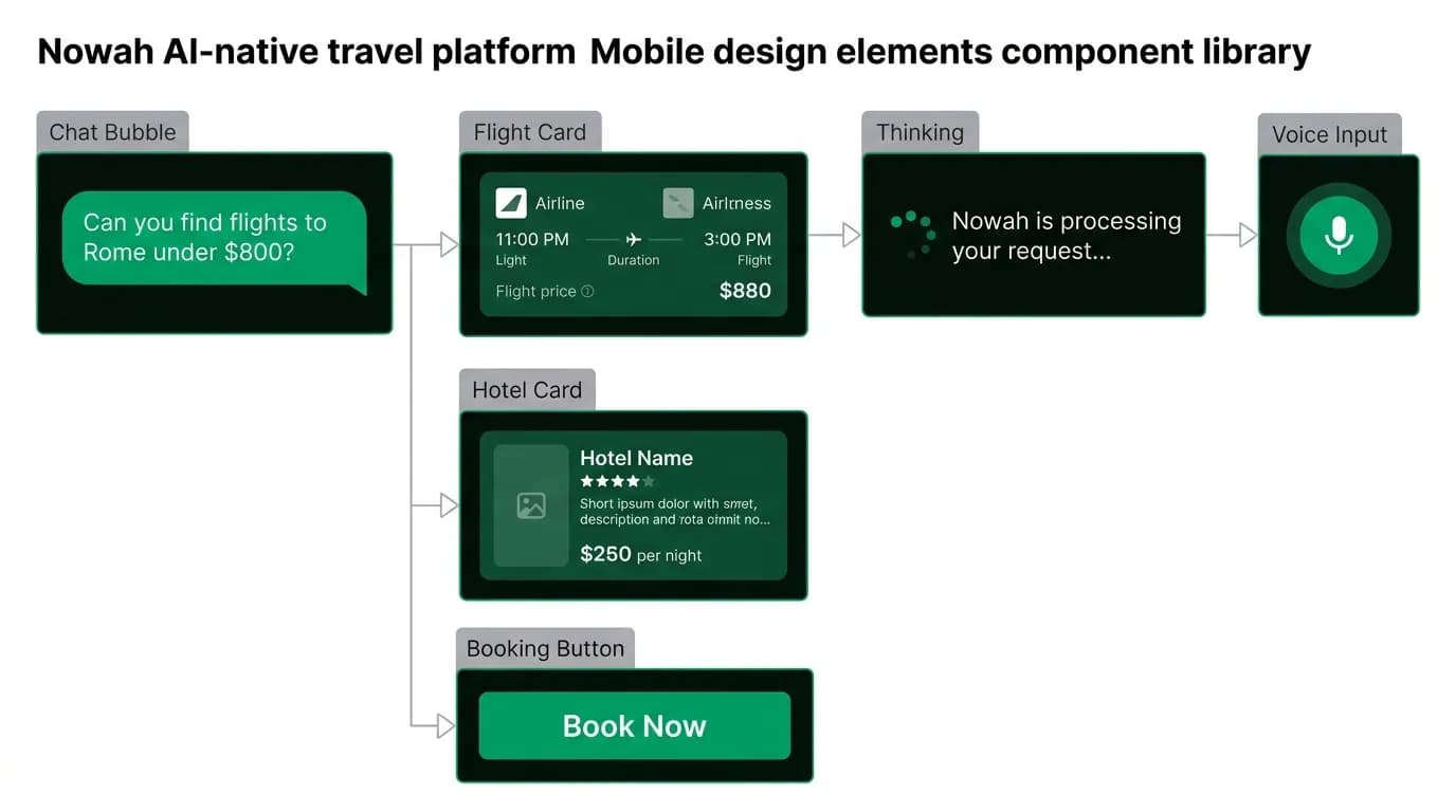
Our mobile app has one primary screen: the chat. There is no search form. No filter sidebar. No results grid. The user types or speaks, and the agent responds. Everything happens within the conversation flow.
This sounds like a simplification, but it is actually a radical rearchitecting of how travel information is presented. In a traditional app, flights exist on a flights page, hotels on a hotels page, and trip details on a trip page. In our app, flights, hotels, and trip details appear inline in the conversation wherever they are relevant.
The conversation is not a layer on top of the product. It is the product.
Rich inline components
A chat interface does not mean plain text responses. When the agent finds flights, it renders interactive flight cards directly in the conversation. Each card shows airline, times, duration, stops, and price. The user can tap to expand details, tap to book, or keep scrolling to see the other options.
Hotel recommendations render as rich cards with a photo, location, price per night, and a one-line summary of why the agent chose it. "This boutique hotel is 8 minutes walk from the Colosseum, in the quiet Monti neighborhood you tend to prefer."
These are not external links or redirects. They are native UI components embedded in the message stream. The user never leaves the conversation context to interact with them.
The design principles for inline components:
Self-contained. Each card has enough information to make a decision without tapping into it. The critical details (price, time, location) are visible at first glance.
Action-ready. Every card has a primary action button. For flights: "Book this flight." For hotels: "Reserve." One tap starts the booking process.
Contextual. The agent's text message above the cards explains why these options were chosen and which one it recommends. The cards are not raw data; they are curated results with narrative context.
One-tap actions
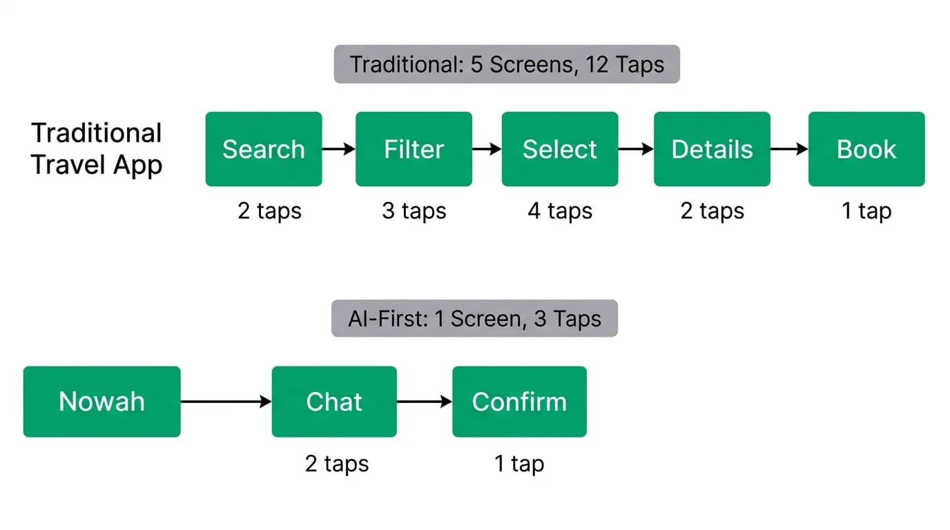
Traditional travel booking on mobile is a multi-page ordeal. Search results page, details page, traveler information page, seat selection page, payment page, confirmation page. Each page is a potential drop-off point. Each form field is a friction moment on a small screen.
We collapsed this into a conversation with one-tap actions. The user confirms their choice with a single tap. Traveler details are pre-filled from their profile. Payment uses a saved method. Seat preferences are known from memory. The booking confirmation appears as a new message in the chat.
The numbers tell the story. A traditional mobile booking flow requires 15-20 discrete decisions (date, time, airline, class, seat, hotel, room type, payment method...). Our flow requires 1-2. "Book option B" or just "that one."
This is possible because the AI agent has already made the other decisions based on the user's preferences and history. The agent selected the three best options. The agent knows the seat preference. The agent has the payment method on file. The user just confirms.
The role of visual elements
Not everything should be a card. Part of designing an AI-first mobile experience is knowing when to use text, when to use cards, and when to use other visual elements.
Text works for explanations, recommendations, and conversational context. "I found three great options for your Tokyo trip. Option A is the cheapest, but it has a long layover in Seoul. Option B is direct and arrives in the morning, which you prefer. Option C is premium economy with extra legroom."
Cards work for structured data that needs comparison. Flights, hotels, activities. Anything with discrete attributes that the user needs to evaluate.
Maps work for spatial context. "Here are the three hotels I am considering, all within walking distance of Shinjuku Station." A small inline map with pins replaces a paragraph of location descriptions.
Status indicators work for progress. "Searching 342 flights..." "Checking availability..." "Booking confirmed." These keep the user informed during operations that take a few seconds.
The design challenge on a 6-inch display is density. You have limited vertical space. Cards need to be compact enough that the user can see at least two options without scrolling. Text needs to be concise. Maps need to convey useful information at a glance, not just exist as decoration.
Small screen optimization
AI responses tend to be verbose. Models are trained on internet text, which rewards length. For mobile, we actively design for brevity.
Our response length guidelines: simple confirmations under 30 words. Flight presentations under 100 words plus three cards. Explanations under 150 words. No paragraph should exceed three sentences on mobile.
This is not just aesthetic. 72% of millennials and Gen Z want AI trip planning-trip-planning-ai-shines) on mobile. They are reading on screens held at arm's length on subway commutes. Dense paragraphs do not get read. Short, structured responses with clear visual hierarchy do.
Voice queries are growing over 40% year over year. On mobile, voice is often the primary input method. The agent's response to a voice query should feel like a response to a spoken question, not a written essay. Short, direct, conversational.
The best travel app feels like texting a friend
This is the design north star. Not texting a customer service agent. Not querying a database. Texting a friend who happens to know everything about travel.
A knowledgeable friend does not send you a spreadsheet of flight options. They say "take the 9 AM direct, it is $50 more but you get there in time for lunch and the airline is better." A friend does not make you fill out a form. They say "same passport details as last time?" A friend does not give you a loading spinner. They say "checking... okay, here is what I found."
The personality, the warmth, the efficiency of a good friend who is also an expert. That is what AI-first mobile design feels like when it is done right. And it is why we believe conversational AI is not just a different interface for travel booking. It is a better one.
Nowah is an AI travel agent that searches and books real flights and hotels through conversation — no filters, no thirty open tabs. Plan your next trip.