Adapting a Chat Interface from Mobile to Desktop
Chat on mobile is full-screen immersion. Chat on desktop gains side panels, wider cards, keyboard shortcuts, and split views — but the conversation remains the anchor.
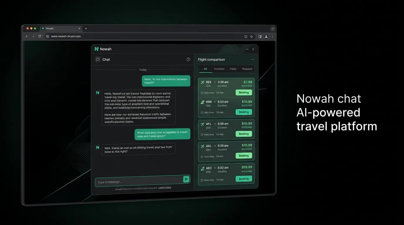
On a phone, the chat is the screen. It occupies every pixel. Messages fill the width. Cards stretch edge to edge. The input bar sits at the bottom, thumb-reachable. There is nothing else visible because there does not need to be. The conversation is the product, and the product is all you see.
On a 15-inch laptop screen, that same full-width approach would create absurdly wide message bubbles and cards that stretch into unreadable proportions. A chat message spanning 1400 pixels of width is not immersive. It is uncomfortable. The eye has to travel too far. The density feels wrong. The intimacy of conversation is lost in the empty space.
Adapting a chat interface from mobile to desktop is not a matter of scaling things up. It is a matter of using the additional space wisely while preserving the conversational core that makes the experience work.
Chat width constraints on desktop
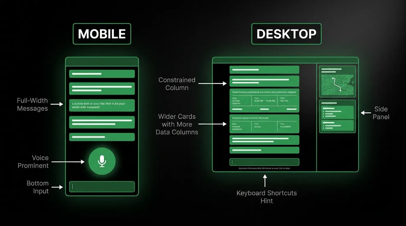
The first and most important desktop adaptation is constraining the chat column width. Our web implementation caps the chat at roughly 680 pixels. This keeps message bubbles at a comfortable reading width, maintains the visual density that makes conversation feel conversational, and leaves room on either side for additional content.
Six hundred and eighty pixels is not arbitrary. It corresponds to roughly 65 to 75 characters per line for our body text size, which is the optimal range for reading comfort according to typography research. Any wider and the eye starts losing its place when returning to the start of the next line. Any narrower and the text feels cramped.
The constrained chat column sits centered in the viewport, or slightly left of center when side panels are active. The surrounding space is not wasted. It is either clean negative space that keeps focus on the conversation, or it hosts panels that provide contextual information.
Side panels: conversation plus context
The biggest advantage desktop has over mobile is the ability to show the conversation and contextual information simultaneously. On mobile, viewing a map requires navigating away from the chat. On desktop, the map can live in a side panel while the conversation continues.
We use side panels for three primary purposes. First, location context: when the AI presents hotel options, a map panel on the right shows where each hotel is located relative to landmarks the user mentioned. The user does not have to leave the conversation to understand the geography.
Second, comparison views: when the user is deciding between options, a panel can show two or three options in a structured comparison format while the conversation continues in the main column.
Third, trip details: once a trip is booked, a panel can show the full itinerary, upcoming actions, and documents while the user continues chatting about modifications or additions.
The panels are not always visible. They appear when the AI's response includes content that benefits from spatial context, and they collapse when the conversation moves to topics that do not need supplementary display. The conversation always has priority. Panels support it but never compete with it.
Wider cards with more visible data
Flight and hotel cards on desktop can be wider than their mobile counterparts, which means more information can be visible without truncation or abbreviation.
On mobile, a flight card might show "Delta" and "LAX-NRT." On desktop, the same card shows "Delta Air Lines" and "Los Angeles (LAX) to Tokyo Narita (NRT)." The additional width accommodates the full names without making the card feel bloated.
Hotel cards benefit even more from width. On mobile, amenity icons have to be small and limited to three or four. On desktop, six or eight amenities can display as labeled icons rather than just symbols, giving the user more information at a glance.
The underlying component is the same. It queries its container width and adjusts which data elements are shown and how they are arranged. Narrow container: compact layout with abbreviations. Wide container: expanded layout with full labels. The data model is identical. The presentation adapts.
Keyboard shortcuts
Mobile interaction is entirely touch and voice. Desktop adds the keyboard, which changes the interaction dynamic in meaningful ways.
Enter sends a message. This feels natural to anyone who has used a messaging app on a computer. It makes the chat feel responsive and fast, matching the pace of typing rather than requiring a mouse move to a send button.
The text input supports multi-line entry for complex queries. A user describing a multi-city trip might want to type several sentences before sending. The keyboard accommodates this naturally in a way that a phone keyboard struggles with.
These are small additions, but they change the feel of the desktop experience from "mobile app on a big screen" to "chat interface designed for a keyboard." The distinction matters for users who do their serious travel planning at a desk.
Split-view opportunities
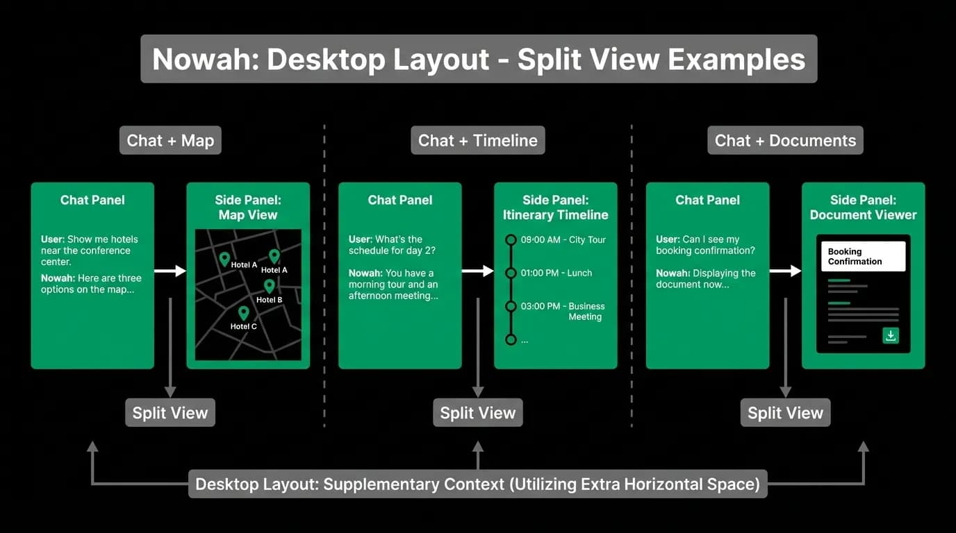
Desktop enables split-view patterns that are simply impossible on mobile. The most valuable is chat plus itinerary: the conversation occupies the left portion of the screen while a visual itinerary timeline occupies the right. As the user adds flights and hotels through conversation, the itinerary updates in real time.
Chat plus map is similarly powerful. The user says "find me hotels near the Eiffel Tower" and the map panel immediately shows the search area with results pinning in as the AI finds them. The conversation provides context and explanation. The map provides spatial understanding. Together they give the user a richer understanding than either could alone.
These split views are not available on mobile because the screen cannot accommodate both views at useful sizes simultaneously. On a phone, the map would be too small to be useful, or the chat would be too small to read. Desktop resolves this constraint by having enough space for both.
The conversation remains the anchor
Through all of these desktop adaptations, one principle holds: the conversation is the anchor. Side panels, wider cards, keyboard shortcuts, and split views are all extensions of the chat, not replacements for it. The user's primary interaction is still conversational. They still talk to the AI, receive recommendations, and make decisions through dialogue.
Desktop does not add a search form or a results grid or a filter sidebar. It does not revert to traditional patterns just because the screen is bigger. It stays conversational and uses the extra space to make the conversation richer, not to bypass it.
This is the key design insight for adapting chat interfaces across form factors. The interaction model does not change. The information density does. Design a responsive chat layout that preserves the conversation at every breakpoint and uses additional space to enhance context, not to introduce competing paradigms.
Nowah is an AI travel agent that searches and books real flights and hotels through conversation — no filters, no thirty open tabs. Plan your next trip.