Designing Color for Dark Interfaces
Accent colors behave differently on dark backgrounds — luminance shifts, neon fatigue sets in faster, and semantic meaning must carry through reduced palette choices.
A color that looks balanced on a white background becomes electric on black. The same green that read as "calm and trustworthy" on a light interface screams "neon sign" on a dark one. Luminance perception shifts fundamentally when you invert the background, and every accent color in your palette needs to be re-evaluated.
Designing color for dark interfaces is not applying your light-mode palette to a dark background. It is building a new color system from scratch, with different saturation rules, different semantic weight, and different fatigue thresholds.
The neon trap
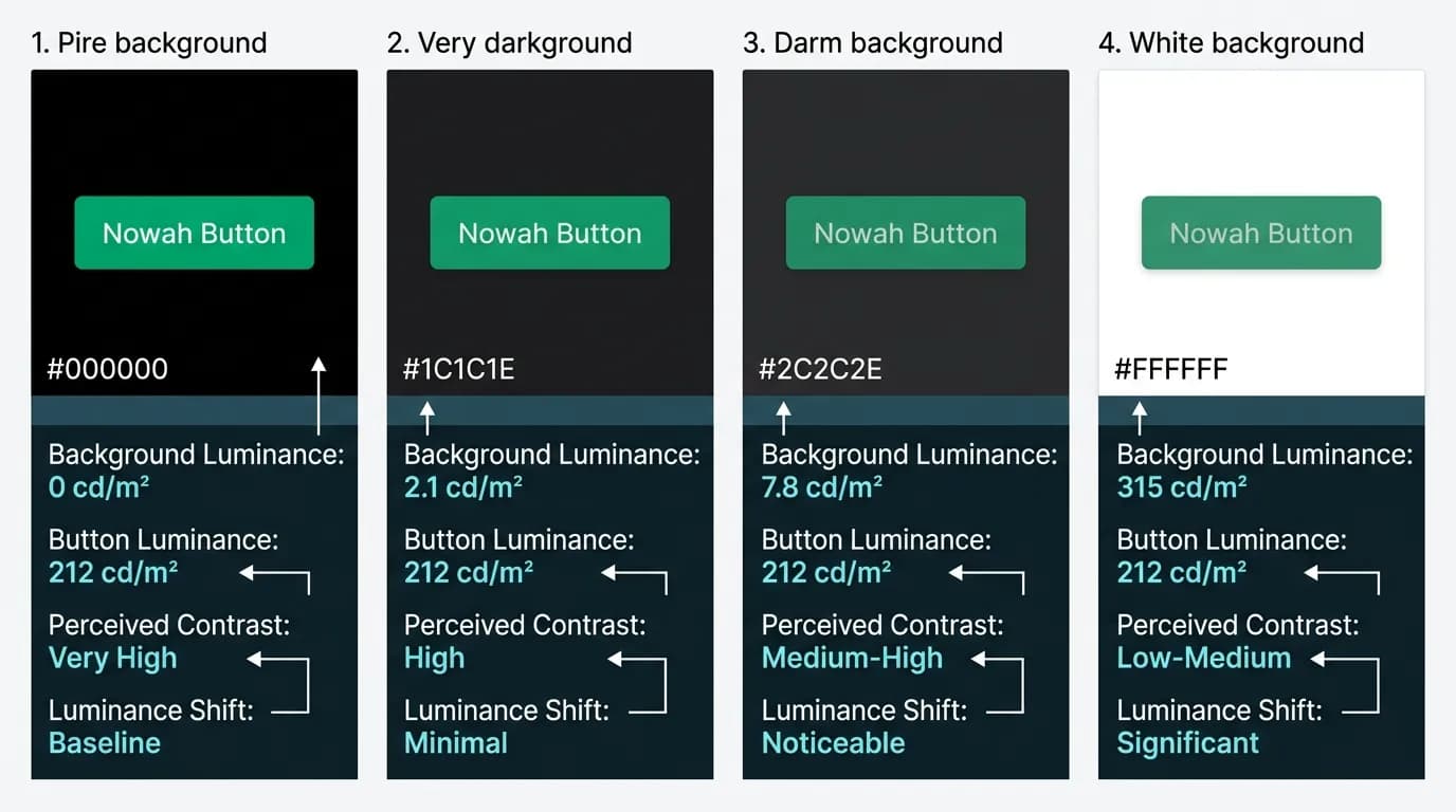
Highly saturated colors on dark backgrounds create a visual phenomenon designers call the neon effect. The color appears to glow, radiating light into the surrounding dark space. At small doses — a button, a price highlight — this is useful. At large doses — colored headers, tinted backgrounds, multiple accent elements — it is exhausting.
The neon trap catches teams that reuse their light-mode accent color without adjustment. A blue that read as "professional" on white reads as "electric" on black. A red that communicated "danger" on white communicates "alarm" on black. The semantic meaning shifts because the perceived intensity shifts.
The antidote is selective desaturation. Colors used at large scales (background tints, section headers, large icons) need lower saturation on dark backgrounds than on light ones. Colors used at small scales (buttons, indicators, price text) can maintain or even increase saturation because the small surface area prevents fatigue.
Nowah Green: choosing a primary that works everywhere
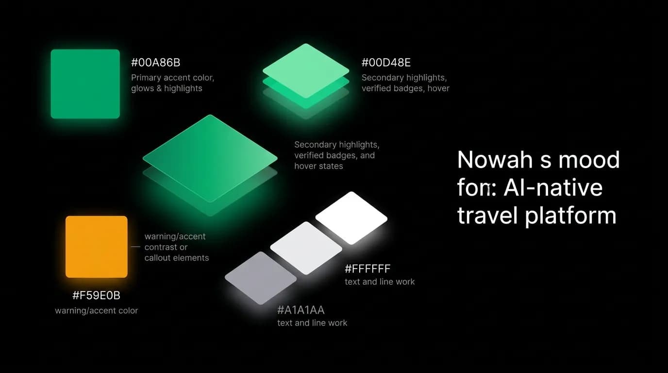
Our primary accent is #00A86B — a medium-saturation green that reads as confident and trustworthy. We chose this specific shade because it maintains its character across all usage contexts in our dark interface.
On the primary action button ("Book," "Confirm," "Send"), the green reads as a clear call-to-action against the black background. The button is bright enough to draw attention without feeling harsh. On price text, the green highlights financial information against white body text. The user's eye goes to green numbers automatically because the color breaks the monotone text hierarchy. On the microphone button during voice recording, the green pulses with the audio waveform, creating a clear visual signal that the app is listening.
The color holds up at every scale. As a large button fill, it is vivid without being neon. As small price text, it is distinct without being distracting. As an icon accent, it is recognizable without dominating.
We tested several greens before settling on #00A86B. Higher saturation greens (#00FF7F, for instance) looked great on a single button but became fatiguing when multiple green elements appeared on screen simultaneously — a flight card with a green price, a green select button, and a green "Cheapest" badge. The moderate saturation of #00A86B keeps its identity without overwhelming when multiplied.
Semantic color on dark
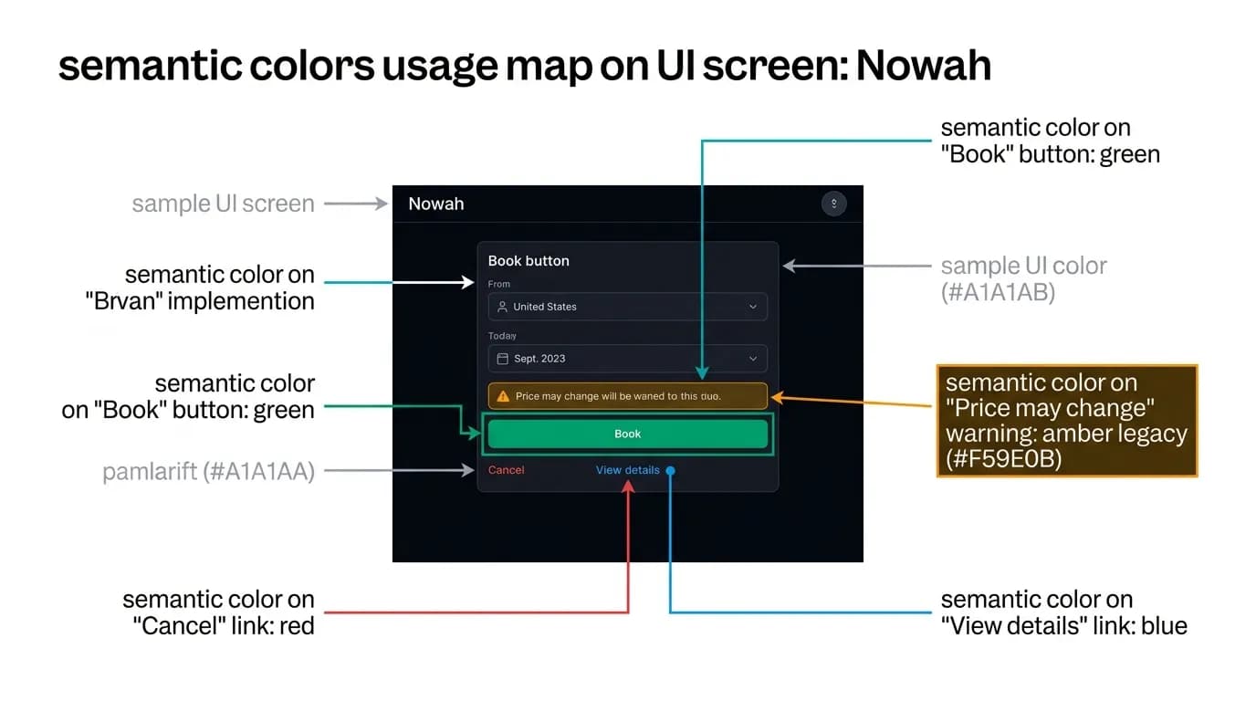
Color carries meaning. Red means error, danger, or destructive action. Amber means warning or pending state. Blue means informational link or action. Green means success, affirmation, or primary action. These semantic mappings must survive the transition to a dark background.
Our semantic palette: #FF3B30 for errors, cancellations, and destructive actions. #FFD60A for warnings and pending states. #007AFF for links and informational states. #00A86B for success, confirmations, and primary actions.
Each color was chosen for sufficient contrast against both the black background and the dark gray card surfaces. #FF3B30 on #000000 provides a 4.6:1 contrast ratio — adequate for large text and icons, though we pair it with text labels to ensure accessibility. #FFD60A at 12.9:1 contrast is highly visible for warning indicators. #007AFF at 4.2:1 is used primarily for interactive text where the underline styling provides additional signaling beyond color alone.
The key principle: on a dark interface with limited visual elements, each color carries more weight than it would on a busy light interface. Use fewer colors, use them consistently, and make sure every color instance carries the same semantic meaning.
Supporting grays
The gray scale does most of the work in a dark interface. Between pure white (#FFFFFF) and pure black (#000000), our grays create the visual hierarchy that organizes information.
#8E8E93 is our secondary text color — timestamps, labels, captions, and supporting information. It is clearly subordinate to white text but readable against both black backgrounds and dark gray card surfaces.
#636366 is our border and divider color. Lines at this shade provide structure without visual noise. They separate sections and cards with enough contrast to be visible but not enough to dominate.
#48484A is our disabled state color. Disabled buttons, unavailable options, and inactive elements use this shade to communicate "present but not actionable" without disappearing entirely.
This three-gray system provides enough levels of hierarchy for most interface needs. Adding more grays creates subtlety that is difficult to distinguish on screens in variable lighting conditions — the very conditions where our travel app is used.
Avoiding neon fatigue
Neon fatigue sets in when the eye is exposed to high-contrast, high-saturation color on dark backgrounds for extended periods. It manifests as discomfort, reduced reading speed, and eventually the user dimming their screen or closing the app.
We combat neon fatigue through restraint. The green accent appears on primary buttons, active indicators, and price text — high-impact, small-surface-area elements. It does not appear on backgrounds, headers, or large text blocks. The majority of the interface is white text on black background with gray hierarchy. Color is an accent, not a theme.
When multiple colored elements appear together — a flight card with a green price, an amber "1 stop" indicator, and a green "Select" button — the total colored surface area is still a small fraction of the card. The eye registers the color information and returns to the neutral text for details.
This restraint is itself a design decision. A more colorful interface might feel more "alive" in screenshots, but screenshots are not the usage context. The usage context is a 53-minute session at 11 PM, and at 11 PM, restraint is kindness.
Nowah is an AI travel agent that searches and books real flights and hotels through conversation — no filters, no thirty open tabs. Plan your next trip.