How We Designed the Chat-First Booking Flow
From casual conversation to confirmed booking in five steps — every transition is designed to maintain trust, spatial continuity, and conversational momentum.
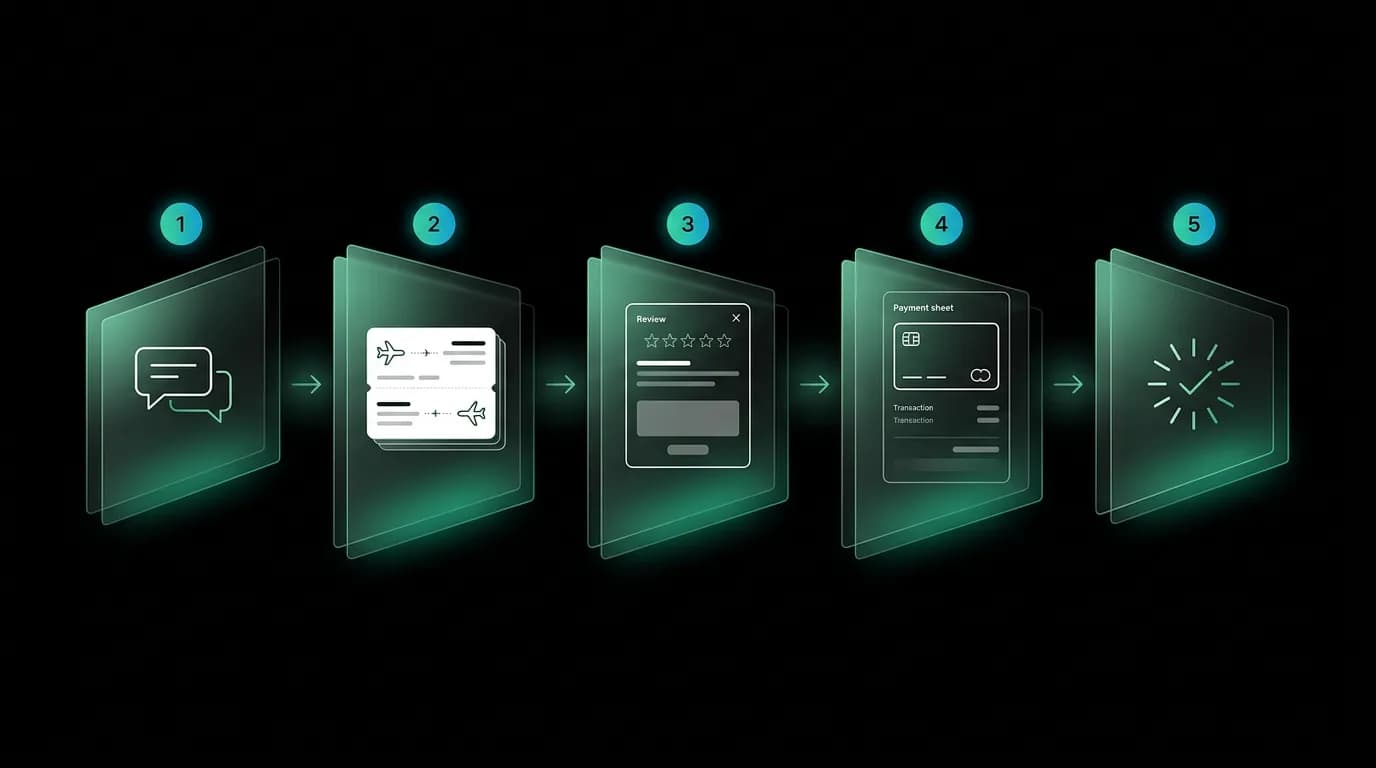
There is a precise moment in every travel booking conversation when the energy shifts. The user stops exploring and starts committing. They go from "show me options" to "I want that one." The conversation transitions from discovery to transaction.
In a traditional booking interface, this transition is handled by navigation. You click through to a details page, then to a passenger form, then to a payment page. Each click is a new URL, a new layout, a new mental model. The conversational context — why you chose this flight, what the AI said about it, the comparison you just made — disappears behind a page load.
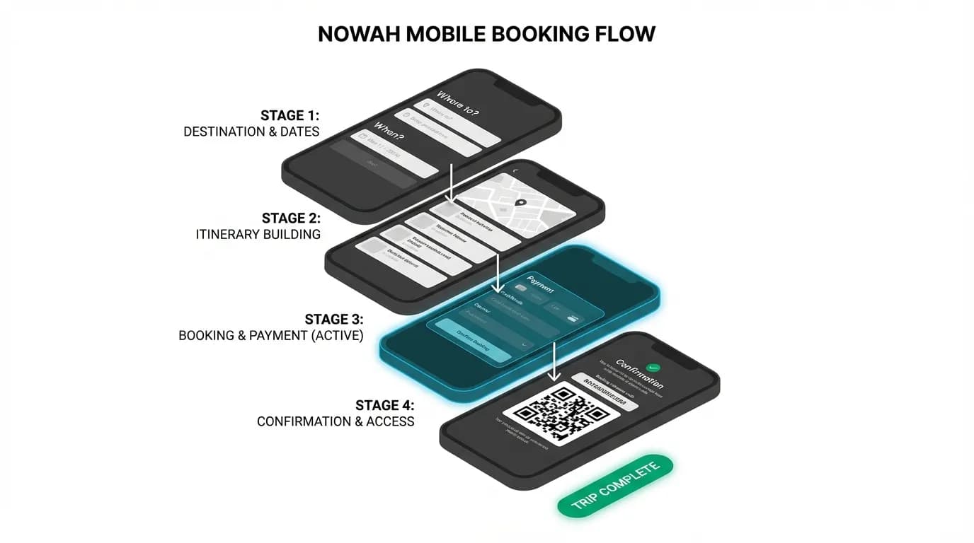
We designed the booking flow to keep the conversation alive throughout the entire transaction. Five stages, zero page navigations, and every transition animated to maintain spatial continuity.
Stage 1: Conversation — the AI narrows options naturally
The booking flow does not start with a form or a search. It starts with a conversation. The user describes what they want, the AI asks clarifying questions, and through iterative dialogue, the options narrow from the entire universe of flights and hotels to a curated set of three.
This stage matters for the booking flow because it establishes context. By the time options appear, the user has already communicated their preferences, budget, schedule constraints, and any special requirements. The AI has already demonstrated competence by asking the right follow-up questions. Trust has been building through conversation before a single dollar amount appears.
The average online travel agency requires 6 to 9 steps from search to confirmation. We target four. The conversation replaces the first 3 to 5 steps of a traditional funnel — destination selection, date picking, filtering, sorting, comparing — with a dialogue that feels like planning with a knowledgeable friend.
Stage 2: Card selection — tap to expand, not navigate away
When the AI presents options, they appear as cards within the chat — flight cards or hotel cards in a horizontal carousel. Each card shows the essential decision-making information: airline, times, duration, stops, and price for flights; property name, image, rate, amenities, and location for hotels.
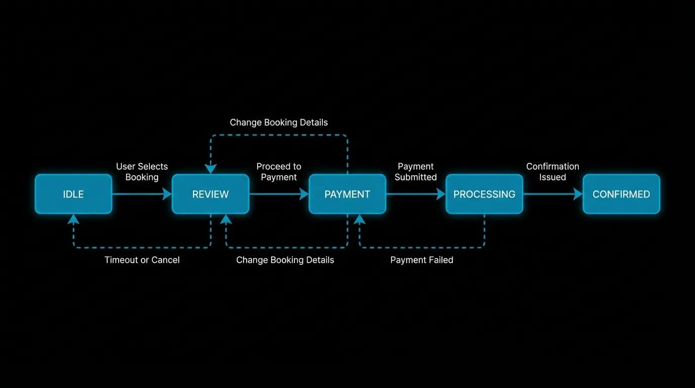
The user taps "Select" on the card they prefer. This is the commitment gesture — the moment browsing becomes buying intent. But critically, tapping "Select" does not navigate away from the chat. The card expands into a review modal that slides up from the card's position on screen.
This spatial continuity matters. The user can still see the chat behind the modal (dimmed but visible). They have not left the conversation. They can dismiss the modal and go back to the options or ask the AI another question. The transition feels like zooming in, not jumping to a different place.
The animation is a 200-millisecond slide up with a spring curve. Fast enough to feel responsive, slow enough to be perceived as a spatial movement rather than a sudden appearance. The spring curve adds a subtle organic feel — like a card being lifted rather than a screen being replaced.
Stage 3: Review modal — full details without leaving chat
The review modal is the most information-dense screen in the entire booking flow. It contains everything the user needs to verify before spending money: full fare details, the cancellation policy with specific refund amounts, a traveler information form, a total price breakdown with taxes and fees, and any booking restrictions.
This is the largest single component in the application by a significant margin, reflecting the genuine complexity of what needs to be communicated at this stage. We resisted the urge to simplify by hiding information. Instead, we organize it with clear visual hierarchy — critical information like price and cancellation terms is immediately visible, while supplementary details like fare class codes and baggage rules are available without scrolling far.
The traveler form within the review modal uses progressive disclosure. If the AI already has the user's passport details and contact information from a previous booking, those fields are pre-filled with a "From your profile" badge. The user only needs to verify, not re-enter. For new users, the form shows four to six fields at a time rather than dumping twenty fields on one screen.
The review modal also includes a clear "Back" action that slides the modal down and returns to the card carousel. This bidirectional transition reinforces the spatial model: the modal came from the card, and it returns to the card. No page loads, no navigation stack confusion.
Stage 4: Payment — why native presentation wins
When the user confirms the review and taps "Pay," a payment sheet slides up from the bottom of the screen. This sheet uses the platform's native payment presentation rather than a custom form.
The reasoning is straightforward: payment is where trust cannot be custom. Users have seen and used native payment sheets hundreds of times. They recognize the interface. They know their saved cards will appear. They see familiar brand marks. A custom payment form, no matter how well designed, introduces visual unfamiliarity at the exact moment the user needs maximum confidence.
The native sheet handles card tokenization, biometric authentication, and digital wallet integration without any card data touching the application server. This is not just a design decision — it is a security architecture decision that users benefit from even if they do not consciously know it.
After payment is authorized, the sheet dismisses with a slide-down animation. The chat is still visible behind the now-dismissing review modal. The spatial stack unwinds: payment sheet down, review modal down, back to the chat — but now with a processing indicator.
Stage 5: Processing and confirmation — animation as emotional design
The moment between tapping "Pay" and seeing "Confirmed" is the most emotionally charged in the entire app. The user has just spent several hundred dollars. The transaction is in flight. Uncertainty peaks.
We fill this moment with a processing sequence that communicates progress and builds anticipation. Three animated checkmarks appear in sequence: "Validating details" (check), "Securing booking" (check), "Confirmed!" (burst animation). Each step takes one to two seconds, which is both the actual processing time and a deliberate pacing choice.
The final confirmation uses a burst animation — a radial expansion of the green checkmark with particle effects — paired with haptic feedback on mobile. The haptic is a single firm tap that lands at the exact moment the burst animation peaks. This multimodal feedback — visual plus physical — creates an unmistakable "it worked" signal.
The confirmation screen shows the booking reference number, a summary of what was booked, and three clear next-step actions: "View your trip," "Share with your travel partner," and "Add to calendar." These actions acknowledge that booking is not the end of the journey — it is the beginning.
Mapping this flow to your own product
The five-stage pattern — conversation, card selection, review, payment, confirmation — is not specific to travel. It applies to any chat-first product where the conversation leads to a transaction.
The key design principles are consistent across applications. Keep the conversation visible throughout the transaction to maintain context. Use spatial animations (slides, expansions) rather than page navigations to preserve continuity. Front-load trust signals (reasoning, policies, review steps) so the payment moment feels earned rather than rushed. Use native platform components for payment to borrow existing trust. And design the confirmation as a moment of delight, not just a receipt.
Chat-first booking interfaces show four to eight times improvement in engaged user conversion compared to traditional form-based funnels. The improvement comes not from better copy or smoother animations — though both help — but from a fundamentally different relationship between the user and the interface. The user is not filling out forms and clicking through pages. They are having a conversation that naturally leads to a decision, supported by interface elements that appear exactly when needed and disappear when they are not.
The booking flow is the moment of truth for any transactional AI product. Design it as a conversation that earns trust at every stage, and the conversion will follow.
Nowah is an AI travel agent that searches and books real flights and hotels through conversation — no filters, no thirty open tabs. Plan your next trip.