Why Nowah Is Pure Black
True black is not a style choice — it is a product decision rooted in OLED physics, nighttime travel research, and the premium positioning a travel AI demands.
It is 11:47 PM. You are in bed, phone propped on the pillow, researching flights for a trip you have been thinking about for weeks. The screen glows. Your partner rolls over and squints. You dim the brightness, but the white background still bleeds light into the room like a flashlight under a blanket.
This is when most travel planning happens. Not at a desk during business hours. Not in a well-lit office. Sixty-two percent of travel bookings occur outside business hours, according to Phocuswright research from 2024. People plan trips at night, on planes, in dim hotel rooms, during commutes in dark train cars. The travel industry designed its apps for fluorescent-lit offices and then wondered why engagement dropped after sundown.
We chose pure black as a product decision, not a style preference. Here is why.
OLED pixel physics and what #000000 actually does to a screen
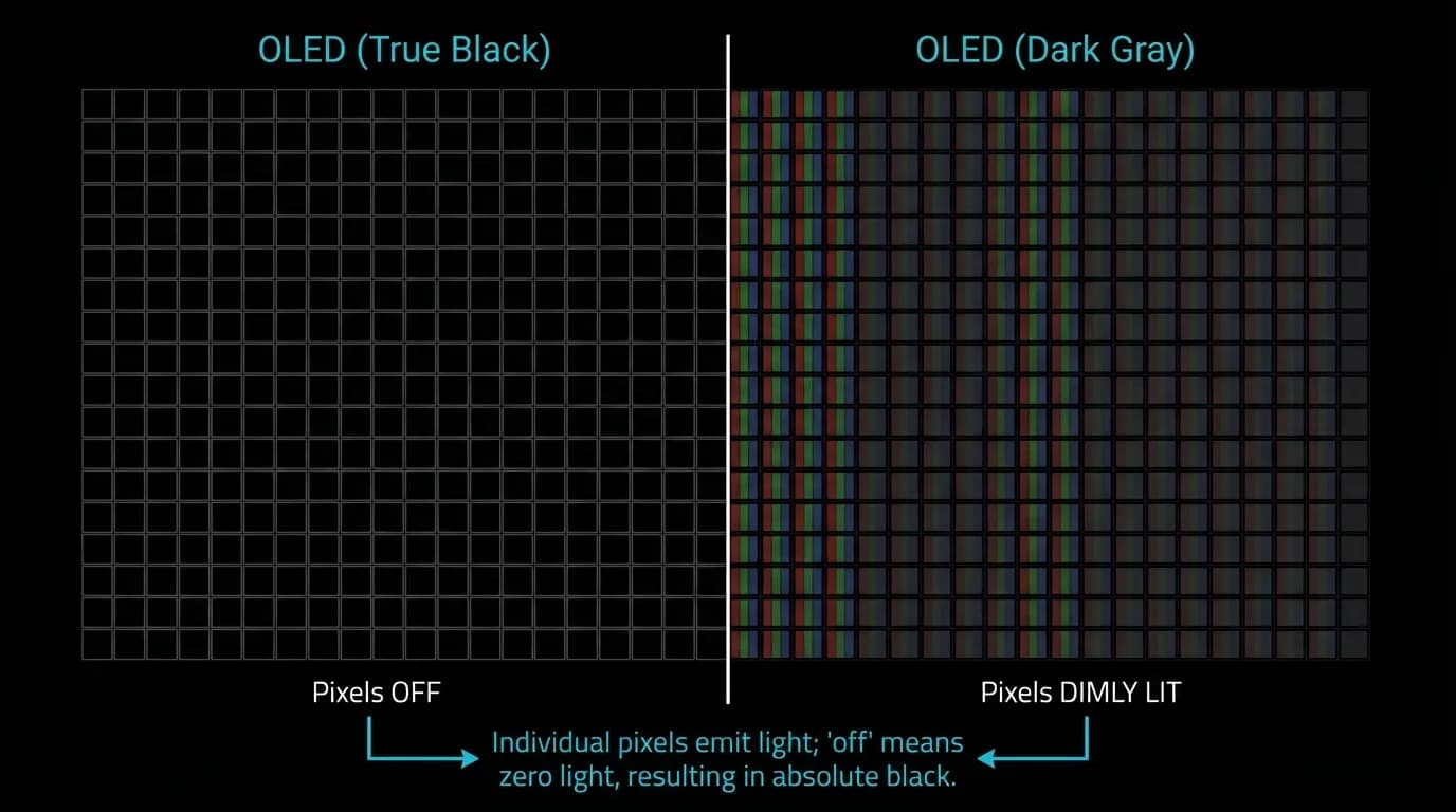
Modern smartphones overwhelmingly use OLED displays. Unlike LCD screens that use a backlight behind every pixel, OLED screens light each pixel individually. When a pixel displays true black — hex value #000000 — the pixel turns off completely. It draws zero power. It emits zero light.
This is not a subtle distinction. A dark gray pixel at #1C1C1E still fires. It draws roughly 40% of the power of a fully white pixel. Multiply that across millions of pixels on a screen, and the difference between true black and dark gray becomes measurable in both battery life and light emission.
For a travel app, this matters more than it does for most software. The average travel planning session runs 53 minutes. That is nearly an hour of screen time per session. On a true black interface, every pixel that is not showing content is turned off, saving meaningful battery. When you are in an airport at 14% battery with no charger in sight, those saved milliwatts matter.
Contrast ratios at 21:1 — the measurable advantage
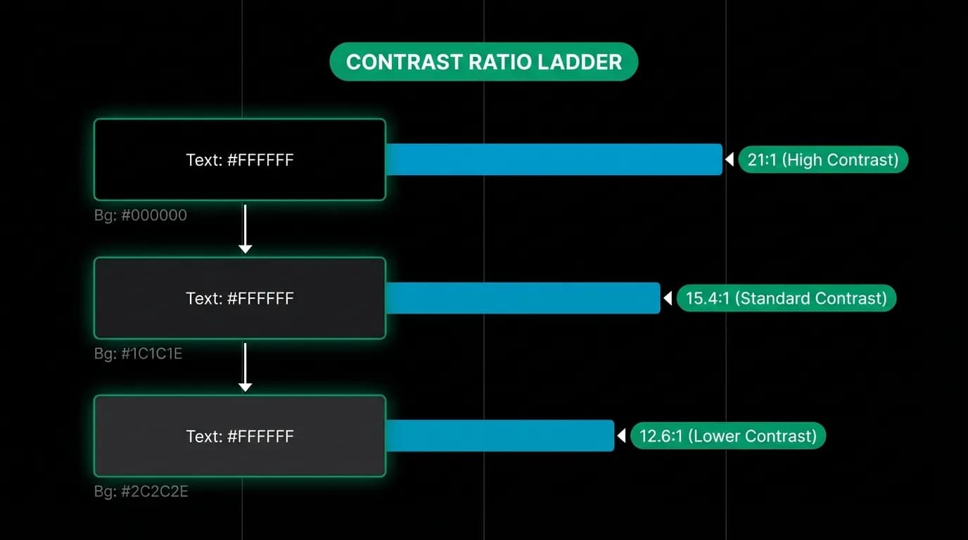
White text on pure black achieves a 21:1 contrast ratio. That is the theoretical maximum under WCAG guidelines. White text on dark gray (#1C1C1E) drops to 15.4:1. White on a slightly lighter gray (#2C2C2E) falls to 12.6:1.
All three exceed WCAG AAA requirements for normal text, which asks for 7:1. So why does the difference matter?
Because travel interfaces are information-dense. A flight card shows departure time, arrival time, duration, number of stops, price, and airline — all in roughly 180 pixels of vertical space. When a user is glancing at this card in a dim airplane cabin or under harsh airport fluorescents with tired eyes, every point of contrast ratio helps. The 21:1 ceiling gives us the maximum room to build a typographic hierarchy using opacity. Primary text at full white. Secondary text at 60% opacity. Tertiary at 38%. Each level remains readable because the baseline contrast is as high as physics allows.
Premium positioning through restraint
There is a reason luxury brands gravitate toward black. It communicates restraint. It lets the content — the product, the imagery, the information — take center stage. Black is the absence of distraction.
In a travel app, the content is the trip. Flight cards, hotel photos, destination imagery, booking confirmations. On a pure black background, these elements float. They command attention because they are the only source of light on the screen. A hotel hero image on black looks like a photograph in a gallery. The same image on a white background looks like a thumbnail in a spreadsheet.
This positioning matters because travel is aspirational. People are not just buying flights and hotel rooms. They are buying the idea of being somewhere else, doing something different. The interface should respect that aspiration, not diminish it with visual noise.
Battery life as a travel feature
We keep coming back to battery because it is genuinely a travel feature that designers undervalue. Consider the contexts where people use a travel app:
- Waiting at a gate with no available outlet
- On a long-haul flight in airplane mode
- Navigating a foreign city with maps, translation, and travel info competing for battery
- At a hotel with a dead adapter that does not fit the local outlets
Eighty-two percent of users prefer dark mode when it is available, according to Android Authority data from 2024. And apps with dark mode average 0.3 stars higher in app store ratings, per AppFollow analysis. Users may not consciously think "this app saves my battery," but they feel the difference during long sessions.
A true black interface on an OLED screen is not just dark mode. It is the most battery-efficient state a screen can be in while still displaying content. For a travel app that competes for screen time against maps, messaging, and camera apps during a trip, that efficiency is a competitive advantage.
Design constraint as creative accelerator
Committing to a single background color sounds limiting. In practice, it accelerated our design process.
When you have one background, every element needs to earn its place. There is no hiding behind subtle background tints or gradient fills. A card either has enough contrast to float on black or it does not. A button either reads clearly at arm's length or it fails. The constraint forces clarity.
It also simplified our component library. We do not maintain separate light and dark variants. Every component is designed for one context. This cuts design and engineering time, reduces visual inconsistency, and means what we ship is exactly what we tested.
The creative acceleration comes from the focus. Instead of debating whether a screen should be light or dark, we invest that energy in typography, spacing, motion, and information hierarchy. The background is settled. Everything else gets more attention.
Implementing dark-only in practice
Our approach is straightforward. The background token is #000000. Surface elements — cards, modals, input fields — use #1C1C1E. Elevated elements like popovers and dropdown menus use #2C2C2E. This three-level system creates depth without shadows, which largely disappear on dark backgrounds anyway.
The theme is forced to dark on both mobile and web. There is no light mode toggle. This is an intentional product decision, not a missing feature. Every pixel of the interface is designed, tested, and optimized for one mode. The result is a cohesive experience that looks and feels considered, because it was designed for exactly one canvas.
When you build for one mode, you build it right. When you build for two modes, you build two things half as well.
The midnight booking session nobody designs for
Back to that 11:47 PM moment. On Nowah, the screen is dark. The only light comes from the text you are reading and the flight cards you are evaluating. Your partner does not stir. Your eyes do not strain. The app feels like it was designed for exactly this moment — because it was.
Pure black is not a trend. It is not a preference. It is the correct engineering decision for a product used by travelers in low-light environments for extended sessions on OLED devices. The data supports it. The physics supports it. The user behavior supports it. And once you commit to it, every other design decision gets sharper.
The best interface is the one you forget you are looking at. On pure black, the interface disappears. Only the trip remains.
Nowah is an AI travel agent that searches and books real flights and hotels through conversation — no filters, no thirty open tabs. Plan your next trip.