Designing Trust When AI Books Your Flights
When an AI agent handles your $500 flight purchase, trust is not assumed — it is designed through transparency, reasoning, reversibility, and incremental commitment.
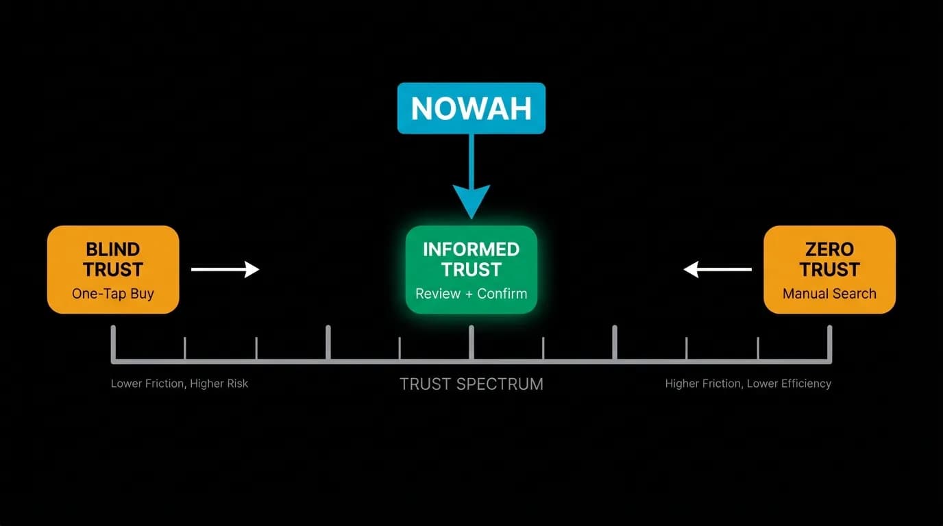
You would not hand $500 to a stranger on the street and ask them to buy you a plane ticket. You would want to know who they are, why they chose that flight, what happens if something goes wrong, and whether you can get your money back. You would want to verify the details before the money left your hands.
An AI travel agent faces the same trust deficit, except it is worse in some ways. At least the stranger on the street has a face. An AI is a text bubble on a screen. It has no body language, no reputation you can check, no history of recommendations from friends. Trust must be entirely designed into the interface.
At Nowah, trust is not a feature we added. It is the architecture of the booking flow. Every screen, every card, every transition is evaluated against a simple question: does this make the user more or less confident in spending money?
Transparency of reasoning
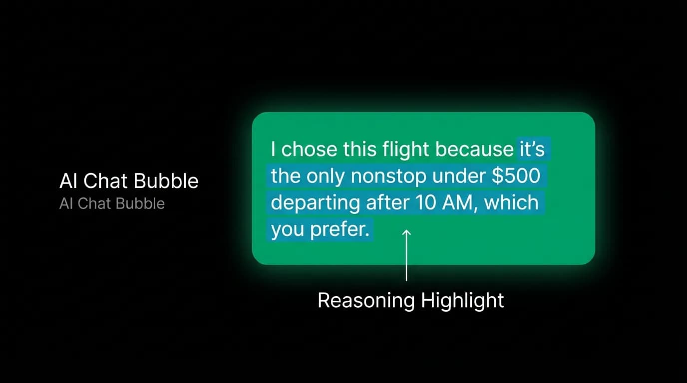
The most powerful trust signal in AI-assisted booking is explaining why. Not just presenting three flight options, but telling the user the logic behind the selection.
"I chose this flight because it is the only nonstop option under $500 that departs after 10 AM, which you prefer based on your travel history."
That single sentence does several things simultaneously. It demonstrates that the AI understood the user's constraints (budget, nonstop, departure time). It reveals the filtering criteria so the user can evaluate whether the logic makes sense. It references personalization ("which you prefer") in a way that feels like service, not surveillance.
Users who see reasoning behind AI recommendations are 2.3 times more likely to select the first option presented. This is not because they blindly trust the explanation. It is because the explanation gives them enough information to evaluate the recommendation without doing the research themselves. The AI shows its work, and the user can quickly verify whether the work makes sense.
We apply this pattern consistently. Every set of flight or hotel options comes with a brief explanation of why these specific results were selected. The explanation is not buried in fine print. It appears in the AI's message text, immediately above the option cards, in natural language.
Source attribution and freshness
Travel prices change constantly. A flight that costs $450 now might cost $480 in an hour. Users know this, and it creates anxiety. "Is this price still available? When was this last checked? Will it change while I am looking at it?"
We address this with explicit freshness indicators. Each set of results includes a timestamp: "Prices as of 2 minutes ago." This is a small line of secondary text, but it communicates two critical things. First, these are real, current prices from live inventory — not cached results from yesterday. Second, there is an implied window of relevance. Two minutes ago is fresh. Two hours ago would raise questions.
The freshness indicator pairs with a refresh mechanism. If a user returns to a set of options after a conversation tangent, the AI offers to re-check prices rather than presenting potentially stale data. This costs a few seconds of search time but preserves trust.
The review step that no one should skip
Between selecting an option and paying for it, there is a mandatory review step. This is not a summary page that users reflexively click through. It is a full-detail expansion that surfaces everything the user needs to confirm before spending money.
The review modal shows the complete fare rules, the cancellation policy (with specific refund amounts and timelines), all traveler information that will be submitted, the total price with a breakdown of base fare, taxes, and fees, and any restrictions that apply.
This is deliberately comprehensive. In traditional booking flows, fare rules and cancellation policies are buried behind expandable sections that most users never open. We bring them to the foreground because hidden policies erode trust retroactively. A user who discovers a non-refundable policy after booking feels deceived. A user who sees the same policy before booking feels informed.
The review modal slides up from the card's position in the chat, maintaining spatial continuity. The user can see the chat conversation behind the modal, which preserves context and provides a visual reminder that this is part of a conversation, not a sudden jump to a different part of the app.
Reversibility as a design principle
The cancellation policy is shown before the book button, not after. This is a deliberate inversion of the pattern used by many booking platforms, where cancellation terms are technically available but practically hidden until after purchase.
We show cancellation information prominently because reversibility is a trust signal. When a user sees "Free cancellation within 24 hours" displayed clearly before they commit, they feel safer committing. The option to undo reduces the stakes of the decision, which paradoxically increases the likelihood of making the decision in the first place.
For non-refundable bookings, we are equally transparent. "This fare is non-refundable. If you cancel, you may receive airline credit but not a cash refund." The wording is specific, not vague. Users do not encounter "cancellation fees may apply" — they see the actual consequence.
The trust paradox: AI that admits uncertainty wins
There is a counterintuitive dynamic in AI trust. An AI that presents every recommendation with absolute confidence actually generates less trust than one that occasionally expresses uncertainty.
"These are the three best options I found for your dates. I should mention that prices on this route tend to fluctuate a lot — if you are flexible on dates, I could check adjacent days to see if there is a better deal."
That message communicates competence (I found good options), honesty (prices fluctuate), and helpfulness (I can do more research if you want). The admission that prices fluctuate is technically a caveat, but it reads as expertise. A human travel agent would say the same thing.
We design our AI responses to include appropriate uncertainty. Not on every message — that would undermine confidence. But at moments where the user is making a significant financial decision, acknowledging the complexity of the situation builds more trust than pretending everything is straightforward.
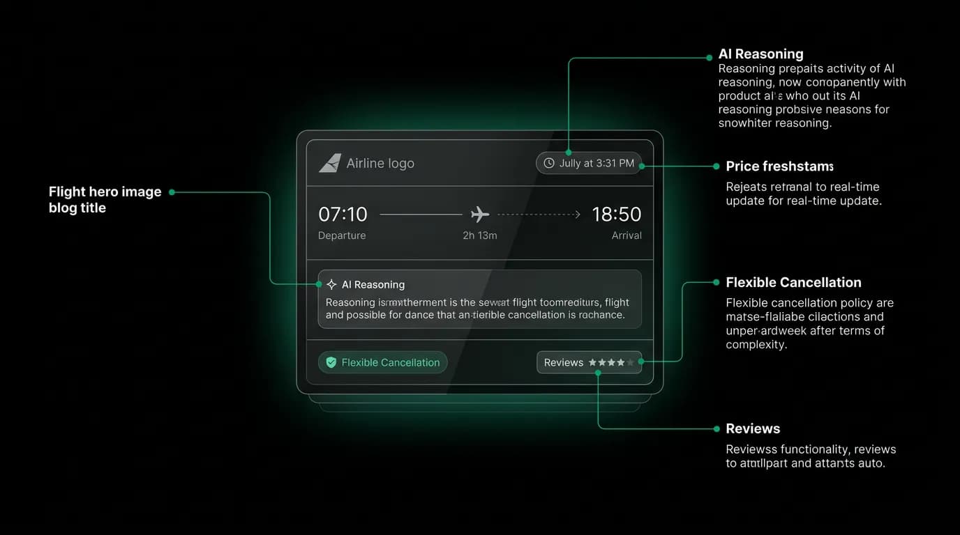
Annotating a flight card with every trust signal
A single flight card is a dense trust exercise. In roughly 180 pixels of height, it needs to communicate enough information for a user to feel confident tapping "Select."
The airline name and logo provide brand trust. Users have existing relationships with airlines, and seeing a familiar logo anchors the option in reality. The departure and arrival times with timezone labels prevent confusion on routes that cross time zones. The duration and number of stops set expectations for the travel experience. The price, highlighted in green, is the primary decision factor for most users and is positioned for maximum visibility.
Below the card, the AI's reasoning text connects the data points to the user's preferences. Above the card, the freshness timestamp confirms the data is current. The "Select" button is large enough to tap easily (44 by 44 points minimum), positioned in the thumb-friendly zone, and colored to indicate it is the primary action.
After selection, the review modal surfaces everything the card could not fit: fare class details, baggage allowance, seat selection availability, cancellation terms, and the full price breakdown. The card earns interest. The review modal earns commitment. The payment sheet earns the money.
Trust is not a feature — it is the flow
You cannot add trust to a booking flow the way you add a button to a screen. Trust is the cumulative effect of every decision in the flow working together. Transparent reasoning leads to confident selection. Honest pricing leads to comfortable review. Clear cancellation policies lead to willing payment. A celebration animation on confirmation leads to satisfied sharing.
Skip any step and the chain breaks. Show options without reasoning and users doubt the curation. Hide cancellation policies and users fear the commitment. Skip the review step and users feel rushed. Present a flat confirmation screen and users wonder if the booking actually went through.
Our booking flow targets a 65% completion rate for users who enter the flow — dramatically higher than the industry standard of 3 to 5 percent for traditional travel booking funnels. The difference is not a better payment form or a smoother animation. It is trust, designed into every pixel of every screen the user sees between "I want to go to Tokyo" and "Your flight is confirmed."
Nowah is an AI travel agent that searches and books real flights and hotels through conversation — no filters, no thirty open tabs. Plan your next trip.