Pure Black vs. Dark Gray: Why the Difference Matters
The 28-unit difference between #000000 and #1C1C1E changes OLED pixel behavior, contrast ratios, depth perception, and the entire elevation strategy of your interface.
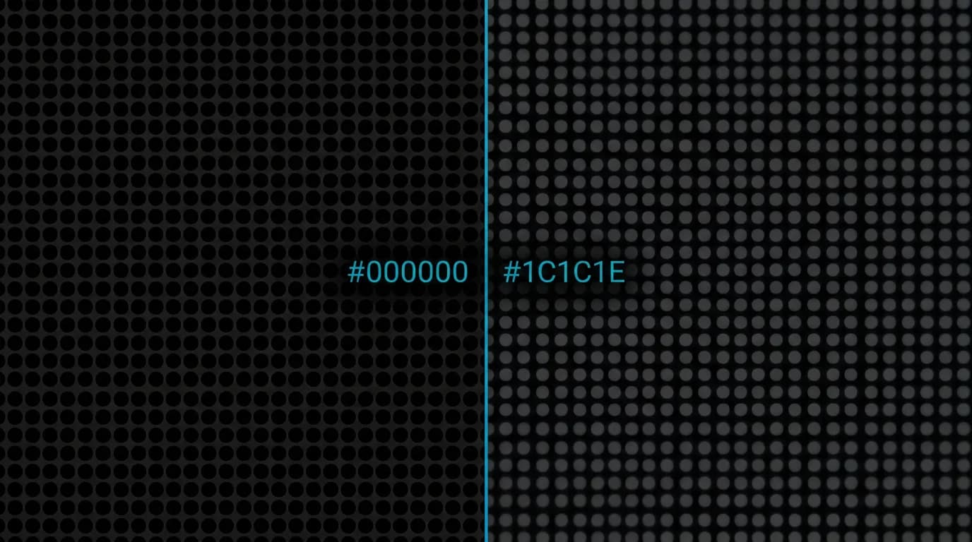
Twenty-eight units. That is the brightness difference between #000000 and #1C1C1E on the 0-255 luminance scale. It sounds negligible. It changes everything about how your interface looks, how it performs on modern screens, and how you create depth without shadows.
This is not a philosophical debate about dark mode aesthetics. It is an engineering discussion with measurable consequences for contrast ratios, power consumption, visual hierarchy, and the readability of your interface.
OLED physics: pixels off versus pixels dim
On an OLED screen, each pixel produces its own light. A pixel displaying #000000 is turned off. No light, no power draw. The pixel is physically dark — as dark as the screen can possibly be.
A pixel displaying #1C1C1E (28, 28, 30 in RGB) is on. Dimly, but on. It draws roughly 40 percent of the power of a fully white pixel. On a screen with millions of pixels, the aggregate power difference between pure black and dark gray backgrounds is meaningful — especially for a travel app where sessions average 53 minutes.
This is not theoretical. OLED screens constitute the vast majority of premium smartphones. When your background is #000000, every pixel not displaying content is drawing zero power. When your background is #1C1C1E, every one of those pixels is drawing 40 percent of maximum.
For a user at 14 percent battery in an airport, this matters. For a user on a 12-hour flight with no charging options, this matters. Battery life is a travel feature, and background color is a battery feature.
Contrast ratio math
White text (#FFFFFF) on pure black (#000000) achieves a 21:1 contrast ratio. This is the theoretical maximum — no darker background or brighter foreground exists in the sRGB color space.
White text on dark gray (#1C1C1E) drops to 15.4:1. Still excellent. Still well above WCAG AAA requirements of 7:1 for normal text. But the 5.6-point difference has practical implications.
That gap is your hierarchy budget. When you build a typographic hierarchy using opacity, you reduce white text from 100% to 80% to 60% to 38% for different levels of importance. On a 21:1 base, your 60% opacity text (approximately 12.6:1 contrast) is still AAA compliant. On a 15.4:1 base, 60% opacity text (approximately 9.2:1) is still readable but leaves less room for additional hierarchy levels.
Starting at the maximum gives you the most room to create nuanced text hierarchies without dropping below readability thresholds. Every point of contrast is budget for visual differentiation.
Depth perception on black
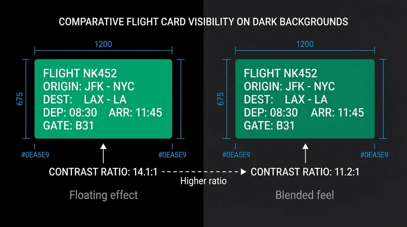
The human visual system perceives depth through luminance differences. Brighter elements appear closer. Darker elements appear farther away. On a pure black background, even a slightly lighter surface (like #1C1C1E for a card) creates a pronounced elevation effect. The card appears to float above the background.
On a dark gray background, the same card has less luminance contrast with the background. It sits more flatly. It does not float — it blends. This is neither good nor bad in isolation, but it fundamentally changes your elevation strategy.
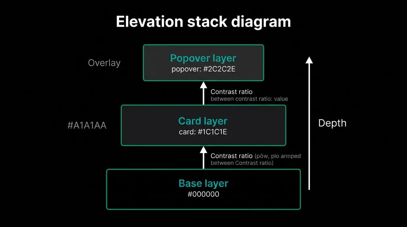
We use a three-level elevation system. Pure black (#000000) is the background — the deepest layer. Cards and surfaces use #1C1C1E — the middle layer, visibly elevated above the background. Popovers, dropdown menus, and modals use #2C2C2E — the top layer, elevated above surfaces.
Each step is a luminance increase that the eye reads as physical depth. Background to surface: 28 units. Surface to elevated: another 16 units. The total stack creates a clear spatial hierarchy where background is "behind," cards are "on," and modals are "above."
If the background were #1C1C1E instead of #000000, the first elevation step would need to be a higher luminance (say #2C2C2E) to create the same perceived depth. The entire scale shifts up, and the top layer needs to be brighter still. The cascade effect means less contrast between the highest elevation and white text, which eats into your typography budget.
The floating card effect
On a pure black background, a card with a #1C1C1E background and a subtle 1-pixel border at 10-15% white opacity appears to hover. The black background recedes so completely that the card seems detached from it, existing in its own plane. This is the "floating card" effect.
Flight cards, hotel cards, trip summaries — every card in our interface benefits from this effect. The cards demand attention not through visual noise (heavy borders, drop shadows, gradients) but through the simple physics of luminance contrast against a maximally dark background.
This effect is impossible to achieve with a dark gray background. When the background is already #1C1C1E, a card at the same color is invisible. The card needs a border or a distinctly different background to exist, which starts adding visual complexity that the pure-black approach avoids.
When dark gray wins
Pure black is not universally superior. There are specific situations where dark gray performs better.
Thin white text below approximately 14 pixels on OLED screens can exhibit halation — a glow effect where the bright text bleeds into the surrounding dark pixels. This is a physical artifact of OLED pixel behavior, not a rendering issue. On dark gray backgrounds, halation is reduced because the surrounding pixels are already emitting some light, softening the contrast boundary.
We handle this by avoiding extremely thin text on large areas of pure black. Body text uses regular weight (400), not light weight (300). Small labels use medium weight (500). The slight increase in font weight compensates for halation without sacrificing the benefits of the black background.
For large text and card interfaces, pure black is unambiguously superior. For body-text-heavy reading screens, the halation tradeoff is worth considering. We chose pure black for the overall interface and address halation through font weight rather than background color.
Choose your black with data
The choice between #000000 and #1C1C1E is not a preference. It is a design decision with measurable implications for power consumption, contrast ratios, elevation strategy, and readability. Measure the contrast ratios of your text hierarchy on both backgrounds. Test the elevation of your cards on both. Check the battery impact for your average session length. Look at your text at small sizes on OLED screens.
Then choose with data. Twenty-eight units of brightness is the difference between an interface that floats and one that sits flat. For a travel app used in the dark, on the go, and for long sessions, we chose the one that floats.
Nowah is an AI travel agent that searches and books real flights and hotels through conversation — no filters, no thirty open tabs. Plan your next trip.