Designing AI Products That People Want to Screenshot
Travel is shareable. Dark backgrounds pop in social feeds. Self-contained cards tell the story. Design for the screenshot and virality follows.
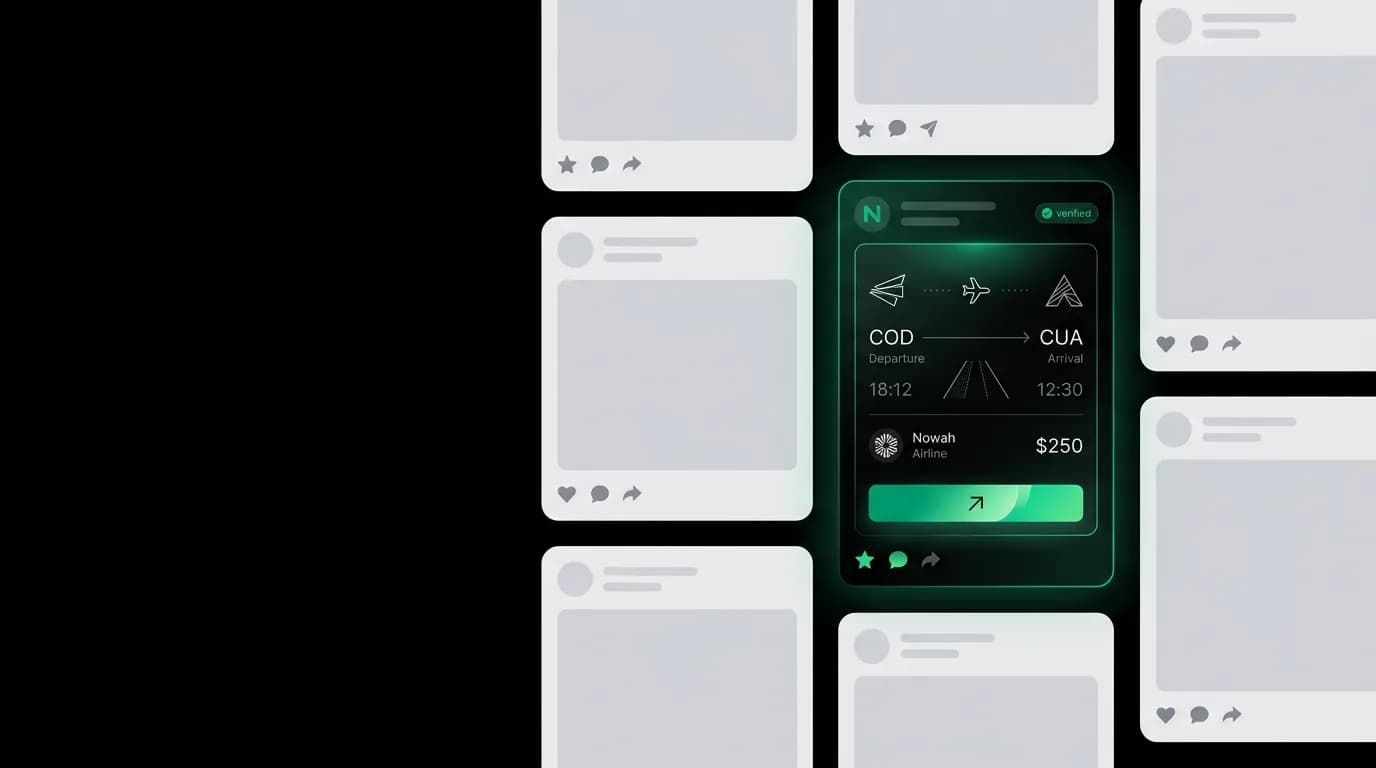
Nobody screenshots Expedia. Think about it. When was the last time someone took a screenshot of a search results page and sent it to a friend? The results page is functional. It is not shareable. There is nothing about a grid of flight listings with filter sidebars that makes someone think "my friends need to see this."
Now think about the screenshots people do share around travel. A stunning hotel room photo. A surprisingly cheap flight deal. A beautiful itinerary. A booking confirmation for a dream trip. These are moments of excitement, surprise, or pride. They are inherently social because travel is inherently social.
We designed Nowah with shareability in mind from the start. Not by adding share buttons (everyone has those, nobody uses them). By designing the interface so that screenshots look good, tell a complete story, and make people want to share them. Every shared screenshot is a product demonstration. Every shared booking card is an ad we did not pay for.
Travel is inherently shareable
Travel occupies a unique position in the shareability spectrum. People want to talk about their trips. They want recommendations. They give recommendations. "Where did you go?" and "Where should I go?" are among the most common social conversations.
This makes travel products naturally viral if the product gives users something worth sharing. The problem with traditional travel apps is that there is nothing to share. A booking confirmation email is a wall of text with a reference number. A search results page is a generic list. The visual language of traditional travel booking does not lend itself to screenshots.
AI travel agents change this dynamic. A conversation where the user says "find me a beach trip" and the AI responds with three curated hotel options in Bali is a compelling screenshot. It tells a story in one image: I asked for something, and this intelligent agent found it. The conversation format is naturally narrative. It has a beginning (the ask), a middle (the search), and an end (the options). That narrative structure is what makes screenshots shareable.
We see this organically. Users screenshot flight deals the AI finds and send them to group chats. They screenshot hotel cards and send them to their travel partners. They screenshot booking confirmations and post them on social media. Each screenshot shows two things: an exciting travel possibility and the product that found it.
Card design for screenshots
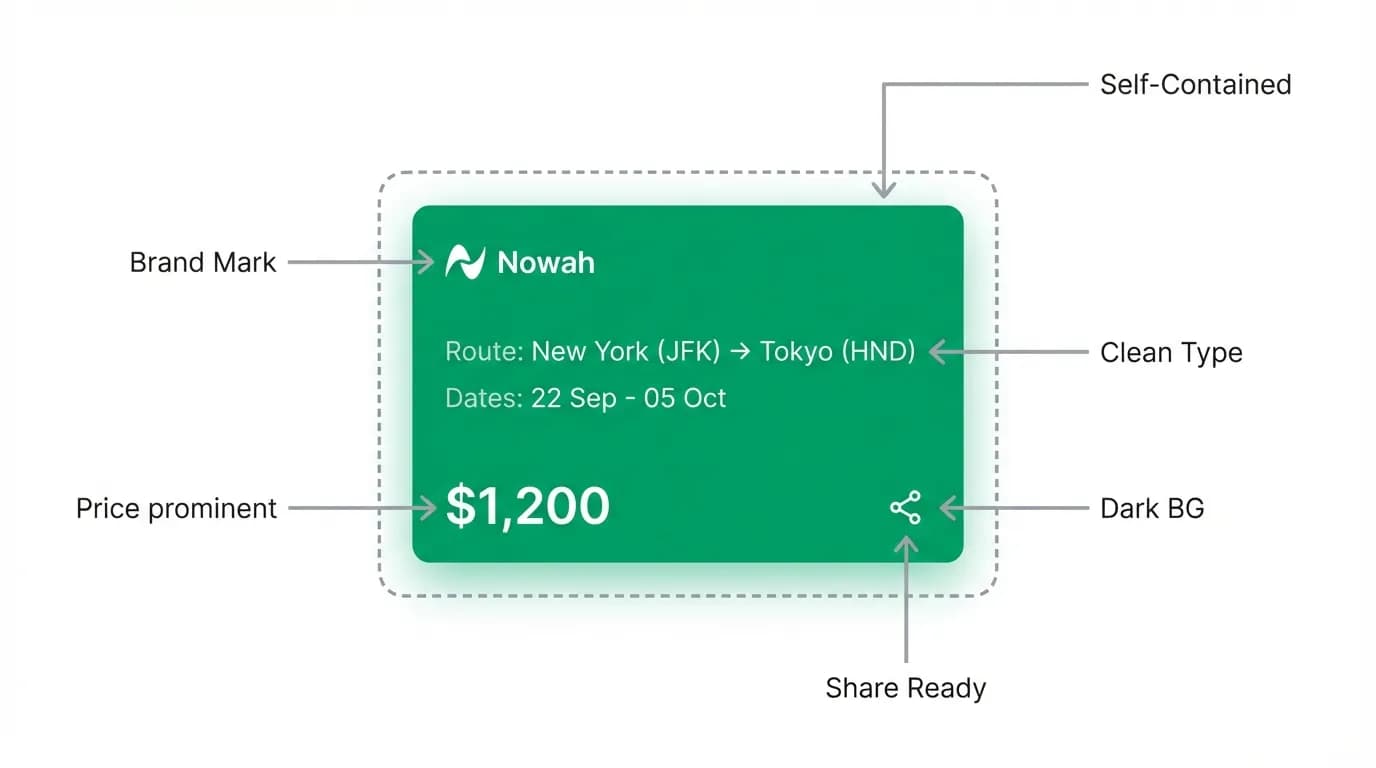
For a screenshot to work as a share, the card needs to be self-contained. The viewer should understand what they are looking at without context from the rest of the conversation.
Self-containment means the card includes all necessary information. A flight card screenshot should show: origin, destination, airline, times, price. A hotel card screenshot should show: hotel name, location, photo, price, rating. The viewer does not need to see the conversation above or below the card to understand the deal.
Clean typography is essential for screenshot readability. Small text on mobile screens becomes even smaller in a screenshot that might be viewed on a different device. We use generous type sizes for primary information (prices, destination names) so they remain readable when compressed or viewed in a social media feed.
The brand presence on cards is subtle but visible. The Nowah logo or name appears on every card, small enough to not be intrusive, large enough to be noticed in a screenshot. When someone sees a shared flight deal and thinks "how do I get deals like that?" the brand name is right there.
Consistent visual style makes screenshots recognizable over time. After seeing a few Nowah screenshots, users start recognizing the format: dark background, green accents, clean cards, conversational context. The visual consistency becomes a brand signal. "That is a Nowah screenshot" becomes a pattern that viewers learn.
We design cards at what we call "screenshot resolution." Before finalizing a card design, we take a screenshot on a phone, send it to ourselves on a different device, and evaluate whether it still looks good and reads clearly. If the text is too small, the layout is too dense, or the information hierarchy is unclear in the screenshot, we revise. The screenshot is a design deliverable, not an afterthought.
The dark theme advantage
Nowah's pure black background is a screenshot superpower that we did not fully appreciate until we saw it in practice.
Social media feeds are dominated by light content. Instagram posts, Twitter/X cards, Facebook shares, iMessage conversations: they are mostly white or light-colored backgrounds with dark text. A screenshot with a pure black background stands out visually because it is different from everything around it.
This is the dark-in-a-light-feed effect. A Nowah screenshot in an iMessage thread or an Instagram story commands attention because the dark rectangle is a visual break from the surrounding light content. The eye is drawn to contrast. Dark content in a light feed is all contrast.
The black background also makes the content on the cards pop. Flight prices in green. Hotel photos with vivid colors. White text on black has higher perceived contrast than the same information on a light background. The screenshot looks sharper, more premium, and more intentional.
Compare this to a screenshot from Kayak (orange header, white body) or Booking.com (blue header, white body). These look like webpage screenshots. Generic. Expected. A Nowah screenshot looks like something designed to be shared because the dark aesthetic reads as curated and premium.
We did not choose the dark theme for shareability reasons. We chose it for OLED optimization, late-night usability, and visual focus. But the screenshot advantage has been one of the most significant secondary benefits. It turns every shared screenshot into a miniature brand advertisement that looks noticeably different from everything else in the feed.
Conversation snippets as social proof
The most powerful Nowah screenshots are not just cards. They are conversation snippets that show the interaction.
"I just said 'find me a beach trip under $1,000' and it found this." The screenshot shows the user's message, the AI's response, and the hotel card. In one image, the viewer sees: what the user asked, what the AI did, and the result. It is a complete product demo in a single screenshot.
This is social proof that no ad can replicate. A user voluntarily showing their friends how the product works is more persuasive than any marketing campaign. The screenshot says "I used this thing and it worked." That carries more weight than "this thing is great, try it."
We design the conversation to be screenshot-friendly at key moments. The AI's response to a search request is typically one or two lines of text followed by cards. This fits on a single screen. The user's message is visible above. The cards are visible below. One screenshot captures the entire exchange.
If the AI's response were five paragraphs of text before the cards, the screenshot would not work. The user would have to scroll, and the resulting screenshot would show either the text or the cards, not both. The brevity of the AI's conversational responses is partly a shareability decision. Say what matters. Show the results. Let the cards do the talking.
What makes a screenshot go viral
Not every screenshot gets shared. The ones that do tend to have specific characteristics.
Surprise works. "I found flights to Paris for $287 round trip." If that is a surprisingly good price, people share it. The screenshot communicates the deal and the product that found it. Surprise is context-dependent, so the AI's "why this option" labels help by providing context: "62% below average for this route." That context turns a price into a deal.
Personal relevance works. A screenshot shared in a group chat planning a trip together is immediately relevant to every person in that chat. "Look what the AI found for our Bali trip" triggers engagement from everyone who cares about that trip. Travel is one of the few product categories where screenshots are not just personal flexes but group-relevant information.
Aesthetics work. A well-designed card on a dark background is pleasant to look at. People share things that look good in their feed. This is why card design quality matters beyond usability. The card is a visual artifact that represents the user's taste. Sharing something ugly reflects poorly on the sharer. Sharing something polished reflects well.
Simplicity works. If the screenshot requires explanation ("see the third card? the one on the right? ignore the stuff at the top"), it won't get shared. The best screenshots tell their story instantly. Flight card with destination and price. Hotel card with photo and location. Booking confirmation with the trip details. One glance, understood.
How Spotify Wrapped perfected shareable design
Spotify Wrapped is the gold standard for screenshot-driven virality. Every December, Spotify generates personalized year-in-review cards that users share millions of times across every social platform. The design principles are worth studying.
Self-contained cards. Each Wrapped card works as a standalone image. "Your top artist was [X]." "You listened to [Y] hours of music." No context needed. No explanation required.
Bold visual design. Bright gradients on dark backgrounds. Large typography. Striking color combinations that stand out in feeds. Wrapped cards do not look like the rest of Spotify's interface. They are designed specifically for sharing.
Personal data as content. The reason people share Wrapped is that it says something about them. Their taste, their habits, their identity. It is shareable because it is personal.
Seasonal timing. Wrapped arrives once a year, creating scarcity and event-driven sharing. Everyone posts at the same time, which creates social pressure to participate.
We borrow several principles from Wrapped for travel. Personal data as content: "You traveled 47,000 miles this year" is a shareable stat. Bold visual design: booking confirmations and trip summaries use larger type and more vivid design than the rest of the interface. Self-contained cards: every shareable element works as a standalone image.
The difference is timing. Spotify has one share moment per year. Travel has multiple share moments per trip: the deal discovery, the booking confirmation, the trip countdown, the post-trip summary. Each one is a screenshot opportunity.
Designing for the share moment
Specific UI decisions that make sharing frictionless:
The booking confirmation is designed as a card, not a page. It fits on one screen. It includes the destination (large text), dates, and a visual element (destination icon or color). It looks good as a screenshot without any cropping.
Flight deal cards include the price prominently and the "below average" context when applicable. A card that says "$287 to Paris (47% below average)" is more shareable than one that just says "$287 to Paris" because the context transforms a price into a deal.
The chat input bar and keyboard are not visible on result screens. When cards appear, the interface is clean above and below. No distracting UI elements clutter the screenshot.
Trip summary cards in the Passport tab are designed for annual sharing. "2026: 4 trips, 12 cities, 6 countries." Large numbers, clean layout, dark background. These are the travel equivalent of Wrapped.
We considered adding a dedicated "Share" button to cards but decided against it. Share buttons add visual clutter and most people screenshot rather than use in-app share functionality. Instead, we optimized the design so that the raw screenshot is the perfect share artifact. No button needed. Just hold the power and volume buttons. The interface takes care of the rest.
Every design decision that makes the product more shareable also makes it more usable. Clean cards are easier to read. Clear information hierarchy speeds up decision-making. Dark backgrounds reduce eye strain. Self-contained cards provide context without scrolling. The shareability optimization and the usability optimization are the same optimization. That is the sign that the design approach is right.
Nowah is an AI travel agent that searches and books real flights and hotels through conversation — no filters, no thirty open tabs. Plan your next trip.