Touch Targets for Travelers: Designing for Bumpy Roads
Tapping a 32-pixel button in a moving taxi is a coin flip. Travel apps need 44pt minimum targets with generous spacing because users are rarely sitting still at a desk.
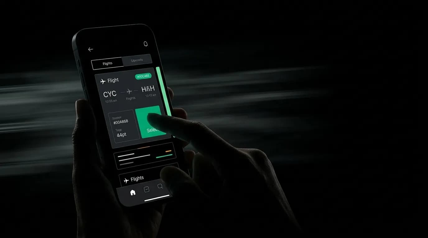
You are in the back of a taxi in Bangkok. The driver is navigating traffic with the confidence of someone who has done this ten thousand times, which means sudden stops, sharp turns, and a general disregard for lane markings. You need to tap the "Select" button on a flight card to lock in your connection before the price changes. Your thumb hovers over the screen. The car lurches. You miss.
This is not a hypothetical. This is how a significant percentage of travel app interactions actually happen. People use travel apps in moving vehicles, crowded airports, turbulent flights, and unfamiliar streets where they are simultaneously trying to navigate and not walk into traffic. The idea that your user is sitting calmly at a desk with a steady hand and full attention is a fantasy that travel app designers cannot afford.
Why 44x44pt is the minimum, not the target
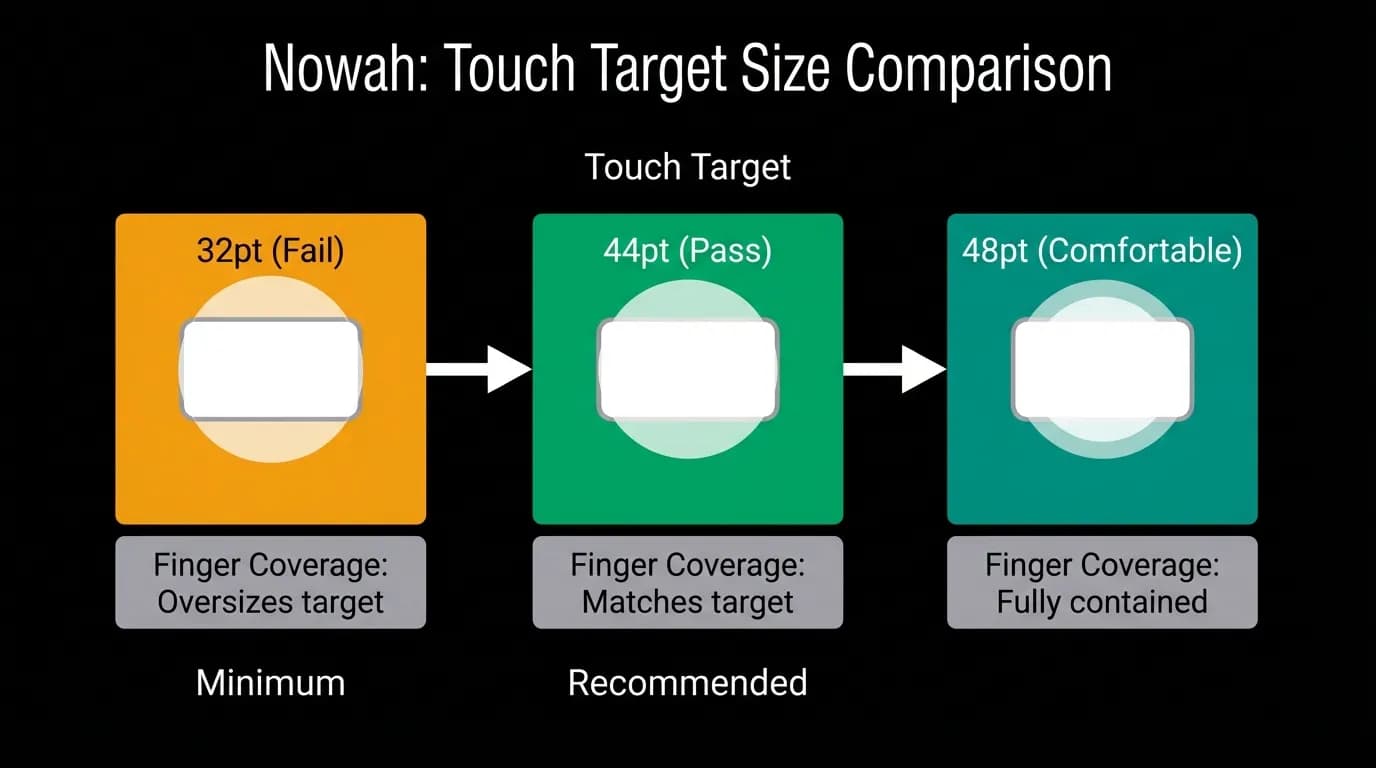
The 44x44 point minimum comes from platform guidelines and accessibility standards. It is the smallest touch target that most adults can reliably tap with a finger. But minimum means minimum. It is the floor, not the ceiling, and in a travel context you should be designing well above it.
Here is the math that makes this concrete. The average adult fingertip covers roughly 45 to 57 points on a screen. A 44pt target means your button is smaller than the finger trying to tap it. That works when the user is focused and the device is stable. It starts failing when either of those conditions degrades, and in travel, both degrade constantly.
Our input bar sits at 48 pixels minimum height. The tab bar runs 83 pixels tall. These are not arbitrary numbers. They account for the reality that the person holding the phone might be walking, standing on a moving train, or operating with one hand while dragging a suitcase with the other.
Fat finger prevention through spacing
Size is only half the equation. The other half is spacing. Two perfectly sized 44pt buttons placed 4 pixels apart will still cause mis-taps because fingers are imprecise instruments. The tap you intended for the left button lands on the right one, and now you have selected the wrong flight.
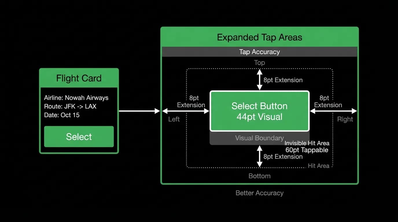
The solution is generous spacing between tappable elements. On our flight cards, which run about 180 pixels tall, the Select button needs to be clearly isolated from other interactive elements. We use padding and invisible hit area expansion to create a comfortable buffer zone around every tappable element.
The invisible hit area is a technique worth understanding. The visual boundary of a button might be 44 points, but the actual tappable area extends 8 points in every direction. The user sees a button. The system sees a larger target. This means taps that land slightly outside the visible button still register correctly, which is exactly what you want when your user is bouncing down a dirt road in a rideshare.
The thumb zone is prime real estate
Phone ergonomics research has mapped out where your thumb can comfortably reach when holding a device with one hand. The bottom third of the screen is the easiest zone. The top corners are the hardest. This is not new information, but it is information that travel apps routinely ignore.
Our primary actions live in the bottom third. The input bar, the tab navigation, the main action buttons on cards. When you need to book a flight or send a message to the AI, you are not stretching to the top of the screen. You are tapping in the natural resting position of your thumb.
The center tab in our five-tab navigation is the chat, which is the primary interaction point. It sits dead center of the bottom bar, in the most accessible position on the entire screen. This is a deliberate choice. The thing you use most should be the easiest thing to reach.
Flight card buttons: size, spacing, and tap area expansion
Flight cards are where touch target design gets tested hardest. You have a 180-pixel card that needs to display airline, times, duration, stops, price, and a Select button. That is a lot of information in a small space, and every element competes for room.
The temptation is to shrink the Select button to make space for more data. Resist this. The Select button is the entire point of the card. If the user cannot tap it reliably, the data is irrelevant. We keep the Select button at a full 44pt minimum with expanded hit areas, and we give it clear visual weight using our primary green accent so it stands out even in peripheral vision.
Testing technique: use your app in a moving car
The simplest and most revealing quality test for touch targets is to use your app in a moving vehicle. Not as the driver, obviously. As a passenger. Try to complete a booking flow while the car navigates city traffic. Every mis-tap, every moment of hesitation, every time you have to retry an action tells you something about your touch target design.
We run this test regularly. It catches problems that no amount of desk-based QA will find. A button that feels fine when you are sitting still becomes impossible when the world is vibrating around you.
Audit your tap targets with the 44pt ruler
Here is a practical exercise. Take any screen in your travel app and overlay a 44-by-44 point grid on every interactive element. If any element is smaller than one grid square, it is too small. If any two elements overlap within one grid square of each other, they are too close.
Then do the same exercise while walking. Not just standing, but actually moving through space. The results will be different, and the moving results are the ones that matter for a travel product.
The bumpy road is not an edge case. For travel apps, it is the primary use case. Design accordingly.
Nowah is an AI travel agent that searches and books real flights and hotels through conversation — no filters, no thirty open tabs. Plan your next trip.