Typography on Black: Lessons from Six Months of Dark-Only Design
White text on black requires different font weights, increased line spacing, and opacity-based hierarchy — six months of dark-only design taught us what the style guides skip.
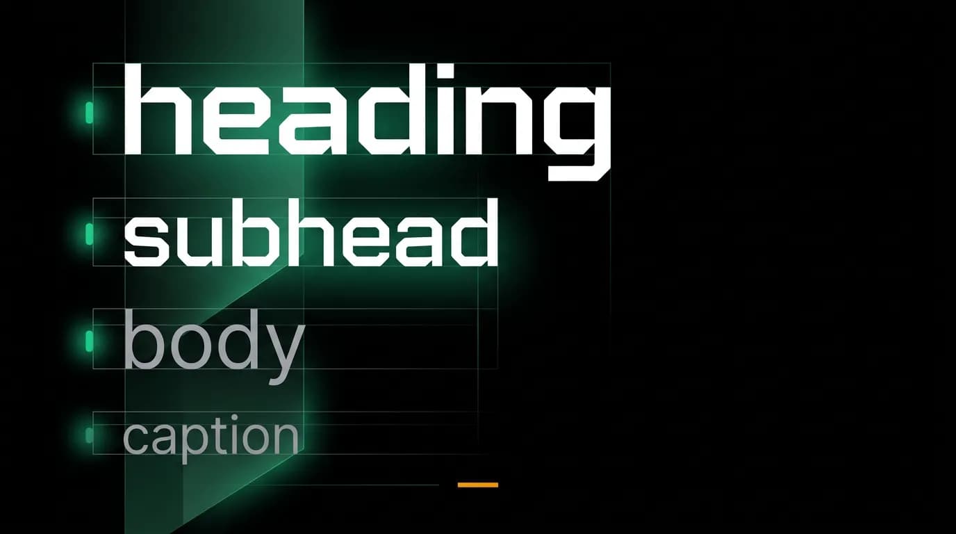
Typography on a dark background is not typography on a light background with inverted colors. The physics are different. Light text emits photons into a dark field, creating optical effects that do not occur when dark text absorbs light from a bright field. Six months of designing exclusively for a pure black background taught us lessons that no style guide fully covers.
These are not theoretical observations. They are solutions to problems we discovered through extensive testing across devices, lighting conditions, and text sizes.
The halation problem
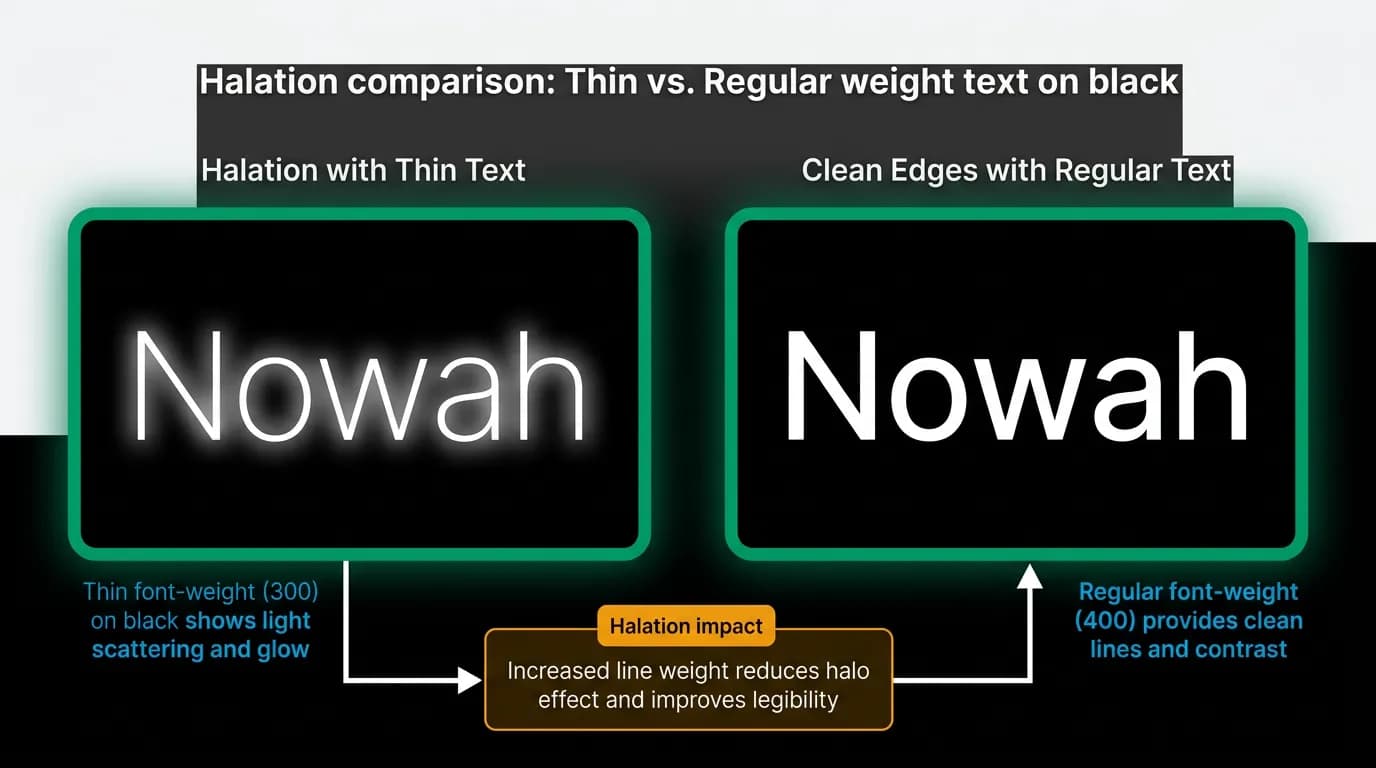
Halation is the phenomenon where bright elements appear to bleed or glow on OLED screens. When white text (#FFFFFF) sits on a pure black background (#000000), the extreme contrast at pixel boundaries can cause the text to appear slightly blurred or glowing, especially at small sizes and thin weights.
This is a physical property of OLED panels, not a rendering bug. Each white pixel is emitting light surrounded by pixels that are completely off. At the boundary, the light bleeds into the visual perception of the surrounding dark area.
Halation is most visible under two conditions: thin font weights (light or ultralight, typically 200-300) and small text sizes (below 14 pixels). At regular weight (400) and standard body size (16 pixels), halation is minimal. At semibold (600) and headline sizes (20 pixels and above), it is effectively invisible.
The solution is not to avoid pure black backgrounds. It is to avoid thin text on pure black backgrounds. We set regular weight (400) as our minimum for any text on the pure black background. Where we might have used light weight (300) on a light interface for an airy, elegant feel, we use regular weight on dark. The slightly heavier letterforms have crisper edges against the black.
Font weight adjustment
The general principle: use one weight heavier on dark backgrounds than you would on light. If your light-mode heading is semibold (600), your dark-mode heading can stay at semibold or even drop to medium (500) because the white-on-black contrast naturally adds visual weight. If your light-mode body text is regular (400), keep it at regular — do not go lighter.
This might seem contradictory. Going heavier for small text (to avoid halation) but potentially lighter for large text (because contrast adds perceived weight). The reconciliation is that the adjustment depends on size, not a blanket rule. Large, bold text does not suffer from halation and can be slightly lighter because the high contrast makes it appear heavier than it is. Small text needs the weight to maintain edge clarity.
In practice, our type scale uses: semibold (600) for headings at 24 pixels and above, medium (500) for subheadings at 18 pixels, regular (400) for body text at 16 pixels, and regular (400) for captions at 13 pixels. We do not use light (300) anywhere in the app.
Line spacing on black
Standard line-height recommendations (1.4 to 1.6 for body text) feel tighter on black backgrounds than on white backgrounds. This is a perceptual effect: the high contrast between text lines and the black inter-line space makes the spacing appear smaller than it is.
We increased our body text line-height to 1.6, which is the higher end of the standard range. On a white background, this would feel generous, almost loose. On our black background, it reads as comfortable — the space between lines gives the eye enough rest between each line of glowing text.
Paragraph spacing is equally important. We use 1.5 times the font size as paragraph spacing, creating clear visual breaks between text blocks. Without this extra spacing, long AI responses — which can be several paragraphs — feel like dense walls of glowing text.
Text hierarchy with opacity
On a light interface, text hierarchy typically uses color: black for primary, dark gray for secondary, medium gray for tertiary. On a dark interface, you can use the same approach (white, light gray, medium gray) or you can use opacity on a single white color.
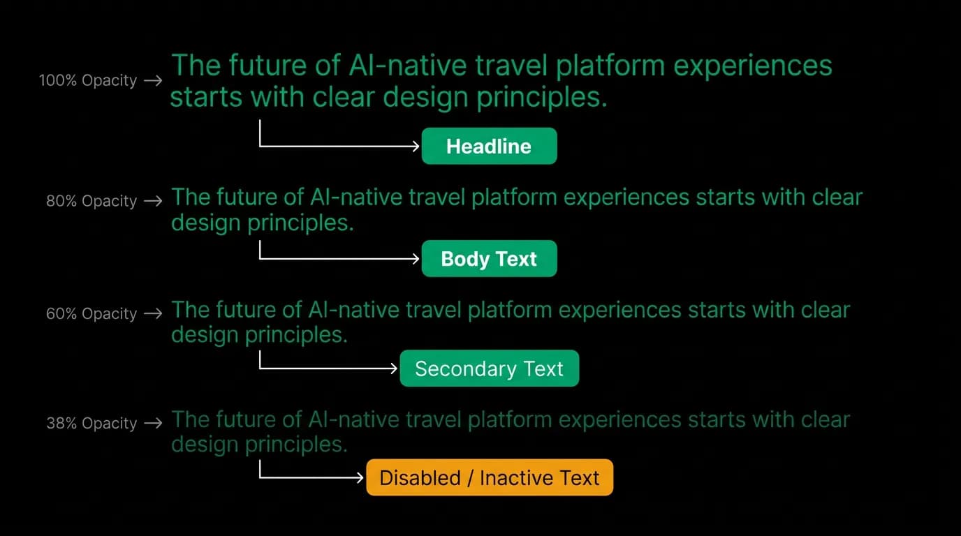
We use a hybrid approach. Primary text is #FFFFFF at 100% opacity. Secondary text is #8E8E93 — a specific gray that we tested for readability across all background levels. Disabled text is white at 38% opacity.
We chose a named gray (#8E8E93) for secondary text rather than white at 60% opacity because the named gray maintains a consistent appearance whether it sits on the black background (#000000) or on a dark gray card (#1C1C1E). White at 60% opacity would look different on each background because the opacity blends with the underlying color. The named gray is absolute.
For disabled states, we use opacity (38%) because disabled elements should visually recede regardless of their background. The opacity approach ensures that disabled text on any surface is consistently subdued.
Long-form readability
AI responses can be lengthy. A flight recommendation might be three paragraphs of reasoning followed by card options. A trip summary might be several paragraphs with embedded details. These are not chat-message-length texts — they are article-length texts rendered in a chat bubble.
For long-form readability on black, we apply three additional rules. Maximum line width of approximately 65 characters — wider lines cause the eye to lose its place on the return sweep, and this effect is amplified when the text is self-luminous against a dark field. Increased paragraph spacing to provide clear rest points. And we avoid justified text, using left-aligned (ragged-right) text instead, because justified text creates uneven word spacing that is more distracting on a high-contrast background.
These are the kinds of lessons that only emerge from building and using a dark-only product over months. The initial design might look right in a mockup tool. After reading AI responses at midnight for six months, you discover what "reads right" actually requires.
Nowah is an AI travel agent that searches and books real flights and hotels through conversation — no filters, no thirty open tabs. Plan your next trip.