Date and Time in Travel UI: A Deceptively Complex Problem
Departs 11:30 PM March 15, arrives 2:45 PM March 17 local time — timezones, date formats, and duration display turn two simple numbers into a design nightmare.
"What time do I land?"
This should be the simplest question a travel app answers. The departure time is in the data. The arrival time is in the data. Display them. Done.
Except the departure time is in the origin timezone and the arrival time is in the destination timezone, and those might be different by anywhere from one to twelve hours, and the flight might cross the international date line, and the user might be in a third timezone right now, and "local time" means different things depending on which location you consider local.
Date and time display in travel is one of those problems that looks trivial on the surface and turns into a design nightmare the moment you consider the edge cases. And in travel, the edge cases are the main cases.
Timezone display: the fundamental decision
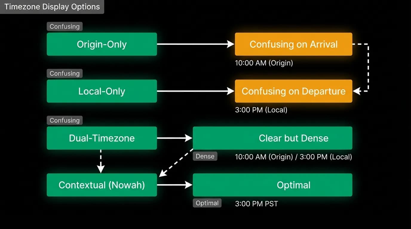
When showing a flight's departure and arrival times, you have to choose a timezone convention. There are four options, each with trade-offs.
Origin timezone for everything. Departure shows the time at the origin airport. Arrival also shows the time at the origin airport. This is internally consistent but confusing on arrival: "I arrive at 4 AM? Oh wait, that is 4 AM back home, not 4 AM in Tokyo."
Destination timezone for everything. The opposite problem. Departure time in the destination timezone is confusing: "I depart at 2 PM? My flight is at 11 AM local time."
Local timezone for each event. Departure shows origin-local time. Arrival shows destination-local time. This is what the user actually needs (when do I need to be at the airport? when do I land at my destination?) but it means the two times on the same card are in different timezones, and the difference between them is not the flight duration.
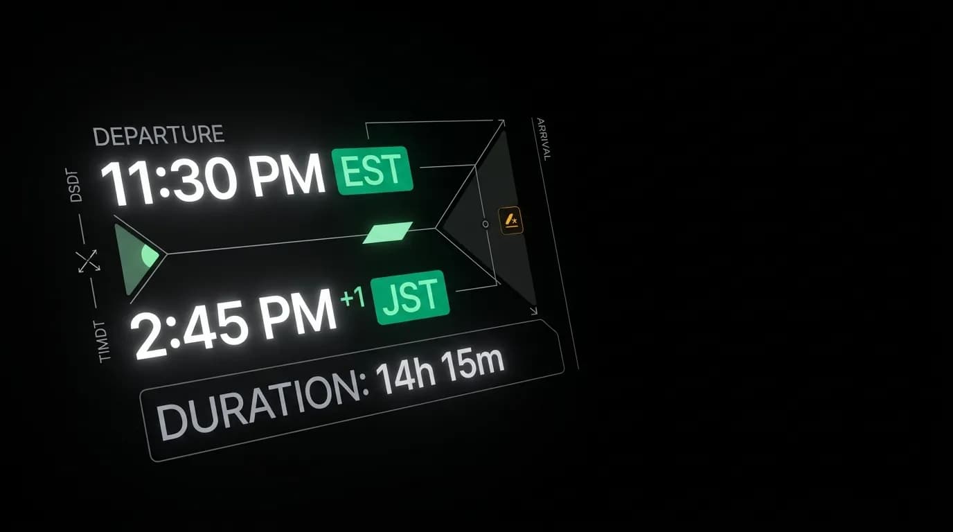
Each time with its timezone abbreviation. Our approach. Departure shows "11:30 PM EST" and arrival shows "2:45 PM JST +1." Each time is in its local timezone, and the timezone abbreviation eliminates ambiguity. The user knows exactly what clock each time refers to.
The +1 day indicator
Overnight flights create a specific display challenge. You depart at 11:30 PM on March 15 and arrive at 2:45 PM on March 17. You left on a Saturday and landed on a Monday. Without a clear day indicator, the user might assume they arrive the same day or the next day when they actually arrive two days later.
The "+1" notation next to the arrival time is the standard solution, but it needs to be prominent enough that users actually see it. A small "+1" in a lighter color next to the time is easy to miss. We display it as a distinct badge element adjacent to the arrival time: a clearly visible "+1" or "+2" that communicates "you arrive this many days after your departure date."
For flights that arrive the same day, no badge appears. The absence of the badge is the signal that the arrival is same-day. This convention works because the badge only appears in the unusual case, drawing attention when attention is needed.
Duration formatting
The duration between departure and arrival needs its own formatting. There are multiple conventions: "14h 30m" (compact), "14 hours 30 minutes" (verbose), "14:30" (clock-style). Each has trade-offs.
We use the compact format on cards: "14h 30m." This is concise enough for the limited space on a flight card and unambiguous. The "h" and "m" labels prevent confusion with clock time. Nobody reads "14h 30m" as a time of day.
In expanded detail views, the format can be slightly more verbose for readability. But on the card, where space is at a premium and the user is scanning multiple options, the compact format wins.
For layovers between connecting flights, the duration gets a different treatment. "2h 15m layover in Dallas" is displayed as a distinct element between flight segment cards, with enough visual separation that the user does not confuse the layover duration with a flight duration.
International date formats
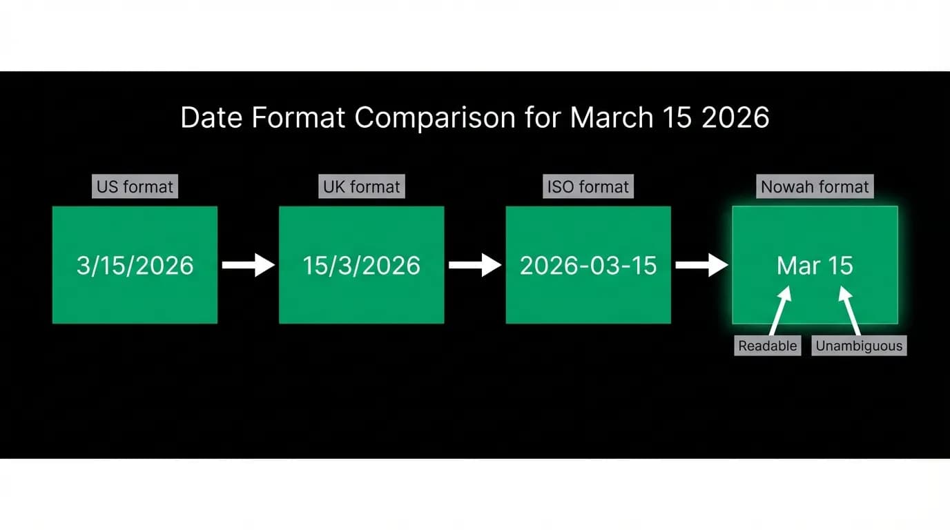
Date formatting is a regional minefield. March 15, 2026 can be written as 3/15/2026 (US), 15/3/2026 (UK and most of Europe), 2026-03-15 (ISO), or 15.03.2026 (Germany).
The US format is actively dangerous in a travel context. "3/4/2026" means March 4th in the US and April 3rd in the UK. For a travel app with a global user base, this ambiguity could mean a user showing up at the airport on the wrong date.
We use an unambiguous format: "Mar 15" or "March 15, 2026." Spelled-out or abbreviated month names cannot be confused. "Mar 15" means March 15 everywhere in the world. It is slightly longer than the numeric format but eliminates a category of misunderstanding that has real consequences in travel.
For the full date with year, we use "March 15, 2026." For compact display on cards, "Mar 15." For ranges, "Mar 15 - 22" or "Mar 15 - Apr 2." Always with the month name, never with ambiguous numeric format.
Putting it all together
A flight card shows: departure time with timezone abbreviation, arrival time with timezone abbreviation and day-change badge, compact duration, and dates in month-name format. Each piece has been individually designed to be unambiguous, and together they form a time display that answers the user's questions without creating new ones.
"When do I leave?" 11:30 PM EST. "When do I arrive?" 2:45 PM JST, the next day. "How long is the flight?" 14h 15m. "What date?" Mar 15.
Four pieces of time information, each clear on its own, each unambiguous in context. For a problem that seems like it should be trivial, getting this right requires surprisingly careful design.
Nowah is an AI travel agent that searches and books real flights and hotels through conversation — no filters, no thirty open tabs. Plan your next trip.