The Design System for a Chat-First Product
When most UI is generated content, the design system shifts from screen templates to tokens, components, and composition rules that handle any arrangement the AI produces.
A design system for a static app documents screens. Here is the home screen. Here is the profile screen. Here is the settings screen. Each screen has a fixed layout with known components in known positions. The design system is a catalog of these layouts and the components that fill them.
A design system for a chat-first AI product cannot document screens because the screens are dynamic. The chat screen might show a greeting, three flight cards, a paragraph of text, and two suggestion chips right now. A minute later it might show a hotel card, a map reference, and a booking confirmation. The layout is not predetermined. It is composed in real time based on what the AI generates.
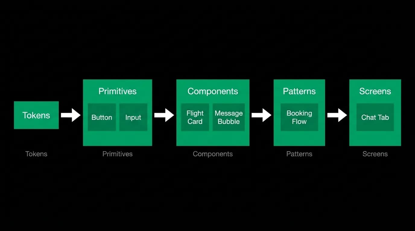
This fundamentally changes what a design system needs to be. Instead of screen templates, it needs tokens, components, and composition rules. Tokens define the visual language. Components are the building blocks. Composition rules govern how those blocks arrange themselves when the AI assembles them into a response.
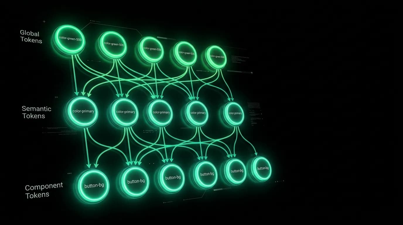
Token hierarchy: global to semantic to component
The token system has three layers. Global tokens are the raw values: pure black is the hex code for black, green is the hex code for the primary accent. These are the foundation, used everywhere.
Semantic tokens map global values to meaning: background color resolves to black, primary action color resolves to green, error color resolves to red. The semantic layer creates an abstraction that allows the same green to be called "primary action" in a button and "price highlight" on a card without either component knowing the actual hex value.
Component tokens map semantic values to specific component properties: chat bubble padding is 16 pixels, flight card height is 180 pixels, tab bar height is 83 pixels. These are the most specific tokens, and they encode design decisions about individual components.
This three-layer system enables several important things. Changing the green accent across the entire product means updating one global token. Deciding that all error states should use a different shade of red means updating one semantic token. Adjusting the padding inside chat bubbles means updating one component token. The specificity escalation prevents cascade problems where a change in one place causes unexpected changes elsewhere.
Component library organization
The component library is organized by function, not by screen. There are no "home screen components" or "booking screen components." There are chat components, card components, booking components, navigation components, form components, and feedback components.
Chat components include message bubbles, the input bar, typing indicators, and tool-use status pills. Card components include flight cards, hotel cards, trip summary cards, and booking confirmation cards. Booking components include review modals, payment sheets, traveler forms, and processing screens. Navigation components include the tab bar, headers, and back buttons. Form components include text inputs, selectors, toggles, and date pickers. Feedback components include toasts, alerts, empty states, and error states.
This functional organization reflects how the AI uses the components. The AI does not think in screens. It thinks in capabilities: search flights-layer-ai-agent-search-flights) (produces flight cards), confirm booking (produces a confirmation card), report error (produces an error state). The component library is organized along the same lines.
Composition rules
Components need rules for how they combine. When the AI generates a response that includes text followed by three flight cards followed by suggestion chips, the composition rules determine the spacing between each element, the transition animations as they appear, and the scroll behavior of the assembled message.
Rule one: content blocks within a message bubble use a consistent vertical spacing that is larger than the line spacing within a block but smaller than the spacing between separate messages. This creates clear visual grouping: "these things belong together as one response."
Rule two: interactive elements (cards, buttons, chips) get additional top spacing to separate them from preceding text. The eye needs a beat between reading and evaluating actionable options.
Rule three: carousel components (horizontally scrollable card sets) get edge-to-edge width within the bubble, with scroll indicators when cards extend beyond the visible area. The carousel breaks the standard padding of the bubble to maximize card display area.
These rules are documented, not implicit. Any engineer implementing a new message type can look up the composition rules and know exactly how to space and arrange content blocks. No interpretation, no "what feels right." The feeling has been codified.
Variant system
Every component has a variant matrix documenting its states. A flight card has default, loading (skeleton), error (failed to load), selected (green border), and disabled states. Each state has explicit token values for every visual property.
The variant system is critical for AI products because the AI will trigger every state eventually. A flight search that returns no results triggers the error state. A card waiting for price data triggers the loading state. A card the user has already selected triggers the selected state. Every state must be designed, documented, and implemented because the AI does not constrain its output to the happy path.
Documentation in context, not isolation
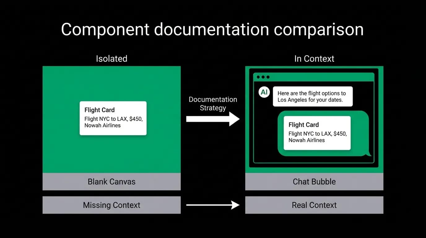
Traditional design system documentation shows components in isolation on a white background. This is less useful for chat-first products because the components never appear in isolation. They always appear in conversation context, surrounded by message bubbles, preceded by AI text, and followed by other components.
Our documentation shows components both in isolation (for detailed specification) and in context (for composition understanding). A flight card spec page shows the card alone with all its measurements. It also shows the card inside a chat message, following a paragraph of AI text, alongside two other cards in a carousel. The contextual documentation is what engineers actually reference during implementation because it shows how the component lives in the real product.
Building your own
If you are building a chat-first product, start your design system with tokens, not screens. Define your color palette, spacing scale, and typography scale as named tokens. Build components that consume those tokens. Document how components compose within messages. Test compositions with real AI output, not placeholder content.
The system scales to any number of new component types because the tokens and composition rules remain constant. When you add a new card type, it inherits the existing spacing rules, animation patterns, and state conventions. The design system grows in components but stays stable in principles.
Nowah is an AI travel agent that searches and books real flights and hotels through conversation — no filters, no thirty open tabs. Plan your next trip.