Designing Price Display for Trust and Clarity
Currency formatting, per-night vs. total, fare breakdowns, and price-change animations — every pixel of price display affects whether users trust the number and tap Book.
The number that closes the deal or kills it is the price. Everything else on a flight card or hotel card exists to support the moment when the user's eyes land on the price and they make a split-second judgment: is this worth it?
If the price is unclear, the user hesitates. If the formatting looks unfamiliar, they question the data. If they cannot tell whether "$180" means per night or total, they feel manipulated. Every pixel of price display affects the trust calculation that determines whether the user taps Book.
Currency formatting: locale-aware by default
Currency display seems simple until you consider that your users span the globe. Americans expect a dollar sign before the number with periods as decimal separators: $1,234.56. Germans expect the number before the currency symbol with commas as decimal separators: 1.234,56 EUR. Japanese users expect no decimal places and a yen symbol: a specific character followed by numbers.
Our price component is locale-aware. It detects the user's locale settings and formats the number accordingly, including symbol placement, decimal separator, thousand separator, and decimal precision. The underlying value is the same. The presentation matches what the user's eyes expect to see.
Getting this wrong creates a trust problem that is disproportionate to the technical simplicity. A price formatted in an unfamiliar convention reads as suspicious. The user does not consciously think "the thousand separator is different from what I am used to." They unconsciously feel that something about the number looks wrong. That feeling is enough to prevent a tap.
Per-night versus total: the hotel card clarity imperative
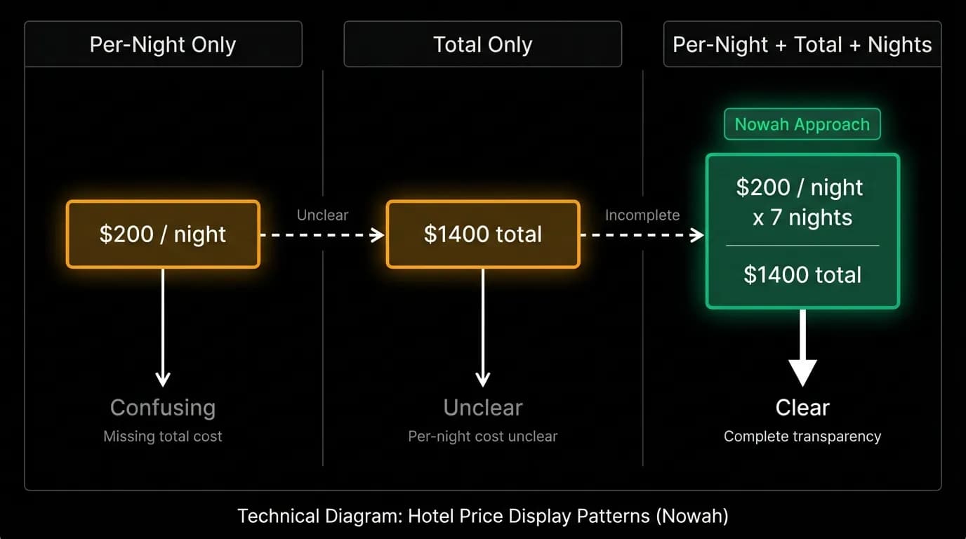
Hotel pricing has a specific ambiguity that flight pricing does not: is the displayed price per night or for the total stay? This single ambiguity has driven more user frustration and more support tickets in the travel industry than almost any other display issue.
We show both. The primary price is per-night, because that is how hotels are conventionally priced and compared. Below it, the total price with the number of nights makes the full cost explicit. "From $180/night. 3 nights: $540 total."
Both numbers are always visible on the hotel card. Never one without the other. This eliminates the mental math that per-night-only display requires ("Wait, how many nights am I staying, let me multiply...") and the sticker shock that total-only display can create without context.
The per-night price gets the larger font and the primary position. The total gets a slightly smaller font but clear visual connection to the per-night price. The relationship between the two numbers is obvious at a glance.
Fare breakdowns: transparency that builds trust
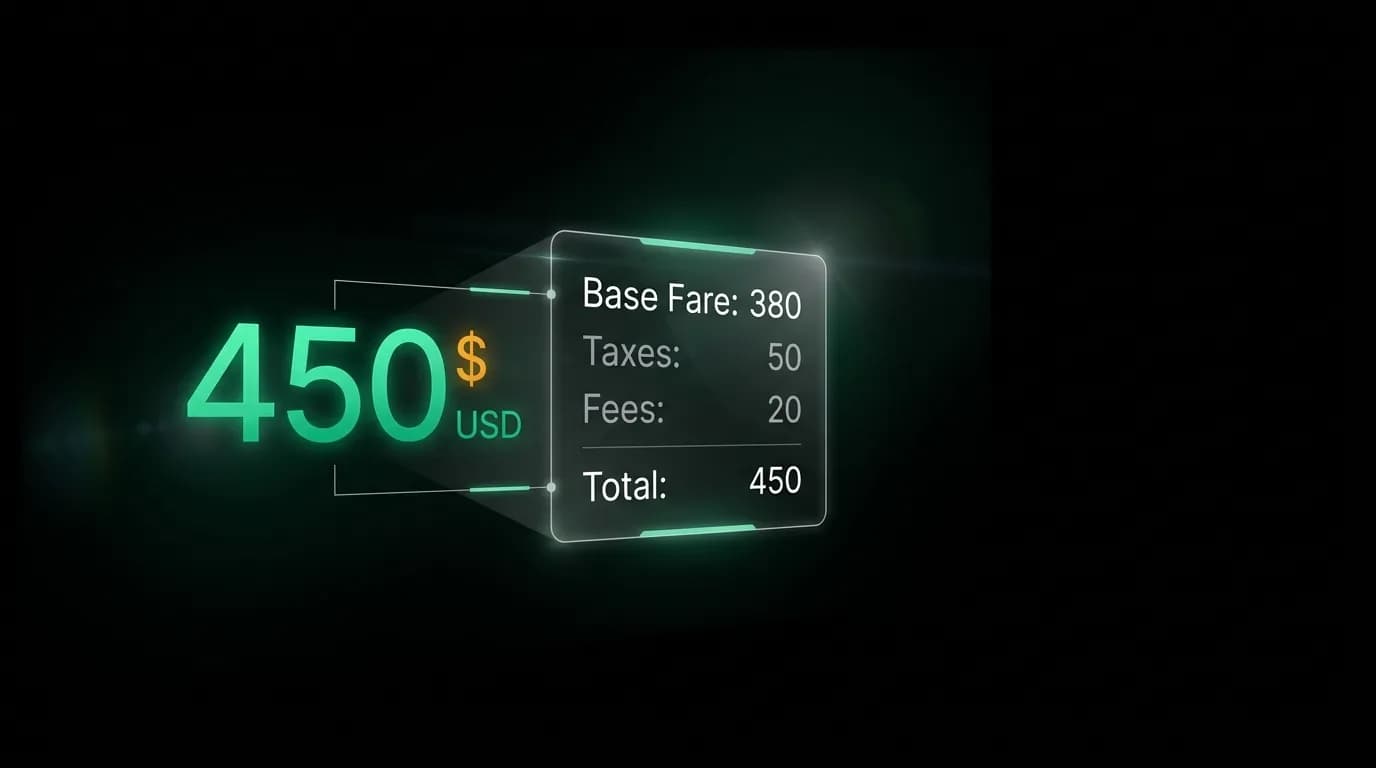
When the user moves from the card view to the booking review, the price expands into a full breakdown: base fare, taxes, fees, and total. This breakdown is not buried in fine print. It is a prominent section of the review screen.
The breakdown serves a trust function beyond mere compliance. When a user sees "$450" on a card and then sees "base fare $380 + taxes $50 + fees $20 = $450" on the review screen, the number feels justified. The platform is not hiding anything. The math adds up. The user can verify.
Contrast this with platforms that show a low price on the card and then reveal a higher total at checkout. The feeling of bait-and-switch is immediate and trust-destroying. Our price on the card is the price on the review screen is the price the user pays. No surprises.
Price-change communication
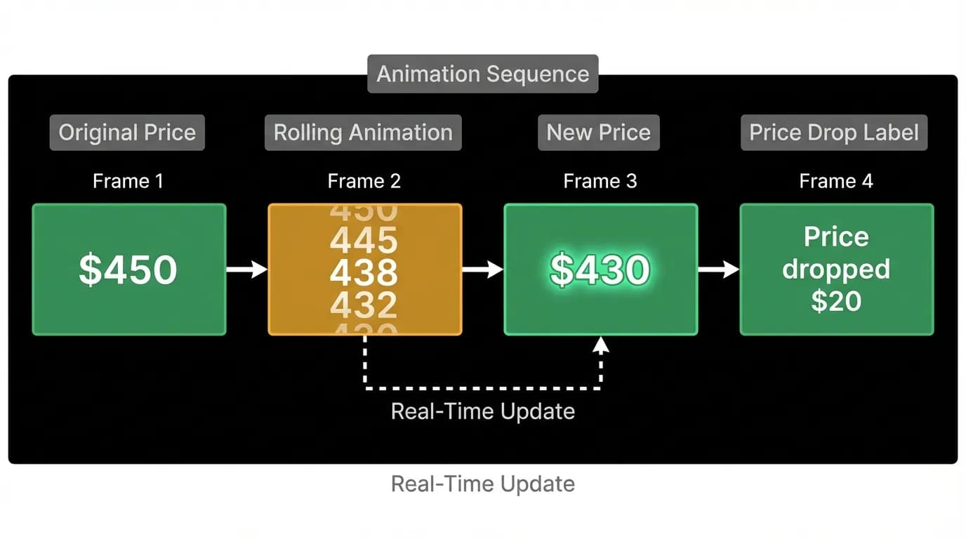
Travel prices are volatile. A flight that was $450 this morning might be $430 now, or $470. When a price changes between the time the user saw the card and the time they reach the booking review, the change needs to be communicated clearly.
For price decreases, we use an animated transition: the old price smoothly rolls to the new price, and a brief green highlight draws attention to the change. A label appears: "Price dropped $20." This is a positive moment, and the design celebrates it subtly.
For price increases, the animation is the same smooth roll, but without the celebratory green highlight. The label is neutral: "Price updated." We do not hide increases or apologize for them. Prices change. The user trusts the platform more when it communicates changes honestly than when it obscures them.
Position on cards
The price occupies a consistent position on every card type: right-aligned, bottom section, in our primary green accent color. This consistency means users always know where to look for the price without scanning. Right side, near the bottom, in green.
The green highlighting is not decorative. It uses the primary accent color that appears on action buttons throughout the product. Psychologically, this creates an association between the price and the action of booking. The price is not just information. It is the threshold for an action. Highlighting it in the action color reinforces this connection.
Font size for prices is larger than surrounding text. Not dramatically larger, but enough that the price reads clearly in peripheral vision. A user scrolling through three flight cards should be able to compare prices without stopping and reading each card in detail.
Edge cases
Zero-price situations (complimentary upgrades, free cancellation refunds) display as "Included" or "No charge" rather than "$0.00." A zero price looks like an error. Words are clearer.
Prices in unfamiliar currencies show an approximate conversion in the user's home currency as a secondary label. "$450 USD (approximately 62,000 JPY)" helps the user calibrate value without opening a separate converter.
Prices that the AI cannot confirm as current show a timestamp: "Price as of 3 minutes ago" with a refresh option. This hedges against the volatility of travel pricing while maintaining transparency.
Every edge case in price display has the same goal: make the user trust the number. Trust the number, tap the button. That is the entire conversion funnel for a travel product, and the price display is where it lives.
Nowah is an AI travel agent that searches and books real flights and hotels through conversation — no filters, no thirty open tabs. Plan your next trip.