Designing the Travel App Widget
Lock screen and home screen widgets show trip status at a glance — departure time, gate number, hotel check-in — without opening the app. Tiny space, maximum utility.
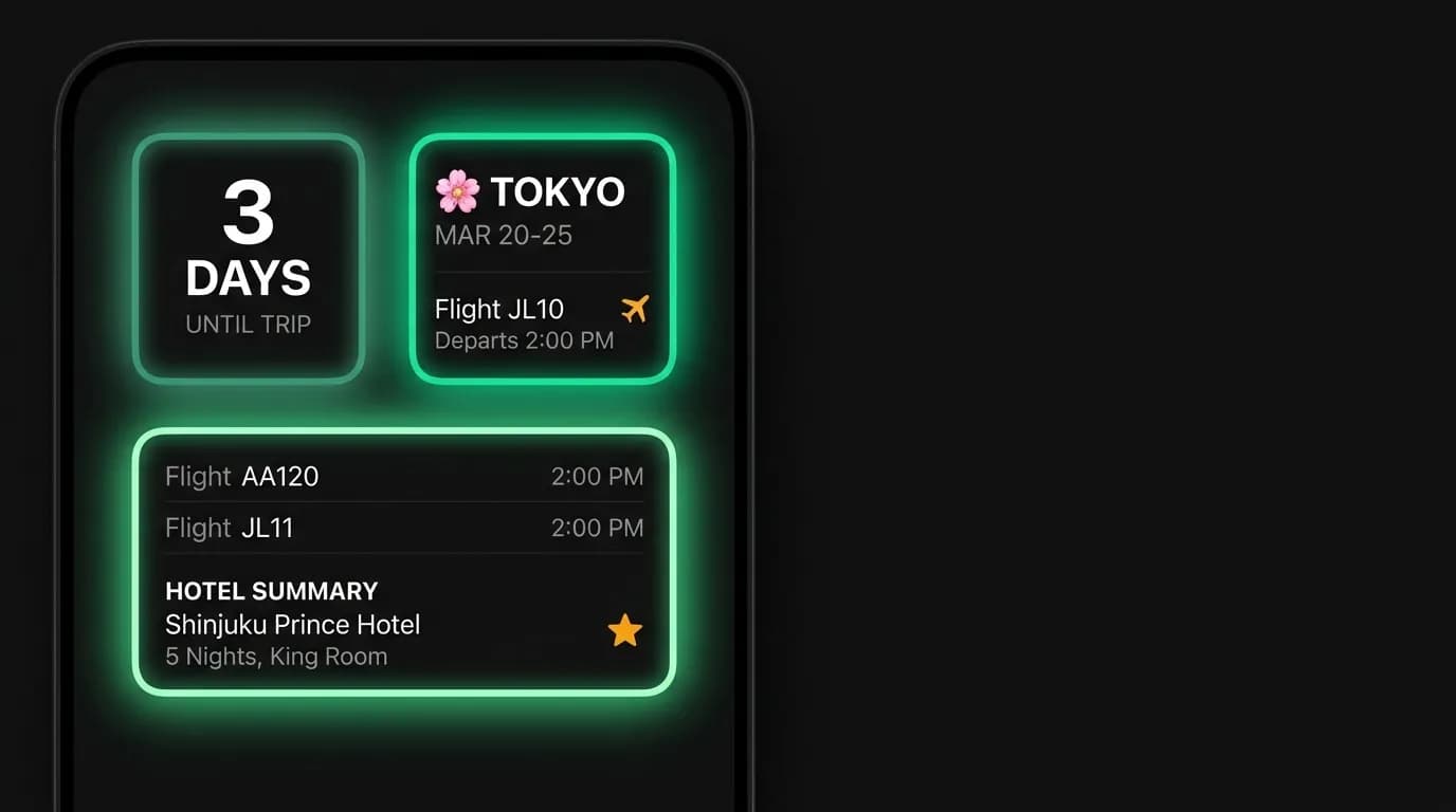
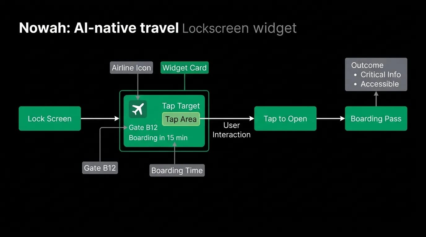
You are at the airport. Your phone is in your pocket. You pull it out, glance at the lock screen, and see: "Gate B12. Boarding in 15 min." You did not open the app. You did not unlock the phone. You did not navigate to the trip detail screen. The information was there, waiting for you, in a widget.
Widgets are the closest current implementation of ambient interface design. They surface information from the app without requiring the user to open the app. For a travel product, where users need quick access to time-sensitive information dozens of times during a trip, widgets are not a nice-to-have. They are essential.
Widget size tiers: small, medium, large
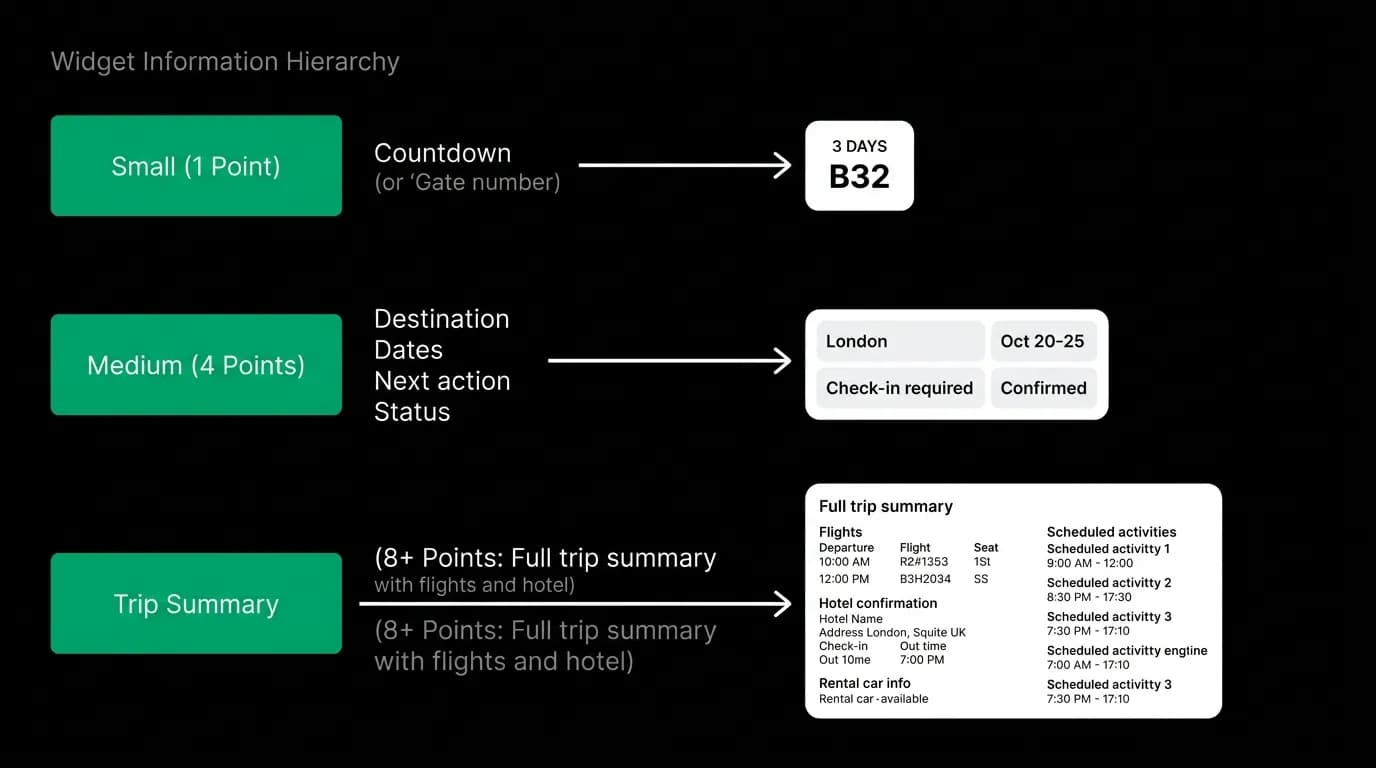
Platform widgets come in three size tiers, each with different information capacity and design constraints.
The small widget, roughly 155 by 155 pixels, has room for one data point. A countdown: "3 days." A gate number: "B12." A departure time: "2:15 PM." The design challenge is choosing which single piece of information is most valuable right now. The AI makes this judgment based on trip state: days before trip, the countdown is most useful. At the airport, the gate is most useful. During a hotel stay, the check-out time is most useful.
The medium widget, roughly 329 by 155 pixels, has room for a trip card. Destination name, dates, and the next action. "Tokyo. Mar 20-25. Flight at 2:15 PM." This gives enough context for the user to recall their trip and see what is coming next without opening the app.
The large widget, roughly 329 by 345 pixels, has room for a mini-itinerary. Flight details, hotel name, and one or two upcoming events. This is the most informative widget and the most useful during an active trip when the user wants a full picture at a glance.
Information hierarchy in tiny spaces
The design challenge for widgets is extreme information hierarchy. On a full app screen, you have hundreds of thousands of pixels to work with. On a small widget, you have roughly 24,000 pixels. Every element must earn its space.
The hierarchy follows user need: what does this person need to know right now, given the state of their trip?
Pre-trip: countdown to departure. The exact day count creates anticipation and serves as a passive reminder that the trip is approaching. Day of departure: departure time and gate. The critical logistics for getting to the right place at the right time. During a hotel stay: check-out time and hotel name. The essential details for the current accommodation. Return day: return flight time and confirmation. The logistics for getting home.
Each trip state surfaces different information. The widget is not a static display. It is a dynamic surface that adapts to context.
Refresh strategy
Widget data needs to be current, especially for time-sensitive information like flight status and gate assignments. But widgets operate under platform-imposed constraints on refresh frequency. The system does not allow arbitrary real-time updates.
Our approach uses background synchronization. The app periodically syncs trip data and pushes updates to the widget. The sync frequency increases as departure approaches: daily when the trip is weeks away, hourly when it is days away, and as frequently as the platform allows when the user is actively traveling.
Flight status changes trigger push-based updates. A gate change, a delay, or a cancellation pushes new information to the widget as quickly as the system allows. The user sees the updated gate number on their lock screen within minutes of the airline posting the change.
Tap-through: deep linking into the right screen
When the user taps the widget, they should land on the most relevant screen in the app, not the home screen. A widget showing a gate number should deep link to the flight detail view for that specific flight. A widget showing a hotel check-out time should deep link to the hotel booking detail.
This deep linking respects the user's context. They tapped the widget because they wanted more information about the specific item shown. Dropping them on the home screen and making them navigate to the relevant detail is a broken experience that defeats the purpose of the widget's contextual awareness.
The deep link path is encoded in the widget data: which trip, which booking, which tab. When the user taps, the app opens directly to that content. No navigation required. The transition from widget to app detail should feel like expanding the widget, not opening a separate application.
Glanceable trip status
The most important widget design principle is glanceability. The user should understand the information within a couple of seconds, ideally under one. This means large text for the primary data point, minimal supporting information, and no visual clutter.
On a dark widget background (matching the app's black theme), the primary data point appears in white, large enough to read at arm's length. A secondary label in gray provides context. The green accent marks action-relevant elements.
No charts. No graphs. No complex layouts. The widget is a signpost, not a dashboard. It tells you one or two things. If you need more, tap it and go to the app.
Designing a widget family
The three widget sizes form a family with consistent design language. Same dark background. Same typography scale (adjusted for each size). Same accent color. Same information about the same trip, at three levels of detail.
Users choose which size to place on their home screen based on how much information they want at a glance. The product should support all three sizes and let the user decide. Some users want the minimal countdown. Others want the full mini-itinerary. Both are valid, and both should be beautifully designed.
The widget family is also a design exercise in progressive disclosure: the same content at three density levels. This exercise sharpens information hierarchy skills that benefit the full app design as well. If you can communicate a trip in 155 by 155 pixels, you can communicate it well at any size.
Nowah is an AI travel agent that searches and books real flights and hotels through conversation — no filters, no thirty open tabs. Plan your next trip.