Micro-Interactions That Build Trust
A button that depresses on tap, a price that animates on update, a checkmark that draws itself during booking — small animations signal that the system is alive and reliable.
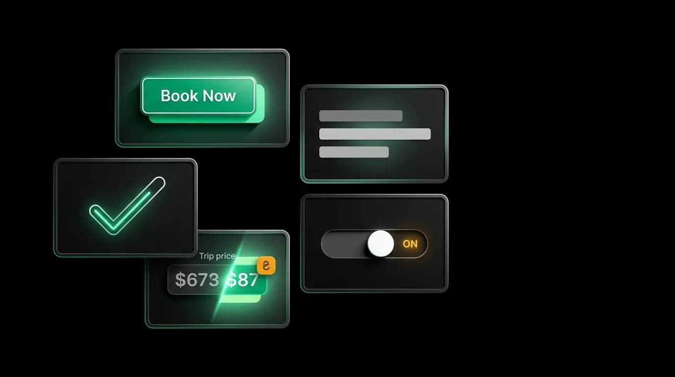
There is a 100-millisecond animation that changes everything about how a product feels. It is the button press: when you tap a button and it scales down to 97% of its size, then springs back. The entire thing takes a tenth of a second. Most users could not describe it if you asked them. But take it away, and the app immediately feels broken. Unresponsive. Dead.
This is the paradox of micro-interactions. They are invisible when they work and glaring when they are missing. Nobody notices that the button depressed. Everybody notices when it does not. And in a product where users are trusting an AI to spend their money on flights and hotels, the cumulative effect of these tiny moments is the difference between "I trust this" and "something feels off."
Button state transitions: the foundation of perceived quality
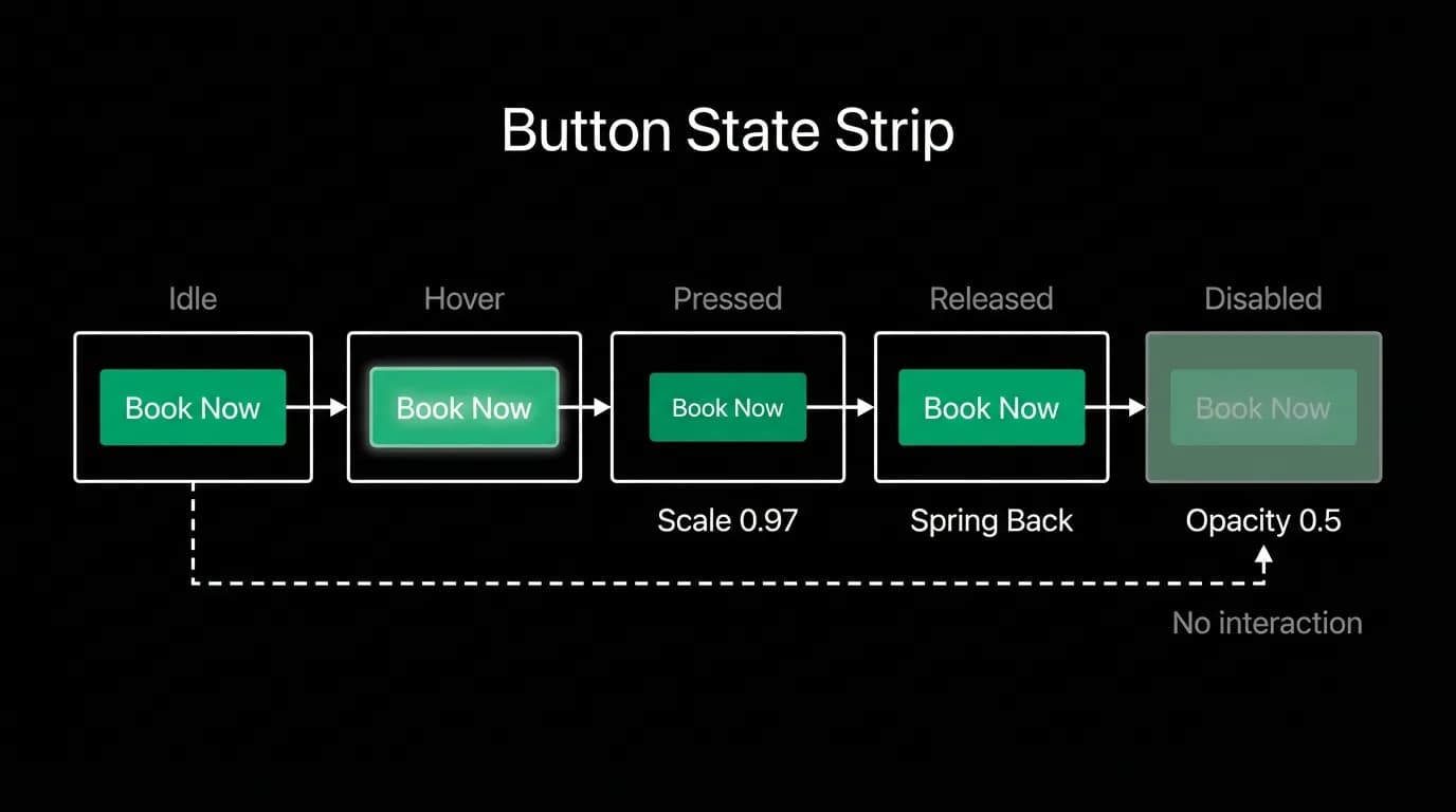
Every button in the interface has five states: idle, hover (on web), pressed, released, and disabled. The transitions between these states are where trust lives.
Idle to pressed is a scale to 0.97 over 100 milliseconds. The button shrinks slightly, as if it is being pushed into the screen. This confirms that the system registered your tap. On devices with haptic support, a light pulse accompanies the visual change.
Pressed to released is a spring-back to 1.0 scale. The button returns to its original size with a slight overshoot, like a physical button popping back up. This spring-back takes about 150 milliseconds and communicates that the press is complete.
Disabled is a drop to 50% opacity with no interactive response to taps. The visual dimming is universal shorthand for "this is not available right now," and the lack of press response confirms it.
These are not decorative choices. Each transition answers a user question. "Did my tap register?" Yes, the button depressed. "Is the action happening?" Yes, the button released and the next state is loading. "Can I tap this?" No, it is dimmed and unresponsive.
Checkmark animations in booking processing
The booking processing screen is one of the highest-anxiety moments in the entire product. The user has entered payment information and tapped confirm. Now they are watching and waiting. The processing screen needs to communicate progress without suggesting completion until the booking is actually secured.
We use a sequential checkmark animation. Each step in the booking process gets a labeled row: validating details, securing your booking, confirming with the airline. As each step completes, a checkmark draws itself from left to right in a smooth stroke. Not a snap appearance. A drawing motion that takes about 300 milliseconds and shows the checkmark being created.
This drawing animation does two things. First, it communicates progress incrementally. The user can see that the system is working through steps, not stuck. Second, the drawing motion itself feels deliberate and careful, which matches the gravity of what is happening. The system is being thorough, not rushed.
Price update animations
Prices in travel are volatile. A flight that was 450 dollars an hour ago might be 430 now, or 470. When a price changes on a card, the transition needs to be visible but not alarming.
We animate price changes as a smooth number roll. The old price transitions to the new price over about 200 milliseconds, with each digit rolling like an odometer. If the price decreased, the new number flashes briefly in green. If it increased, the transition is neutral, no color change, just the smooth roll.
The green flash on decreases is a subtle reward signal. "Good news, the price went down." The neutral treatment of increases avoids creating negative emotion. The price just is what it is. This asymmetric treatment is deliberate: reinforce the positive, remain neutral on the negative.
Loading skeleton design
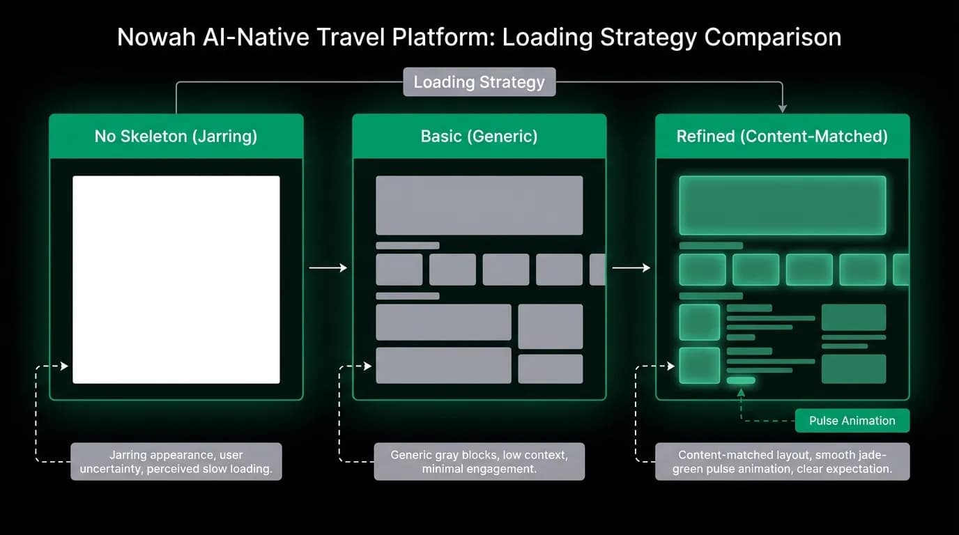
When content is loading, the space it will occupy shows a skeleton placeholder: shapes that match the eventual content, pulsing between 30% and 100% opacity on a one-second cycle.
The shapes matter. A skeleton for a flight card is shaped like a flight card, with rectangular placeholders where the airline name, times, and price will appear. A skeleton for a message bubble is shaped like a message bubble. This shape-matching sets spatial expectations. The user knows what kind of content is coming and roughly where each piece of information will appear.
The pulse rhythm matters too. One second per cycle creates a calm, steady breathing pattern that says "working on it" without urgency. Faster pulsing creates anxiety. Slower pulsing looks frozen. One second is the sweet spot that reads as active waiting.
We never use generic spinners for content loading. A spinner says "something is happening" without any indication of what. A shaped skeleton says "a flight card is loading" which is fundamentally more informative and less stressful.
Toggle animations
Toggles in settings screens use a smooth thumb travel animation. The thumb slides from one position to the other over about 200 milliseconds, with a simultaneous color transition in the track. Off-state is gray. On-state transitions to green.
The smoothness of this animation communicates precision. The toggle did not snap from off to on. It traveled, implying that the system registered the change intentionally and completely. A snapping toggle feels accidental. A sliding toggle feels deliberate.
The cumulative effect
No single micro-interaction builds trust by itself. The button press alone does not convince a user to book a flight. But the accumulation of a hundred tiny, responsive, carefully crafted moments creates an overall impression of quality and reliability.
When every tap gets acknowledged, every state change gets animated, every loading moment gets a shaped placeholder, and every completion gets a drawn checkmark, the cumulative message is: this system is alive, it is responsive, it is paying attention to details, and it is reliable enough to handle your money.
The inverse is equally true. Dead buttons, snapping state changes, blank loading screens, and abrupt completions accumulate into an impression of carelessness. And users who sense carelessness in the interface will not trust the system with a 500-dollar booking.
Three micro-interactions to add to your next release: animated button presses if you do not have them, shaped loading skeletons if you are still using spinners, and a drawn checkmark for your most important completion state. Those three alone will measurably change how your product feels.
Nowah is an AI travel agent that searches and books real flights and hotels through conversation — no filters, no thirty open tabs. Plan your next trip.