The Payment Sheet: Native vs. Custom in a Chat Context
We use native platform payment sheets inside a custom chat UI because payment is where trust cannot be custom — users need to see Apple Pay, Google Pay, and Stripe they recognize.
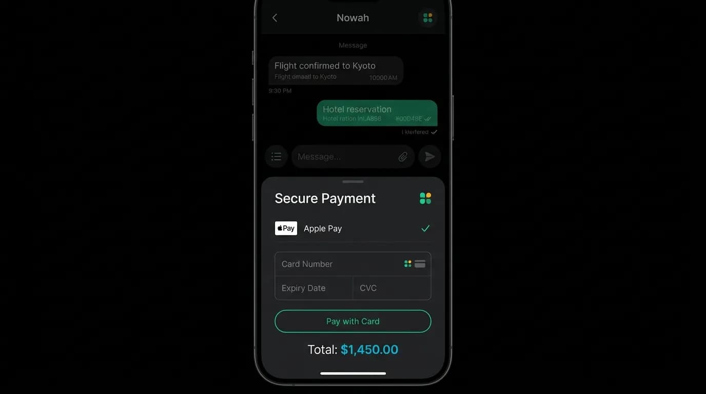
The moment money changes hands is the moment trust either holds or shatters. Everything in our interface — the conversation, the card presentation, the review modal — is custom-designed for our specific product. But when the payment sheet appears, we defer to the platform.
This is a deliberate architectural decision. Payment is where trust cannot be custom.
Why native wins
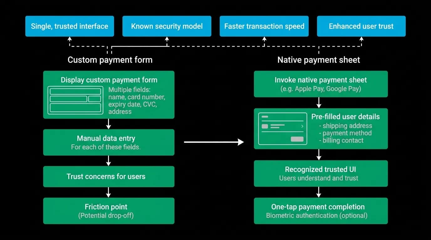
A native payment sheet — the standard system presentation for card payments and digital wallets — carries inherited trust. The user has seen this exact interface when buying apps, ordering food, paying for subscriptions, and completing dozens or hundreds of other transactions. The visual pattern is deeply familiar.
A custom payment form, no matter how well designed, introduces uncertainty. "Is this secure?" "Where is my saved card?" "Why does this look different from other payment flows?" These questions do not occur with native sheets because the user recognizes the interface from their existing mental model.
Native sheets also carry functional advantages. They pre-populate with the user's saved payment methods — credit cards, debit cards, and digital wallets already stored in the device's payment system. The user does not need to type card numbers, expiration dates, or security codes. In many cases, the payment is authenticated biometrically — face recognition or fingerprint — adding a layer of security that custom forms cannot match.
The completion rate advantage is significant. Pre-filled payment details and biometric authentication reduce the steps from "I want to pay" to "payment authorized" from approximately thirty seconds of manual entry to approximately three seconds of recognition and tap. That reduction in friction directly translates to higher completion rates.
Platform consistency
On iOS, the payment sheet follows Apple's standard presentation — a card-style bottom sheet with Apple Pay as the primary option and saved cards below. The visual language matches the system design: blur backdrop, rounded corners, familiar typography.
On Android, the equivalent presentation uses the Google Pay interface with saved cards and payment methods from the user's Google account. Same principle: familiar, pre-filled, system-level trust.
On the web, the payment element renders in a standardized form that users recognize from countless other websites. Saved browser payment methods auto-populate. The visual treatment matches what payment processors present across the web.
In every case, the payment sheet looks like it belongs to the platform, not to our app. This is intentional. At the moment of payment, we want the user to feel like they are using the trusted payment infrastructure of their device, not a custom experience from a travel app they might be using for the first time.
The integration pattern
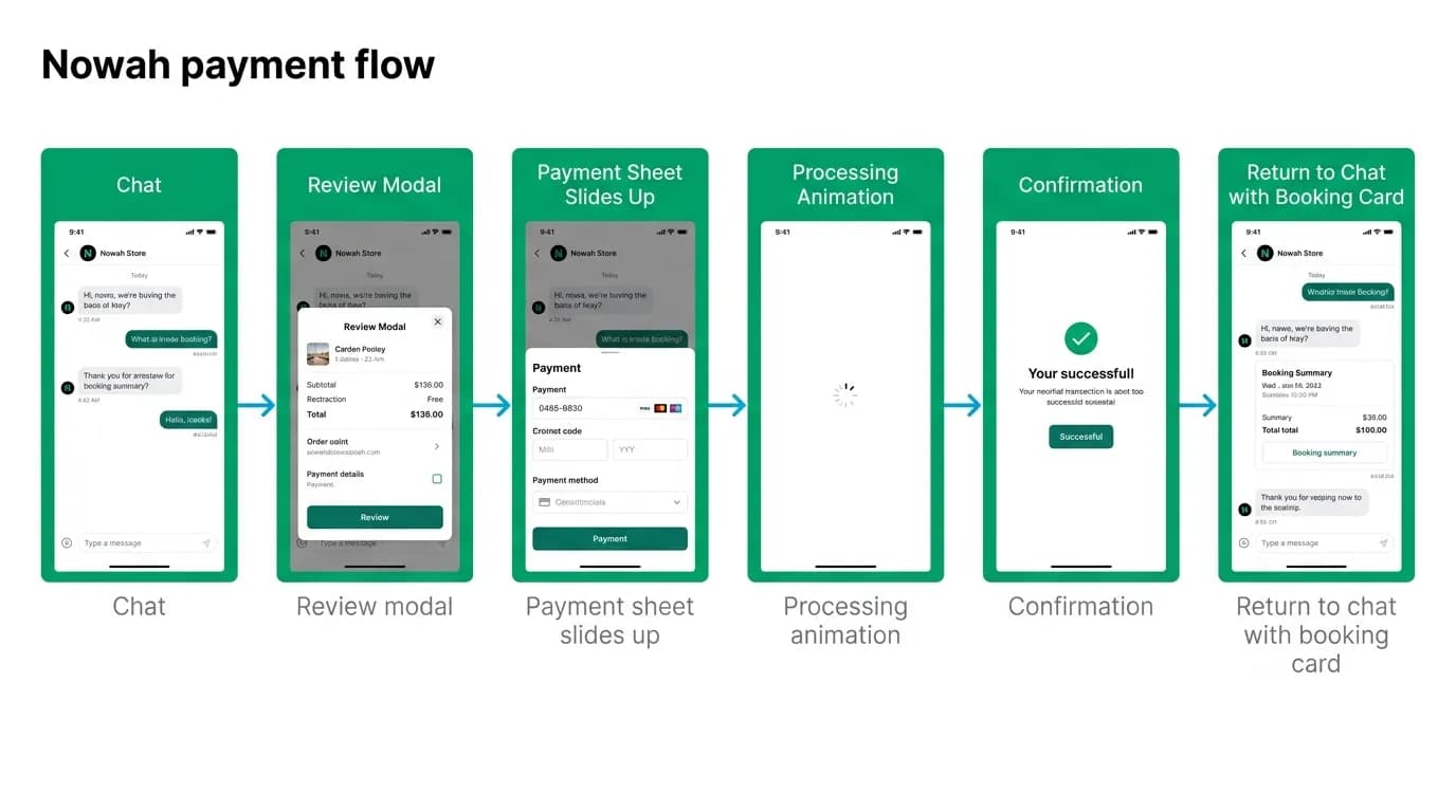
The flow is: the user confirms the review modal and taps "Pay." The review modal slides down or dims. The payment sheet slides up from the bottom, native to the platform. The user selects their payment method and authenticates. The sheet dismisses. A processing animation appears. The confirmation follows.
The transition between our custom review modal and the native payment sheet is the most important handoff in the app. The review modal, which is our design, hands control to the payment sheet, which is the platform's design. The handoff must feel seamless — the sheet slides up as the modal steps back, creating a layered depth effect where the payment sheet is the topmost element.
After payment authorization, the sheet dismisses and our custom processing animation takes over. The return to our interface is equally smooth — the processing screen appears immediately in the space the payment sheet occupied, maintaining spatial continuity.
The processing animation — sequential checkmarks with a final confirmation burst — bridges the gap between "payment authorized" and "booking confirmed." This gap can be several seconds (the system validates the booking, processes the payment, and confirms with the provider). The animation fills those seconds with progress communication rather than dead air.
Returning to chat after payment
After confirmation, the user needs to return to the conversational context. The booking confirmation appears both as a modal (with the reference number and next-step actions) and as a message in the chat. When the user dismisses the confirmation modal, they are back in the chat, with a new message from the AI: "Your booking is confirmed! Here is your reference number. I have added this to your trips. Need anything else?"
This return to chat is essential. The booking was initiated from a conversation, and the post-booking experience should continue in conversation. The user might want to book a hotel for the same trip, add activity reservations, or ask about visa requirements. The chat is ready for all of these, with the full trip context already loaded.
Error handling during payment
Payment failures — declined cards, network timeouts, insufficient funds — are handled with the same conversational approach we use for all errors. The native payment sheet communicates the immediate failure (declined card). When the sheet dismisses, the AI explains the situation in the chat: "The payment did not go through — it looks like the card was declined. Would you like to try a different payment method?"
The booking intent is preserved. The user does not need to re-search, re-select, or re-review. The AI holds the booking state and simply waits for a successful payment. If the user wants to try a different card, the payment sheet re-presents. If the user wants to pause and come back later, the AI offers to hold the selection.
Payment is the highest-stakes interaction in any transactional app. Use native sheets. Borrow the trust that platforms have spent years building. Save your custom design energy for the parts of the experience where custom design adds value — the conversation, the cards, the confirmation. At the moment of payment, familiarity is the feature.
Nowah is an AI travel agent that searches and books real flights and hotels through conversation — no filters, no thirty open tabs. Plan your next trip.