Designing Flight Cards That Sell at a Glance
A flight card has 180 pixels of height to communicate airline, times, duration, stops, price, and cabin class — every pixel must earn its place in the layout.
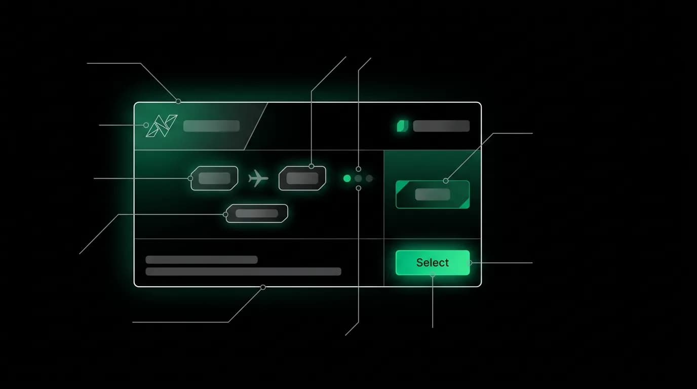
A flight card has 180 pixels of vertical space. In those 180 pixels, it needs to communicate six distinct pieces of information: airline, departure and arrival times, duration, number of stops, price, and cabin class. The user will evaluate this information in approximately eight seconds before deciding to swipe to the next card or tap "Select."
Every pixel earns its place or gets cut. There is no room for decoration, no space for secondary details, no margin for ambiguity. The flight card is the most information-dense component in the entire interface, and its design determines whether users book or keep scrolling.
Six data points, one glance
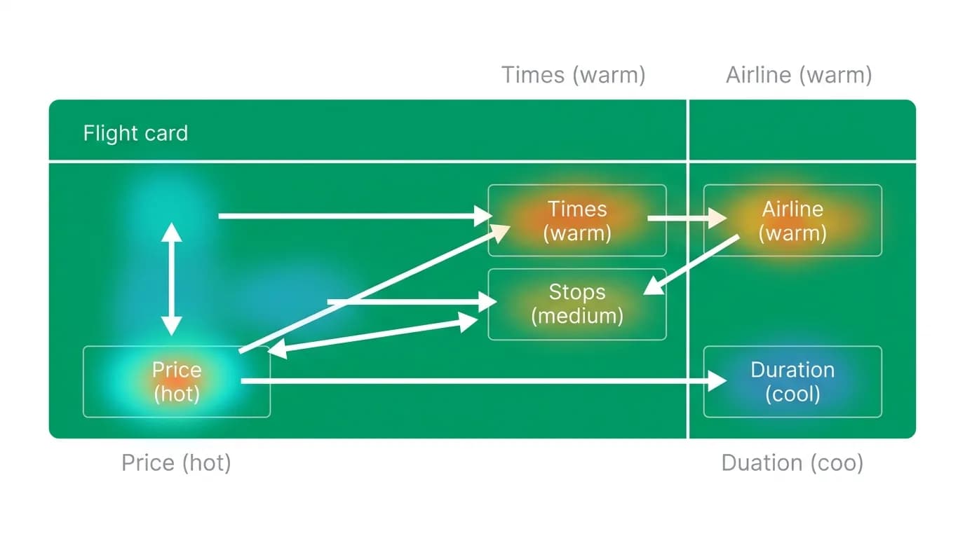
The hierarchy of the six data points follows user research on what travelers evaluate first when choosing a flight.
Price is the primary decision factor for most users. It sits in the top-right corner of the card, rendered in the accent green color at a larger font size than surrounding text. The eye naturally scans to the top-right, and the color difference makes the price pop against the surrounding white-on-dark text. The price is the first thing most users see on the card.
Departure and arrival times are the second most evaluated factor. They sit in the center of the card in a prominent position, formatted as a city-code-to-city-code timeline: "JFK 8:30 AM — NRT 12:45 PM+1." The "+1" indicates a next-day arrival, which is critical information on long-haul flights that users need to see immediately.
The airline name and logo occupy the top-left. The logo provides brand recognition at a glance — users have trust relationships with airlines, and a familiar logo anchors the option in reality. The logo is rendered at a size large enough to be recognizable but small enough to not dominate the card.
Duration sits below the time display as secondary supporting information. "14h 15m" tells the user how long they will be in transit. It is rendered in a smaller, secondary text color because while important, it is usually evaluated after price and times.
Number of stops uses a visual indicator rather than text. A green dot means nonstop. An amber dot means one stop. A red dot means two or more stops. This traffic-light system communicates stop count in a split-second visual scan without requiring the user to read text.
Cabin class is displayed as a small badge — "Economy," "Premium Economy," "Business" — in the bottom area of the card. It provides context for the price and helps users compare across cards when options span multiple cabin classes.
The "Select" button
The "Select" button is the single most important interactive element on the card. It needs to be large enough to tap easily (44 by 44 points minimum), positioned in the thumb-friendly zone (bottom-right), and colored to indicate it is the primary action.
We use the accent green for the "Select" button, matching the price highlight. This creates a visual connection between the number the user evaluated (price) and the action they need to take (select). The button text is concise — one word, no ambiguity about what happens when you tap it.
The button scales down to 0.97 on press with a 100-millisecond animation, providing tactile feedback that the tap registered. This micro-interaction is subtle but important — it confirms the user's action without introducing any delay in the response.
Time formatting and the timezone trap
Travel crosses time zones, and time display is where small design decisions create large confusion. We format times with explicit AM/PM indicators and timezone-implied labels. The departure time uses the origin city's local time. The arrival time uses the destination city's local time. If the arrival is on a different calendar day, a "+1" or "+2" suffix appears after the arrival time.
This seems obvious, but many travel interfaces get it wrong. Displaying times without clear day indicators on a red-eye flight can lead a user to think they arrive the same day when they actually arrive the next day. That misunderstanding could cascade into missed hotel check-ins and broken itineraries.
For multi-segment flights (connections), we show the full itinerary: departure from origin, arrival at connection, time at connection, departure from connection, arrival at destination. Each segment is rendered with its own local times. The connection duration is highlighted if it is unusually short (under 60 minutes) or long (over 4 hours), as both are material to the user's decision.
Visual differentiation across three cards
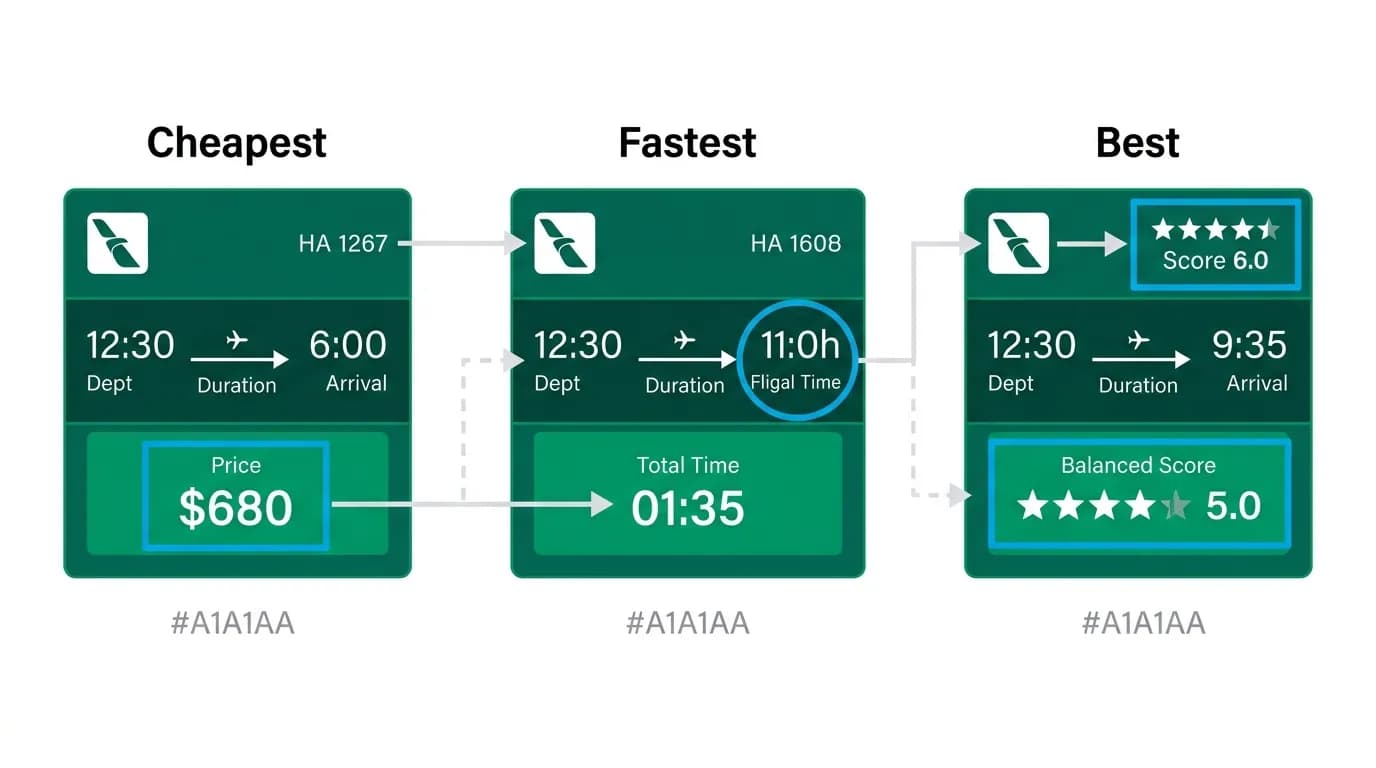
When three flight cards appear in a carousel, each needs to feel distinct. If all three look identical except for slight number differences, the user has to read carefully to compare. If each card has a visual identity, comparison becomes instant.
We achieve this through the card's primary emphasis. The cheapest option emphasizes price — the price text is slightly larger, and a "Cheapest" badge appears at the top of the card. The fastest option emphasizes duration — the duration text is promoted to a more prominent position, and a "Fastest" badge appears. The best overall option (balanced across factors) gets a "Recommended" badge with a subtle border highlight.
These badges create a Goldilocks framing: cheap, fast, best. The user does not need to compare six data points across three cards. They can start with "Am I optimizing for price, time, or balance?" and go directly to the relevant card.
Building a flight card with progressive enhancement
The flight card works at multiple levels of detail. At its simplest — airline, times, price, select button — it functions as a quick-decision tool for users who know what they want. At its richest — with fare class details, baggage allowance, seat map preview, and full cancellation policy — it serves users who need to verify every detail before committing.
The progressive enhancement happens through the review modal. The card shows the essential six data points. Tapping "Select" expands into the review modal, which reveals everything else. The card sells at a glance. The modal confirms on inspection.
This two-layer approach respects both the time-pressured user who wants to book quickly and the detail-oriented user who needs complete information before spending money. The card is the storefront. The modal is the showroom. Both are necessary. Neither alone is sufficient.
Nowah is an AI travel agent that searches and books real flights and hotels through conversation — no filters, no thirty open tabs. Plan your next trip.