Designing for Peak Travel Season: Performance Under Load
Summer and holidays flood travel apps with traffic. Optimistic UI, skeleton screens, graceful degradation, and queue communication keep the experience smooth when servers strain.
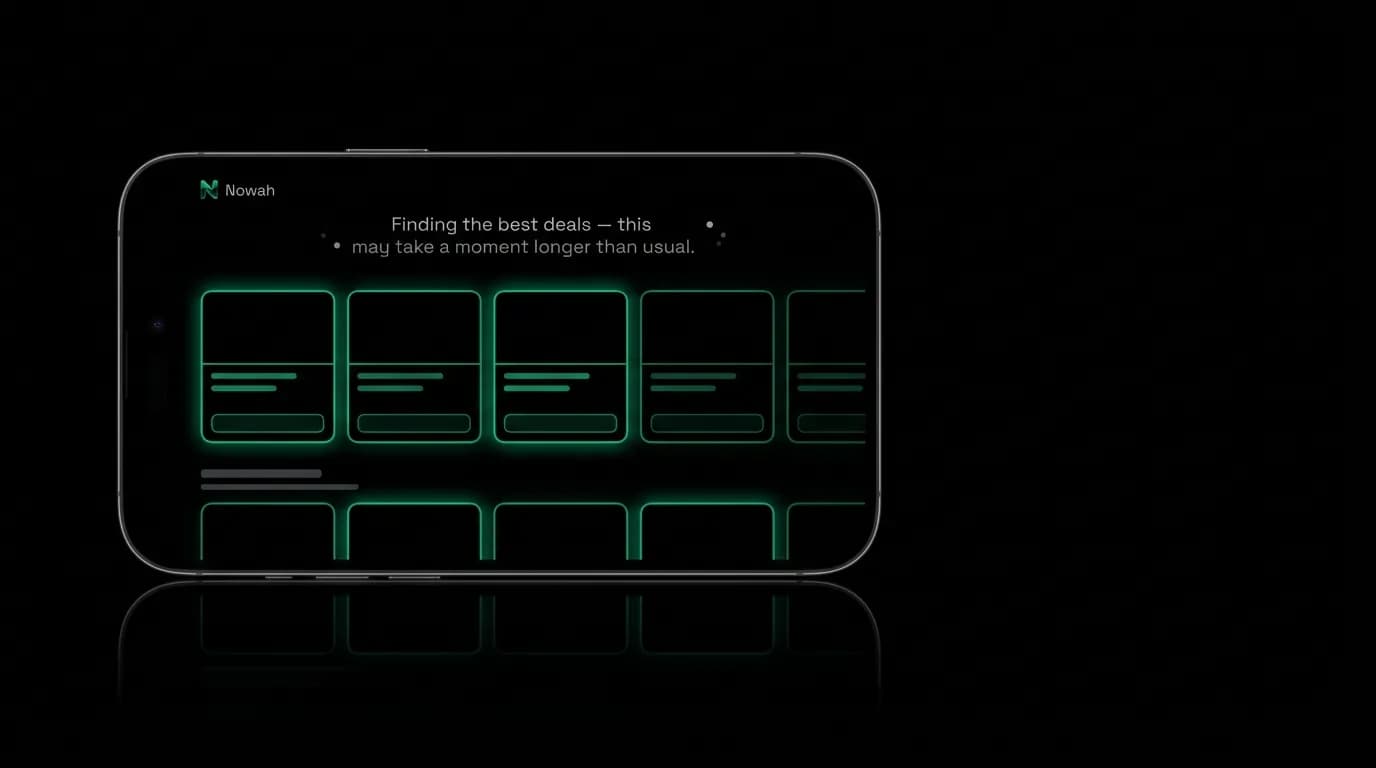
July 1st. The first day of summer for much of the northern hemisphere. Everyone searches flights at the same time. Travel apps that felt snappy in March now feel sluggish. API response times double. Search results take longer to appear. Booking confirmations take extra seconds.
Peak travel season is not just a backend engineering problem. It is a design problem. The interface needs to handle slower responses, partial data, and occasional failures without breaking the user's confidence. When the system is strained, the design must communicate "we are working on it" not "something is wrong."
Optimistic UI: show the action before the server confirms
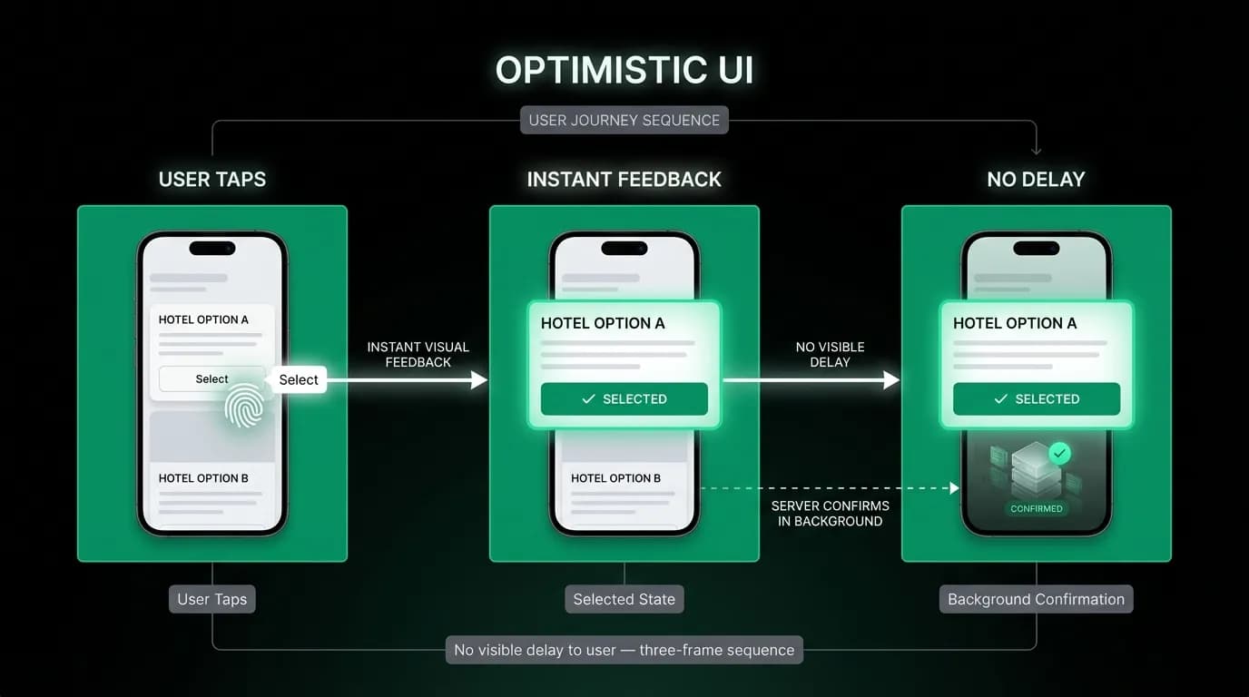
When a user taps "Select" on a flight card, the card should immediately show a selected state: a green border, a checkmark, a visual change that confirms the tap was registered. This happens before the server acknowledges the selection.
Optimistic UI assumes the server will confirm the action successfully, which it does in the vast majority of cases. By showing the result immediately, the user experiences zero latency. If the server subsequently returns an error, the UI reverts and shows an error message. But in the common case, the interaction feels instant.
For a travel app during peak season, when server response times might increase from 200 milliseconds to 2 seconds, optimistic UI is the difference between a responsive experience and one that feels broken. The user taps, sees the result, and moves forward. The server catches up in the background.
The caveat is scope. Optimistic UI works for low-risk, easily reversible actions: selecting a card, adding an item to a list, toggling a preference. It does not work for irreversible actions like confirming a booking or processing a payment. Those actions need actual server confirmation before showing success.
Skeleton screens: shaped content promises
When content takes longer to load than usual, skeleton screens maintain orientation. The user sees the shape of the content that is coming: rectangles where flight cards will appear, circles where profile images will load, lines where text will render.
During peak season, the loading phase is longer, which means skeletons are visible for longer. This is fine, as long as the skeleton communicates that content is actively loading. The pulsing animation (opacity cycling between 0.3 and 1.0 over one second) signals activity. A static gray rectangle signals nothing and might be mistaken for a broken element.
Skeletons should match the actual content shape as closely as possible. A skeleton for a flight card has rectangular placeholders at the exact positions where the airline name, times, price, and buttons will appear. When the real card replaces the skeleton, the transition feels natural because the layout does not shift.
Graceful degradation: what to show when APIs are slow
During peak load, external travel data APIs may respond slowly or partially. A flight search that normally returns results in 2 seconds might take 8 seconds. A hotel search might return results from two sources but time out on a third.
The design response is graceful degradation: show what you have, communicate what is still loading, and let the user proceed with partial results.
"I found 2 great options so far. Still checking one more source." This message tells the user that results are available now and more might come. They can start evaluating the available options while the system continues working.
The alternative, waiting for all sources to respond before showing anything, creates dead time that feels unacceptable during peak season. Users who stare at a loading screen for 10 seconds assume the app is broken and leave. Users who see partial results within 3 seconds stay engaged.
Queue communication
When demand exceeds capacity, some users will need to wait. The worst experience is waiting without information. The second worst is a generic "Please try again later" error. The right approach is honest, informative queue communication.
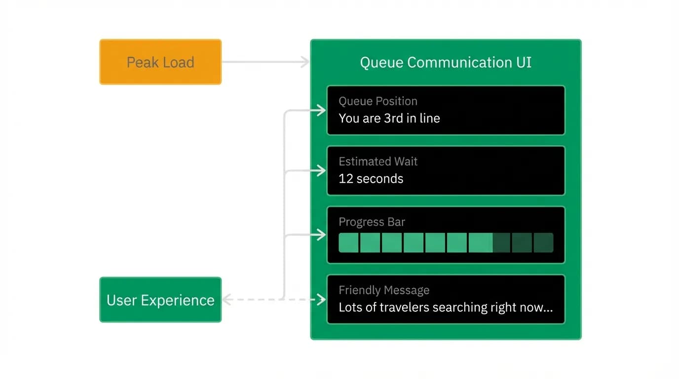
"Lots of travelers searching right now. You are 3rd in line. Estimated wait: 12 seconds."
This message tells the user three things: the delay is due to high demand (not a malfunction), their position in the queue (progress is being made), and the expected duration (it will not take long). All three pieces of information reduce anxiety.
The progress bar should update in real time. Moving from "3rd" to "2nd" to "1st" to "Your search is running" gives the user a sense of forward motion even during the wait. A static "please wait" message with no progress indicator creates indefinite anxiety.
Rate limiting communication
Rate limits protect the system during peak load, but they create user-facing errors that need careful design treatment. When a user hits a rate limit, the error message should explain rather than frustrate.
"You have been searching quickly. Give us a moment to catch up." This is better than "Too many requests. Error 429." The first message explains the situation in human terms and implies it is temporary. The second is technical jargon that makes the user feel punished.
Rate limit messages should include an estimated wait time and, ideally, an automatic retry. The user should not have to manually retry after a rate limit. The system should queue their request and execute it when capacity is available, with a progress indicator showing the wait.
Stress-testing your design
The time to discover how your interface handles peak load is not during peak load. Simulate high-latency conditions during development. Add artificial delays to API responses. Throttle bandwidth. Simulate partial failures. Watch how the interface behaves.
Every loading state should be tested at multiple durations: instant (under 300 milliseconds), short (1 to 3 seconds), medium (3 to 10 seconds), and long (over 10 seconds). Each duration should have appropriate UI treatment. If your design only looks good at the instant duration, it will only look good when servers are healthy, which is exactly when you least need good design.
The test environment should simulate the worst case: peak season, slow APIs, partial failures, rate limits. If the experience remains usable and trustworthy under those conditions, it will feel excellent when things are running smoothly.
Nowah is an AI travel agent that searches and books real flights and hotels through conversation — no filters, no thirty open tabs. Plan your next trip.