Loading States: The 8 Types You Need in an AI Travel App
Skeleton screens, streaming text, tool-use pills, search progress, booking processing, image loading, list pagination, and map tiles — each loading pattern serves a different purpose.
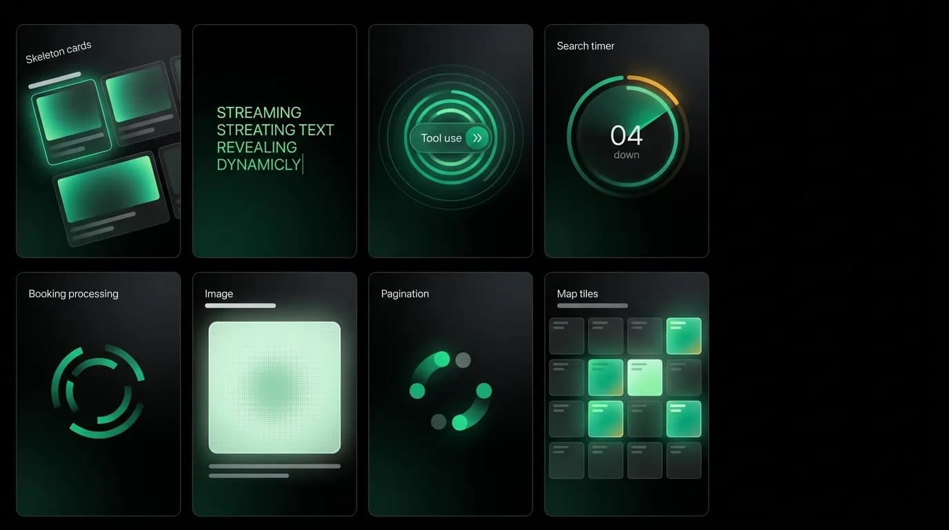
Loading is not one state. It is eight states, each addressing a different user anxiety, each requiring a different visual treatment. Treating all loading as a single spinner is like treating all pain with aspirin. It might help sometimes, but it is the wrong tool for most situations.
In an AI travel app, loading states are especially critical because the system does multiple kinds of work. The AI generates text. It searches external services. It processes bookings. It loads images. It fetches map data. Each operation has different expected durations, different user anxieties, and different design requirements.
Type 1: skeleton screens
When a screen or content area is loading its initial content, shaped placeholders pulse in place of the eventual data. The skeleton for a flight card looks like a flight card: rectangular blocks where the airline, times, and price will appear. The skeleton for a message list shows bubble-shaped blocks.
The pulse cycle runs at 1000 milliseconds, opacity alternating between 0.3 and 1.0. This creates a calm breathing rhythm that communicates "content is coming" without creating urgency or anxiety.
Skeletons work best for content that the user expects to see. The trip list screen has a skeleton because the user tapped on Trips and expects to see trips. The skeleton confirms that the system is fetching the expected content and gives the user a preview of the layout they will be navigating.
Type 2: streaming text
When the AI generates a response, text appears token by token at 30 milliseconds per token with an ease-out curve. This is fundamentally different from a loading state because the user is already consuming content while more content is being generated.
Streaming text reduces perceived wait time by a large share compared to block delivery. The user starts reading as soon as the first words appear, which means the "wait" is only the time before the first token, not the time for the full response.
A subtle pulsing indicator at the end of the streaming text shows that more content is coming. When the AI finishes generating, the indicator disappears. If the AI pauses mid-stream to call a tool, the indicator remains visible to maintain continuity.
Type 3: tool-use status pills
When the AI calls an external tool, a labeled status pill appears in the conversation: "Searching flights..." with an animated icon. The pill slides up over 200 milliseconds, matching the card entrance animation, and sits in the conversation timeline between the user's message and the AI's eventual response.
Tool-use pills address a specific anxiety: what is the AI doing right now? Without them, there is a gap between the user's message and the AI's response that feels like dead air. The status pill fills that gap with information: the AI is not stuck, it is actively doing something.
Different tools get different labels. Flight search, hotel search, checking availability, looking up visa requirements, converting currency. Each label tells the user specifically what work is in progress.
Type 4: search progress
Complex searches that query multiple sources take longer than simple lookups. When a search is expected to take more than a few seconds, a progress indicator shows elapsed time and optionally a search-stage label.
This is different from the tool-use pill because it addresses the anxiety of a longer wait. "Searching 3 airlines... 4 seconds" communicates that the search is active and complex, not stuck. The timer gives the user a sense of investment: the system has been working for a specific amount of time, which implies thoroughness.
Type 5: booking processing
The booking processing screen is the highest-stakes loading state. The user has committed money, and the system is working to secure the booking. This loading state uses a step-by-step animation: sequential checkmarks that draw themselves as each step completes.
Validating your details. Checkmark drawn. Securing your booking. Checkmark drawn. Confirming with the provider. Checkmark drawn.
Each step has a specific label, and the checkmark animation takes about 300 milliseconds per step. The sequential nature communicates progress, and the specific labels communicate what kind of work is happening. This is the loading state where users are most anxious, and the design treatment is the most detailed.
Type 6: image loading
Hotel cards and trip views include images that may take time to load. During loading, a colored placeholder appears in the image area. The placeholder matches the dominant color of the eventual image (if known from metadata) or uses a neutral dark gray.
Images load progressively when possible: a low-resolution preview appears first, then sharpens to full resolution. This technique is common across the web but particularly important in a chat context where images appear in cards that the user is evaluating for booking decisions.
Type 7: list pagination
When a list (trips, messages, search results) extends beyond the initial fetch, a pagination loading indicator appears at the bottom of the list as the user scrolls. This is a simple spinner or skeleton row that tells the user more content is being fetched.
The pagination loading state is the least anxious because the user already has content. They are scrolling to see more, not waiting for the first result. A subtle spinner is sufficient.
Type 8: map tile loading
Map cards load their tiles progressively. The map area appears immediately with the correct bounds and pin positions, but the tile imagery loads in chunks. Tiles that are visible first load first. Tiles at the edges load last.
Map loading is unique because the functional elements (pins, labels) can render before the geographic imagery. The user sees where the hotels are positioned relative to each other immediately, even if the street map behind them is still loading.
Matching loading to anxiety
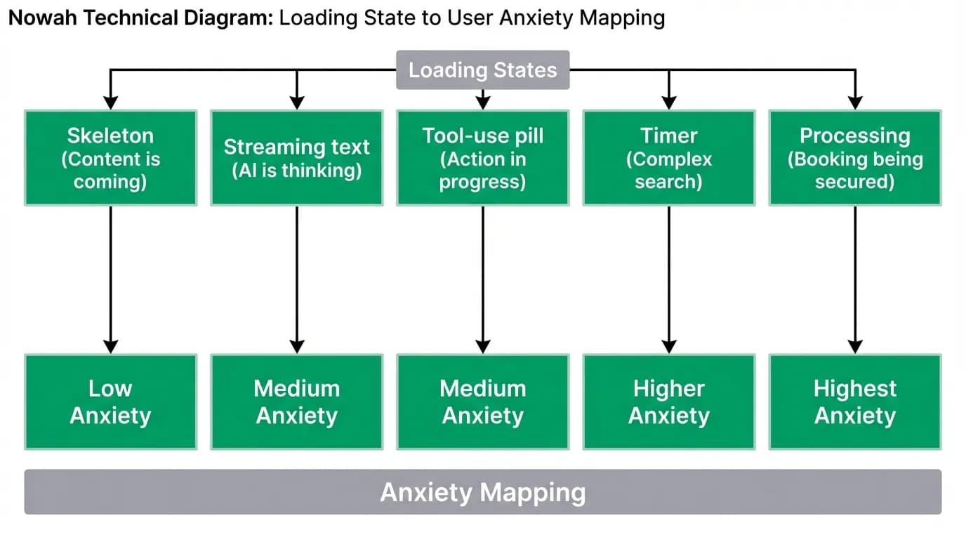
The design treatment for each loading type matches the anxiety it addresses. Higher anxiety gets more detailed, informative feedback. Lower anxiety gets lighter treatment.
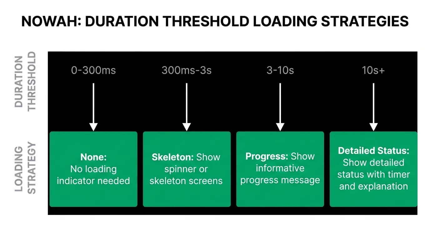
Under 300 milliseconds: no loading indicator needed. The response feels instant. Three hundred milliseconds to three seconds: skeleton or spinner. Quick acknowledgment that work is happening. Three to ten seconds: informative progress with labels or steps. The user needs to know what is happening and that progress is being made. Over ten seconds: detailed status with timer and explanation. The user needs to understand why this is taking time and what they can expect.
Stay informative during long waits. Never cute. A pun during a ten-second booking confirmation is the wrong tone entirely. The user has money on the line. Treat their anxiety with clarity, not cleverness.
Nowah is an AI travel agent that searches and books real flights and hotels through conversation — no filters, no thirty open tabs. Plan your next trip.