Mobile-First AI: Designing Agent Interactions for Small Screens
375 pixels wide, thumb zones that dictate navigation, keyboard management for chat — mobile AI design has constraints that create better products.
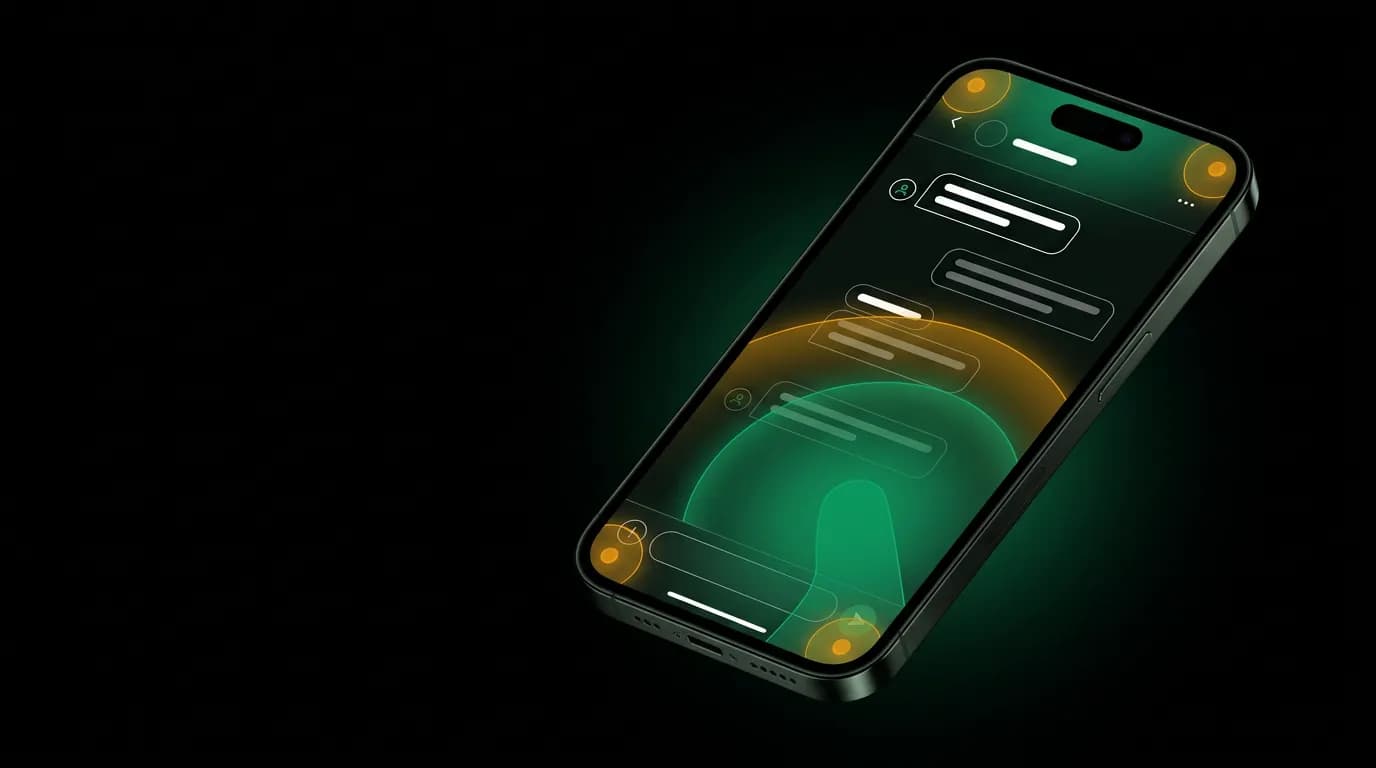
The phone in your pocket has a screen that is roughly 375 pixels wide. That is the canvas for an AI travel agent that needs to display conversations, flight comparisons, hotel photos, booking summaries, and payment flows. Every travel app that was designed for desktop first and then squeezed onto mobile feels it. Filter sidebars that collapse into hamburger menus. Results grids that become endless scrolling lists. Multi-column layouts that stack into single-column towers of information.
We designed Nowah for mobile first. The phone screen is our primary surface. Desktop is the adaptation, not the other way around. This inverted priority changes everything about how we design AI interactions, and we believe it produces a better product on every screen size.
About 60% of millennial and Gen Z travelers prefer booking on their phones. Mobile travel bookings account for roughly 45% of all online bookings and grow about 15% annually. Designing for mobile is not about supporting a secondary use case. It is about designing for the majority.
Screen real estate demands ruthless hierarchy
On a desktop, you can afford to be generous with space. A flight card can show twelve data points. A sidebar can display filters while results fill the main area. Multiple panels can coexist. You have 1440 pixels of width to work with.
On a phone, you have 375 pixels. Minus the system margins, the safe area insets, and the chat message padding, you have roughly 320 pixels for content. That is the width of a playing card held vertically. Everything that matters about a flight option needs to fit in that space.
This constraint forces a design discipline that desktop-first products never develop. You cannot show everything. You have to choose. And choosing means deciding what information users need at this moment versus what they can get with a tap.
For our flight cards, this produced the three-tier hierarchy that we wrote about in our card design post. Primary info (price, schedule) is visible at a glance. Secondary info (airline, stops) is visible on the card. Tertiary info (baggage, cancellation, seat configuration) is behind a tap. On desktop, you might show all three tiers at once. On mobile, the hierarchy is enforced by physics.
The same discipline applies to every element in the chat. AI text responses are constrained to comfortable reading widths. Action buttons are sized for tap targets (44 points minimum). Booking summaries prioritize the total price over the line-item breakdown. Every screen asks: what is the one thing the user needs to see right now?
This ruthlessness makes the product better on desktop too. When we adapted Nowah for the web, the mobile-optimized components scaled up gracefully. Clean hierarchy on a small screen becomes even cleaner hierarchy on a large screen. But the reverse is not true. Desktop-optimized components crammed onto mobile feel cluttered and compromised.
Thumb zones and navigation
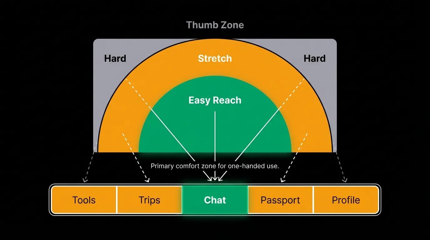
Steven Hoober's research on mobile ergonomics showed that people primarily use their phones one-handed, with the thumb doing most of the tapping. The thumb's comfortable reach zone is an arc at the bottom-center of the screen. Top corners are hard to reach. Bottom center is easy.
This is why the chat tab is the center tab in Nowah's navigation. The five-tab bar sits at the bottom of the screen: Tools, Trips, Chat, Passport, Profile. The center position puts Chat in the thumb's natural resting zone. The user can access the primary function of the app without stretching, shifting their grip, or using a second hand.
This is not a cosmetic decision. It affects usage patterns. The center tab gets more taps than edge tabs purely because of physical ease. For an AI-first product where the chat is the core interaction, placing it where the thumb already is means users default to the chat. They do not need to think about where to go. Their thumb is already there.
The chat input bar sits at the very bottom of the screen, above the tab bar, in the deepest comfort zone. Typing a message requires zero reaching. The send button is to the right of the input field, accessible with a slight thumb extension. The voice input button is to the left. Both are within the natural thumb arc.
We spent time thinking about what goes at the top of the screen (the hard-to-reach area). The answer: things you read but rarely tap. The conversation history scrolls upward. The AI's messages, the flight cards, the booking confirmations, they all live in the scroll area above the input. You read them by scrolling (a comfortable downward thumb motion) but you rarely need to tap them precisely. Tapping happens at the bottom: input, send, quick actions, card buttons.
Keyboard management for conversational input
The keyboard is the biggest screen-space challenge in mobile chat design. When the keyboard is visible, it consumes roughly 40-50% of the screen. The chat area shrinks dramatically. If the design does not handle this well, critical content gets obscured.
When the user taps the text input and the keyboard appears, the conversation scrolls up to keep the latest messages visible above the keyboard. The input field stays pinned just above the keyboard. The tab bar disappears. This maximizes the visible chat area during active conversation.
When the user sends a message and the AI starts responding, we keep the keyboard open. This is a deliberate choice that differs from most chat apps, which dismiss the keyboard after each send. In a conversational AI flow, the user is likely to send follow-up messages. "What about direct flights?" "Can you check a day earlier?" Keeping the keyboard open reduces the friction of the back-and-forth.
When the AI presents flight or hotel cards with action buttons, the keyboard should not block those buttons. If the cards appear while the keyboard is visible, we animate the conversation scroll so the card buttons are visible above the keyboard. If the user taps an action button (like "Book this flight"), we dismiss the keyboard to give the full screen to the booking flow.
Voice input changes the keyboard equation. When the user taps the voice button, the keyboard does not appear at all. Instead, a compact recording interface appears at the bottom. The conversation remains fully visible. For travel queries, voice is often faster and more natural than typing. "Find me a flight to Barcelona next Thursday morning, direct if possible, under $600" takes three seconds to say and thirty seconds to type. Mobile users, especially those traveling and typing with one hand on a moving train, benefit enormously from voice input.
Notification-driven reengagement
On desktop, you can leave a tab open. On mobile, the app closes when the user leaves. The primary reengagement mechanism is push notifications, and for a travel AI agent, notifications are not just marketing tools. They are product features.
Travel app push notifications see engagement rates between 8% and 12%, which is higher than most app categories because travel notifications tend to be personally relevant. "Your flight to Paris departs tomorrow" is not spam. It is useful information.
We use notifications as entry points back into the conversation. A notification about a flight delay does not just inform the user. Tapping it opens the chat with the AI ready to discuss alternatives. A notification about a price drop on a tracked route opens the chat with the search already performed and options ready to view. The notification is not a dead-end alert. It is the beginning of the next interaction.
The notification itself is designed for the lock screen, which is the smallest "screen" we design for. Lock screen notifications need to communicate the key information in one or two lines without the user needing to unlock the phone. "Your LAX to NRT flight dropped $187. Tap to see options." Complete information. Clear action. No app required to understand the message.
We batch notifications to avoid notification fatigue. Multiple updates about the same trip are combined. "3 updates about your London trip" with a single tap to see all three is better than three separate notifications in three minutes. The AI's intelligence applies to notification delivery too: timing, frequency, and bundling are all managed to maintain a high signal-to-noise ratio.
Widget integration
Widgets extend the AI agent's presence beyond the app to the phone's home screen. Travel is a category where at-a-glance information is genuinely useful, and widgets provide it without opening the app.
Our trip widget shows the next upcoming trip: destination, departure date, countdown in days, and flight time. A user with a trip in five days sees "Barcelona in 5 days, UA 1234 departing 8:15 AM" every time they glance at their home screen. This passive reminder keeps the trip top-of-mind and reduces the need to open the app just to check dates.
The widget also updates with real-time information as the trip approaches. On travel day, it shows the flight status, gate number, and boarding time. This turns the home screen into a real-time travel companion.
Widgets are particularly valuable for the five-to-eight-minute micro-sessions that characterize mobile travel app usage. Users do not always have time for a full conversation with the AI. Sometimes they just want to glance at their trip status. The widget serves this use case without requiring the user to open the app, find the trip, and locate the information.
What desktop-first travel apps lose on mobile
Most travel apps were designed for desktop and adapted for mobile. The adaptations are universally compromises.
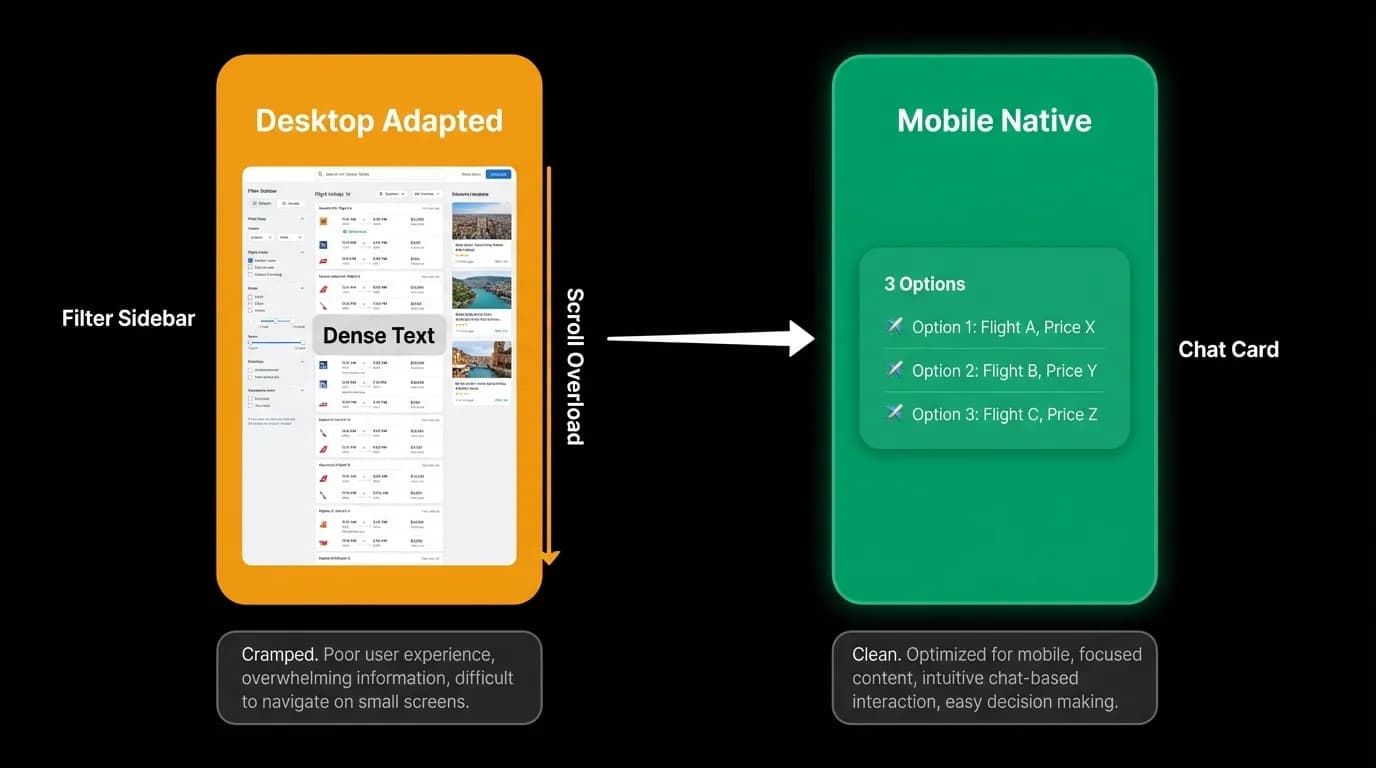
Filter sidebars do not work on phones. Expedia's mobile app puts filters behind a button at the top of the results page. Tapping it reveals a full-screen filter panel with dozens of options: airlines, stops, times, airports, price range. It is functional but slow. Each filter requires taps to open, select, and apply. Applying filters dismisses the panel and reloads results. The back-and-forth between filters and results is tedious on mobile in a way it is not on desktop, where the sidebar and results coexist.
Results grids become scroll marathons. Google Flights' desktop interface shows a timeline view with flights distributed across a visual schedule. On mobile, this becomes a list. Scroll, scroll, scroll. Twenty results. Forty results. The user scrolls past good options because they blend into the infinite list.
Multi-step checkout flows that work on desktop (where the user can see their cart summary alongside the checkout form) become sequential screen transitions on mobile. Each step is a full-screen page. Context from previous steps is invisible. The experience feels fragmented.
Conversational AI avoids all of these problems because the interface paradigm is natively mobile. Chat is vertical. It scrolls naturally. It does not require sidebars, grids, or multi-panel layouts. A conversation thread works identically on a 375-pixel phone and a 1440-pixel desktop. The content is the same. The layout is the same. Only the spacing changes.
This is the deepest argument for conversational AI interfaces on mobile: the conversation paradigm is native to the phone screen in a way that search-and-browse paradigms are not. Phones are designed for vertical scrolling of sequential content. Chat is vertical scrolling of sequential content. The fit is natural.
Mobile constraints as design catalysts
Constraints produce better design. This is a truism in design circles, but it is literally true for mobile AI products.
The 375-pixel width constraint forced us to design flight cards with a ruthless information hierarchy. That hierarchy turned out to be better for decision-making on every screen size. Users do not want twelve data points on desktop either. They want the three that matter.
The thumb-zone constraint forced us to put the primary action at the bottom center of the screen. That placement turned out to be the right default for every screen size. The primary action should always be the easiest to reach.
The keyboard constraint forced us to think carefully about when text input is needed versus when tap or voice input is better. That thinking produced a more efficient interaction model on every platform. Not every user input needs to be typed.
The notification constraint forced us to design information delivery that works in two lines on a lock screen. That conciseness turned out to be the right communication style for travel updates everywhere. Nobody wants a four-paragraph notification about a gate change.
Mobile-first AI design does not mean compromising for small screens. It means letting small screens reveal what actually matters. And what actually matters, clear hierarchy, easy access, efficient input, concise communication, turns out to be what users want regardless of screen size.
We started with 375 pixels. Everything we built for that canvas works better than what we would have built if we started with 1440 pixels and then tried to shrink it down. The constraint was the catalyst. The phone screen taught us what a travel AI agent should look like, and the lesson applies everywhere.
Nowah is an AI travel agent that searches and books real flights and hotels through conversation — no filters, no thirty open tabs. Plan your next trip.