A Motion Design System for AI Interfaces
Seven motion patterns — streaming text, card entrances, tab transitions, modals, button presses, confirmations, and loading states — each with specific timing, curves, and purpose.
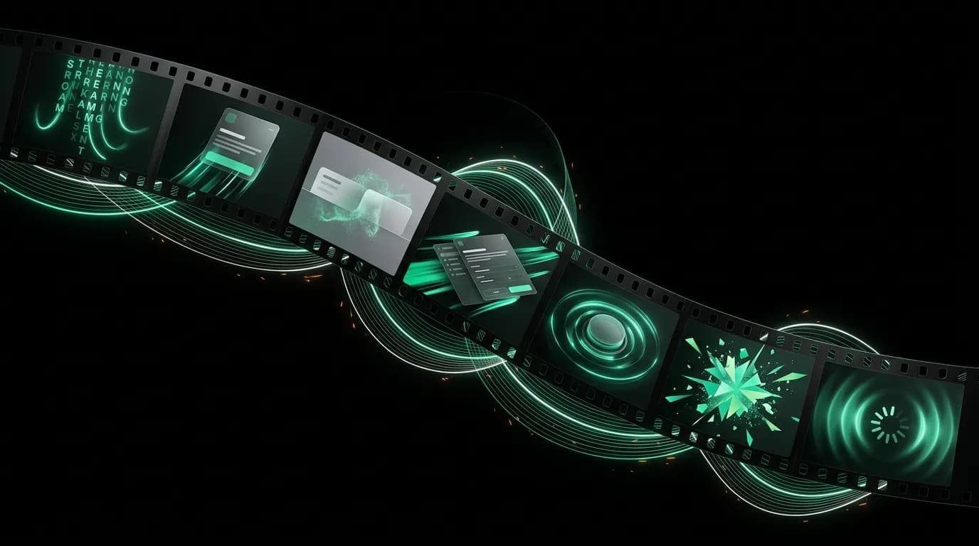
Every animation in a product should be able to answer one question: what state does this communicate? If the answer is "it looks nice," the animation does not belong. If the answer is "it tells the user that the system is processing their request" or "it confirms that the action completed successfully," then it earns its milliseconds.
This is especially true in AI interfaces where the system's internal state is invisible by default. A search engine returns results or it does not. An AI agent might be thinking, searching, comparing, validating, or generating all in the span of a few seconds. Without motion design, the user sees nothing happening and assumes the worst.
We use seven motion patterns across our interface. Each one has a specific purpose, timing, and animation curve. Together they form a motion design system that communicates state consistently and keeps the user oriented through complex, multi-step AI interactions.
Streaming text: 30ms per token, ease-out
When the AI generates a response, text appears token by token in the chat bubble. The timing is 30 milliseconds per token with an ease-out curve, which creates a reading rhythm that feels natural. Not so fast that the user cannot follow along, not so slow that it feels artificially delayed.
This pattern serves multiple purposes. It reduces perceived wait time because the user starts reading as soon as the first words appear, rather than staring at a blank space for several seconds. It builds trust because the user can see the AI "working" in real time. And it creates a conversational rhythm that makes the interaction feel like talking to someone rather than querying a database.
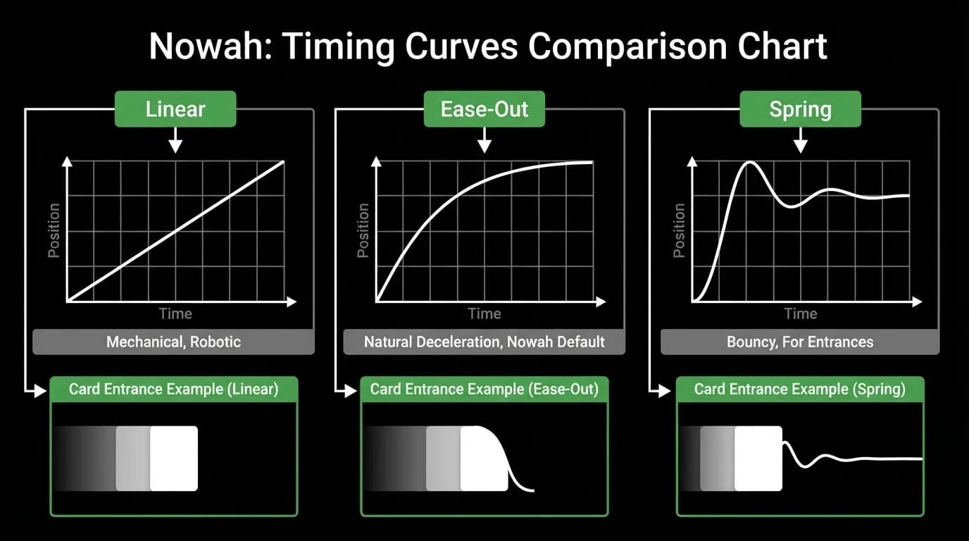
The ease-out curve matters. Linear token display feels mechanical, like a typewriter. Ease-out gives each token a slight deceleration that mimics the natural pace of speech, where words arrive in bursts rather than at a metronomic rate.
Card entrances: slide up plus fade in, 200ms, spring curve
When the AI finds flights or hotels, the result cards animate into the conversation. They slide up from below and fade in simultaneously over 200 milliseconds using a spring curve.
The slide-up communicates spatial arrival. The cards are coming from somewhere, entering the conversation as new objects rather than appearing out of nowhere. This gives the user a split-second to register that new content has arrived before they need to process it.
The spring curve adds a subtle physical quality. The card overshoots its final position slightly and settles back, like a physical object coming to rest. This takes the motion from feeling digital to feeling tangible, which matters when the cards represent real flights and hotels with real money attached.
Two hundred milliseconds is the sweet spot. Faster and the entrance is barely perceptible. Slower and it starts to feel like a delay. At 200ms with a spring curve, the entrance is noticeable enough to draw attention but quick enough to not impede the flow of conversation.
Tab transitions: cross-fade, 150ms
Switching between tabs uses a simple cross-fade over 150 milliseconds. This is deliberately understated. Tab switching is a frequent, utilitarian action. The user wants to move from chat to trips or from trips to profile. They do not need a dramatic transition to tell them that happened. They need confirmation that it happened, and then they need to be looking at the new content.
The cross-fade provides that confirmation without stealing attention. The old content fades out as the new content fades in. It takes 150 milliseconds, which is fast enough to feel instant but slow enough to avoid a jarring snap between states.
We specifically avoided slide transitions for tabs. Horizontal slides imply that the tabs are arranged spatially and that you are moving between adjacent panels. This creates an expectation that swiping should also work, which introduces navigation complexity. Cross-fade is directionless. It simply says "you are now somewhere different."
Modal presentations: slide up from bottom, 300ms, spring curve
When the user taps Select on a flight card and the review modal appears, it slides up from the bottom of the screen over 300 milliseconds with a spring curve. This is the most deliberate motion in the system because it represents the most significant state change: the user is moving from browsing to committing.
The upward slide from the card's position maintains spatial continuity. The user tapped something at a specific location on screen, and the detailed view emerged from that location. There is a visual connection between the action and its result.
The 300-millisecond duration is longer than card entrances because the modal demands more attention. It carries the full booking review, fare rules, cancellation policy, and traveler information. The user needs a beat to shift their cognitive mode from "comparing options" to "reviewing details." The animation provides that beat.
The spring curve keeps it from feeling slow. Without the spring, 300 milliseconds of linear motion would feel sluggish. The spring adds velocity at the start and a natural settle at the end, making the transition feel responsive even at a longer duration.
Button presses: scale to 0.97, 100ms
When a user presses a button, it scales down to 97% of its original size over 100 milliseconds. This is the fastest and smallest motion in the system, and it serves the most fundamental purpose: confirming that the system registered your input.
The 3% scale reduction is barely visible in isolation, but it provides critical tactile feedback. Combined with a light haptic on supported devices, it creates the sensation of pressing a physical button. The screen yields to your touch, confirming that something happened.
One hundred milliseconds is important here. Any longer and there is a perceptible delay between the tap and the response, which creates doubt. At 100ms, the feedback is effectively instantaneous. Press, feel the button depress, see the result. The chain is unbroken.
Success confirmations: burst animation plus haptic, 400ms
When a booking completes successfully, a burst animation plays over 400 milliseconds, accompanied by haptic feedback on supported devices. This is the most emotionally expressive motion in the system, and it is reserved exclusively for moments of genuine completion.
The burst communicates finality and celebration. You just booked a trip. That is a significant moment. The animation acknowledges it with visual energy that matches the emotional energy of the accomplishment. A subtle checkmark drawing itself, a ring expanding outward, a brief flash of color.
Four hundred milliseconds gives the burst room to breathe without overstaying its welcome. It is long enough to register as a moment, short enough to not delay the user from seeing their confirmation details. The haptic feedback adds a physical dimension that screens alone cannot provide.
We are careful about where this animation appears. Only completed bookings. Not successful searches, not form submissions, not navigation actions. If everything gets a burst, nothing feels special. The motion earns its impact through restraint.
Loading states: pulse opacity 0.3 to 1.0, 1000ms cycle
When content is loading, placeholder elements pulse between 30% and 100% opacity on a 1000-millisecond cycle. This is the longest-running animation in the system, and its purpose is purely communicative: something is coming, the system has not forgotten about you, please wait.
The pulse rate matters. Too fast and it creates anxiety. Too slow and it looks frozen. One thousand milliseconds per cycle hits a calm, steady rhythm that communicates "working on it" without urgency or alarm.
We use shaped skeletons rather than generic spinners. The loading placeholder for a flight card is shaped like a flight card. The placeholder for a message bubble is shaped like a message bubble. This gives the user a preview of what is coming, setting spatial expectations before the content arrives.
Cataloging motion into a reusable system
Seven patterns is enough to handle every interaction in the product. That constraint is intentional. Every new animation we consider gets evaluated against the existing seven. Does it fit one of these patterns? If yes, use the established timing and curve. If no, is the use case genuinely new enough to warrant an eighth pattern?
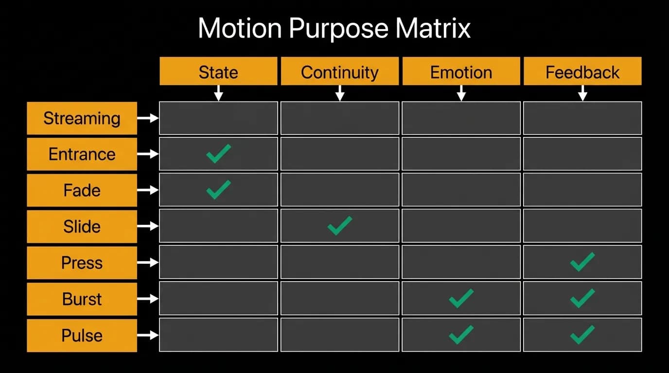
Almost always, the answer is no. The seven patterns cover state communication (loading, streaming), spatial continuity (card entrances, modals), input confirmation (button presses), and emotional acknowledgment (confirmations). Those four categories encompass essentially every reason to animate anything in a product interface.
The system is documented with exact values: durations in milliseconds, scale factors as decimals, opacity ranges as percentages, curve types by name. Any engineer can implement any animation in the system by looking up the values. No interpretation required. No "make it feel right." The feeling has been designed, specified, and codified.
This is what separates a motion design system from a collection of animations. The system is consistent, predictable, and purposeful. Every movement tells the user something they need to know.
Nowah is an AI travel agent that searches and books real flights and hotels through conversation — no filters, no thirty open tabs. Plan your next trip.