The Thinking Indicator: Most Important Animation in AI UX
Three pulsing dots carry the entire weight of user trust during AI processing. Get the thinking indicator wrong and users assume the app is broken.

Three dots. Pulsing gently in the space where the AI's response will appear. They are the smallest, simplest animation in the entire interface. They are also the most important.
The thinking indicator carries the full weight of user trust during the gap between "message sent" and "response received." Get it wrong — too fast, too slow, absent, or ambiguous — and users assume the app is broken. Get it right, and users wait patiently because they know the AI is working.
This is not an exaggeration. The thinking indicator is the difference between a user who waits 15 seconds for a flight search to complete and a user who abandons at 5 seconds. Same search time. Entirely different experience.
The dots that hold the conversation together
When a user sends a message, the response is not instant. The AI needs to process the request, possibly call one or more tools (searching flights, checking hotel availability), and compose a response. This takes anywhere from one to fifteen seconds depending on complexity.
During that gap, the user has no signal that anything is happening unless you give them one. A blank screen with no feedback after 300 milliseconds feels broken. Humans perceive delays above 300 milliseconds as pauses, and pauses without explanation feel like failures.
The thinking indicator appears immediately — within 200 milliseconds of the user sending their message. It communicates one thing: "I heard you, and I am working on it." That single signal buys patience for the rest of the processing time.
Dots versus text versus progress bar
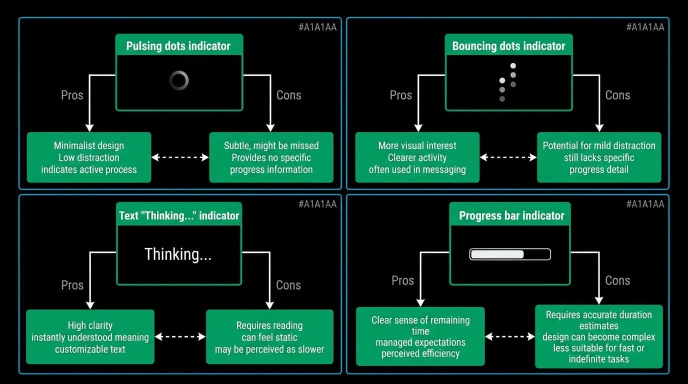
There are several approaches to thinking indicators, each with different strengths.
Pulsing dots are familiar from messaging apps. They say "someone is typing" — a metaphor that maps well to an AI composing a response. The dots are compact, unobtrusive, and universally understood. They work best for short to medium wait times (1 to 8 seconds).
Text indicators like "Thinking..." or "Searching..." are more specific. They tell the user not just that the AI is working but what it is working on. This specificity is useful for longer operations where the vague reassurance of dots is not enough.
Progress bars communicate percentage completion and work well for operations with known durations. They are poorly suited to AI responses where the duration is unpredictable — a progress bar that stalls at 60% for five seconds is worse than no progress bar at all.
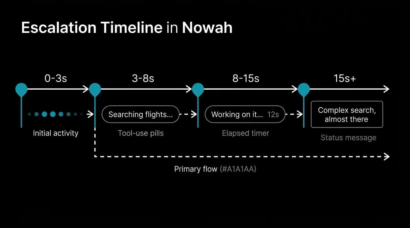
We use a layered approach. The base indicator is pulsing dots. For operations that involve tool calls, we add specific tool-use pills. For long operations, we add an elapsed time display. Each layer builds on the previous one as the wait time increases.
The danger zone: 5 seconds, 15 seconds, 30 seconds
User patience degrades in predictable stages. Zero to three seconds is comfortable — the dots pulse, the user waits, no concern. Three to eight seconds enters attention drift — the user starts wondering how long this will take. Eight to fifteen seconds is the danger zone — without additional feedback, users begin to doubt whether the operation is progressing. Beyond fifteen seconds, abandonment risk climbs sharply.
Our escalation strategy matches these stages. At zero to three seconds, pulsing dots alone. At three to eight seconds, a tool-use pill appears with a specific label: "Searching flights to Tokyo..." The pill converts the vague dots into a specific, understandable action. At eight to fifteen seconds, an elapsed timer appears: "Working on it... 12s." The timer gives the user a concrete sense of progress even when percentage completion is unknown. Beyond fifteen seconds, a status message appears: "This is a complex search. Almost there."
Each escalation level provides more information. The user never has to guess what is happening. They are given progressive detail as their patience is tested, which maintains trust through even the longest operations.
Pulsing, bouncing, or fading
The motion style of the dots matters more than you would expect. We tested three approaches: dots that pulse in opacity (our choice), dots that bounce vertically, and dots that sequence left to right with a wave effect.
Pulsing opacity (cycling between 30% and 100% over 1000 milliseconds) reads as calm and continuous. It suggests steady work happening in the background. The slow cycle rate does not draw excessive attention but maintains visibility. It is the least distracting option for contexts where the user might be reading previous messages while waiting.
Bouncing dots are more playful and attention-grabbing. They work well for short waits but become annoying during longer operations. The repetitive vertical motion creates a "watching a clock tick" effect that amplifies perceived wait time rather than reducing it.
Sequential wave dots are the most visually interesting but also the most distracting. They pull focus strongly, which is counterproductive when the user should be re-reading the conversation context or considering their next message.
We chose pulsing opacity because the thinking indicator should reassure without distracting. It is a background signal, not a foreground attraction.
Implementing escalating specificity
The implementation layers three components. The base thinking indicator component renders pulsing dots and appears immediately on message send. The tool-use pill component renders a labeled status pill and appears when the AI invokes a tool. The elapsed-time component renders a timer that starts counting after eight seconds.
All three components stack vertically in the space where the AI's response will appear. As each appears, it pushes the others up slightly, creating a growing "activity log" that shows the user exactly what the AI is doing.
When the response begins streaming, all indicator components fade out over 200 milliseconds and are replaced by the streaming text. The transition is seamless — the indicators were occupying the response space, and the response replaces them naturally.
Three pulsing dots. They are so simple they barely qualify as animation. They are so important that removing them would break the product. Design your thinking indicator first, test it at every wait duration your product produces, and escalate specificity as the wait time grows. The user's trust depends on it.
Nowah is an AI travel agent that searches and books real flights and hotels through conversation — no filters, no thirty open tabs. Plan your next trip.