Why Our Dark Theme Is a Product Decision, Not Aesthetic
Pure black backgrounds, green accent colors, and OLED optimization — our dark theme is driven by user behavior data, not design trends.
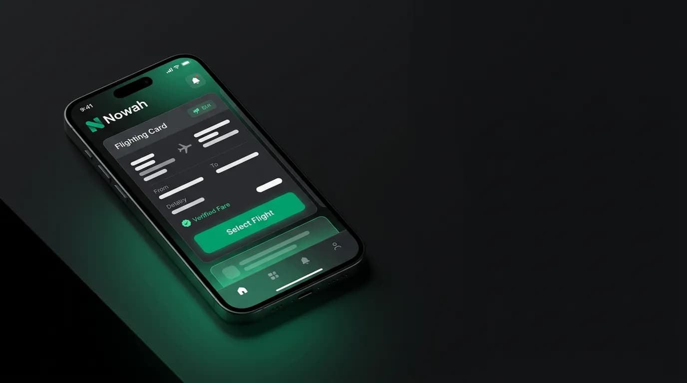
When we showed early Nowah prototypes to people, one of the first things they noticed was the dark theme. Pure black background, green accent color, white text. The reaction split cleanly: some people said "it looks beautiful" and others asked "where's the light mode toggle?"
There isn't one. Nowah is dark-only. And that decision had nothing to do with aesthetics or following design trends. It came from three specific observations about how people use travel apps.
OLED optimization is a battery and perception story
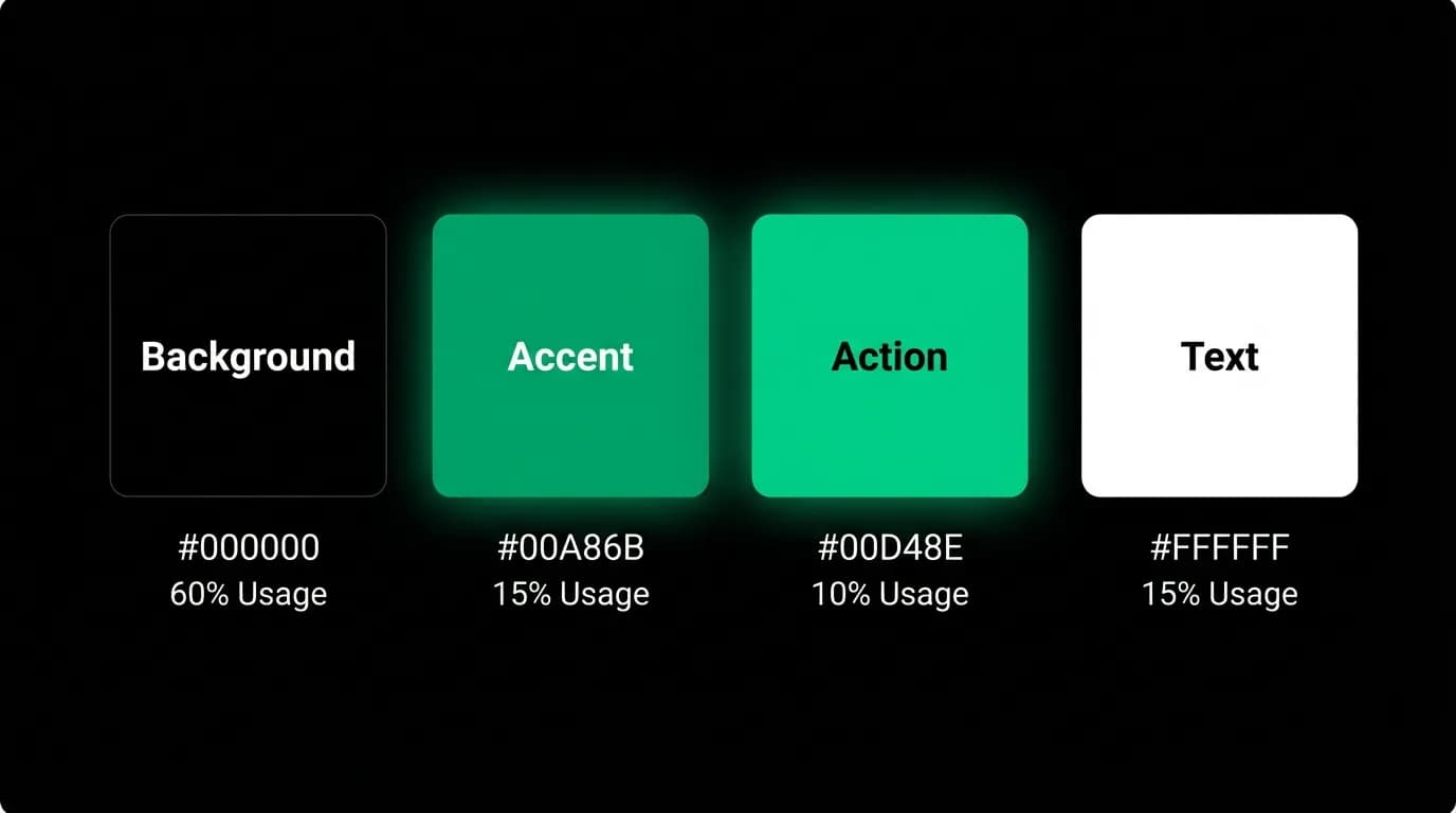
Over 50% of smartphones now ship with OLED screens. On OLED displays, black pixels are literally turned off — they emit no light and consume no power. A pure black background (#000000) on an OLED screen uses measurably less battery than a dark gray (#1a1a1a) and dramatically less than white (#ffffff).
This matters more than it might seem. Travel apps have average session durations of five to eight minutes. But trip planning-trip-planning-ai-shines) sessions can stretch much longer — people research for 20 or 30 minutes at a time, especially in the days before a trip. And travelers checking their app throughout a trip day might open it a dozen times. On OLED screens, the cumulative battery savings from a pure black background are meaningful.
But the perception story matters more than the battery story. OLED black creates an effect where the content — flight cards, hotel images, map elements — appears to float over an infinite dark surface. The screen boundary disappears. The phone becomes a window into the content rather than a white rectangle displaying it.
This is why luxury brands have historically favored dark backgrounds. The dark surface recedes and the product comes forward. For a travel app displaying rich content like destination photos, flight cards with airline logos, and interactive maps, the dark background makes everything else pop.
Late-night booking patterns
Here's the data point that sealed the decision. Most travel research happens in the evening. People plan trips after work, after dinner, lying in bed. The booking session at 10:30 PM scrolling through flight options is practically a cultural ritual at this point.
A bright white interface at 10:30 PM is physically uncomfortable. It's a flashlight pointed at your face in a dark room. Every travel app with a white default theme is torturing its users during their peak usage hours.
Yes, iOS and Android have system-level dark mode that some apps respect. But "respecting system dark mode" and "designing for dark from the ground up" are very different things. An app designed light-first and then darkened often has contrast issues, illegible text, or images that clash with the dark background. When you design dark-first, every element is optimized for that context.
We designed for the 10:30 PM use case because that's when most of our users are there.
The psychology of dark interfaces
Dark interfaces affect perception in ways that go beyond comfort. Research on interface psychology suggests a few patterns.
Dark backgrounds are associated with premium products. Open the apps for financial services, luxury goods, and professional tools — disproportionately dark. Open social media, casual games, and shopping apps — disproportionately light. The association isn't random. Dark interfaces signal seriousness and focus, which matches what you want when you're about to spend $2,000 on a trip.
Dark backgrounds also reduce visual noise. On a white screen, every UI element competes for attention. Borders, shadows, background colors, icons — they're all visible and each one draws the eye. On a dark screen, non-essential elements recede and the important content (the flight card you're comparing, the hotel photo you're examining) dominates your attention.
For a product where the primary interaction is a chat conversation, dark backgrounds have another benefit: they make the text conversation feel intimate and focused, like a direct message rather than a form. The chat thread reads naturally against a dark surface.
Green as the action color
Our primary accent color is #00A86B — a specific shade of green. This wasn't chosen from a brand mood board. It was chosen for functional reasons.
Green means "go." In traffic lights, in financial interfaces (profit), in progress indicators, green signals forward motion and positive outcomes. For a booking app where the primary action is "yes, book this," green on action buttons carries an implicit confirmation cue that blue or purple wouldn't.
Green against black has exceptionally high contrast and visibility. The combination is legible in any lighting condition, from a bright airport terminal to a dark hotel room. It reads clearly at small sizes on mobile screens. And it's distinct — when you see a green accent on a black background, you recognize Nowah immediately. The color hierarchy is intentional. Background black covers roughly 60% of any screen. White text on content takes another 15%. Teal accents for informational elements use about 15%. And the green action color appears on approximately 10% of the interface — only where there's something to do. This scarcity makes green elements highly noticeable, which is exactly what you want for calls to action.
Cross-platform consistency
Nowah runs on iOS, Android, and web. The dark theme is identical across all three. Same black. Same green. Same typography on dark.
This matters for brand recognition. If your app looks different on your phone than on your laptop, it feels like two different products. We wanted Nowah to feel like Nowah regardless of where you open it.
It also simplified development. Supporting both light and dark themes across three platforms means maintaining twice the color tokens, testing twice the visual states, and dealing with edge cases where themes interact with system settings. A single dark theme means every screen is designed and tested once. That let us move faster and ship with more visual consistency.
Travel app sessions average five to eight minutes. In that time, you want the interface to be invisible — the user should be thinking about their trip, not noticing the UI. Consistency across platforms contributes to that invisibility. When the app looks and feels the same everywhere, the interface disappears and the content takes over.
What Hopper and Kayak get wrong with light themes
Hopper uses a light purple-white theme with colorful illustrations. It feels friendly and approachable, which matches their brand positioning as the "fun" travel app. But at 10:30 PM when you're comparing prices, the bright background is aggressive. And when you're making a $1,500 purchase decision, the playful aesthetic doesn't match the seriousness of the moment.
Kayak defaults to white with blue accents. Clean and professional, but optimized for a desktop browsing experience that no longer matches how most people use the product. Their results pages — dense tables of flight data on white backgrounds — work on a 27-inch monitor. On a phone in a dark room, they're overwhelming and bright.
Both apps offer dark mode as an option, but neither was designed dark-first. You can tell. The dark modes feel like inversions — same layouts with swapped colors — rather than designs that take advantage of what dark interfaces do well.
The question isn't "should our app have dark mode?" In 2026, every app should. The question is "should our app be designed for dark from the foundation?" And for a travel app used primarily on phones, primarily in the evening, primarily during high-focus decision moments, we think the answer is clearly yes.
Dark theme as brand identity
There's a final, practical benefit to committing to dark-only. It becomes your identity.
When someone screenshots a Nowah flight card and shares it with a friend, the black background and green accents are instantly recognizable. It doesn't look like any other travel app. In a category where Expedia, Booking.com, Kayak, and Google Flights all use variations of white-and-blue, our dark-and-green stands out in app stores, in screenshots, in social media shares.
We didn't set out to make the app distinctive for its own sake. The dark theme came from functional analysis of how people use travel apps. But the brand distinctiveness it created is a real and valuable side effect. In a market where most products look interchangeable, being visually unmistakable is an advantage you can't easily buy with marketing spend.
The dark theme was one of our earliest product decisions and one of our least controversial internally. The data pointed clearly in one direction: dark backgrounds, high contrast, green actions, OLED-optimized. The aesthetic followed the function. That it also happens to look good is a bonus.
Nowah is an AI travel agent that searches and books real flights and hotels through conversation — no filters, no thirty open tabs. Plan your next trip.