Designing the Booking Confirmation Moment
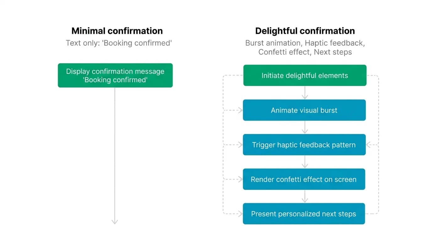
The 3 seconds after a booking confirms are the most emotional in the entire app. A burst animation, haptic feedback, and clear next steps turn relief into delight.
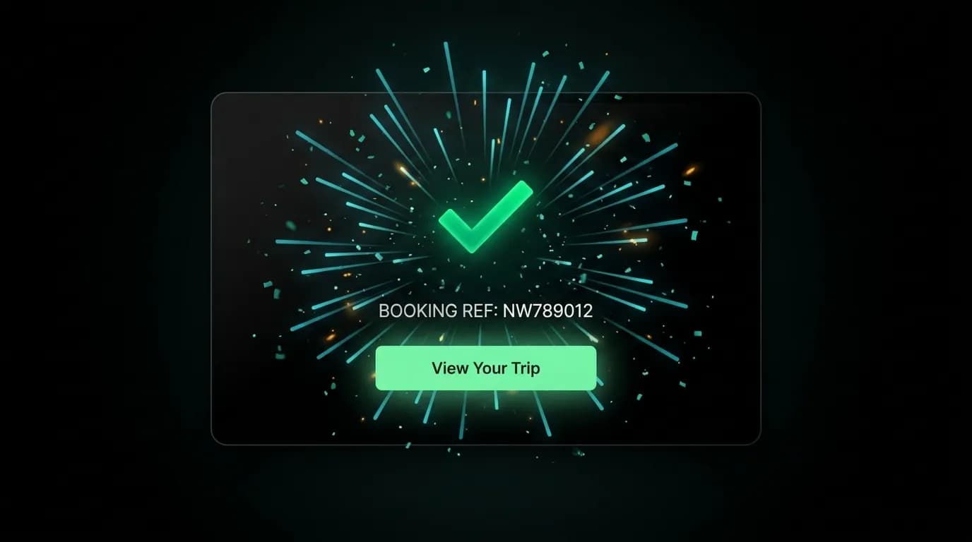
You just spent $500. The payment went through. For a fraction of a second, you feel nothing — just the residual tension of a financial commitment. Then the screen responds.
A green checkmark scales up from the center. Particle effects radiate outward like a quiet celebration. Your phone vibrates once — firm, definitive, unmistakable. The booking reference number appears. "Your trip to Tokyo is confirmed."
The tension releases. You are going to Tokyo.
Those three seconds are the most emotionally charged moment in the entire app. They transform a financial transaction into an emotional event. The design of this moment determines whether the user closes the app feeling anxious ("Did it actually work?") or delighted ("I just booked a trip to Tokyo").
The confirmation burst
The visual centerpiece of the confirmation is a burst animation — a green checkmark that scales from zero to full size, accompanied by radial particle effects that expand outward and fade. The entire animation takes 400 milliseconds.
The timing is critical. Under 200 milliseconds, the animation is over before the user registers it — it feels like a state change, not an event. Over 600 milliseconds, the animation starts to feel slow, introducing a moment of "is something still loading?" anxiety. At 400 milliseconds, the burst is fast enough to feel responsive and slow enough to be perceived as a deliberate celebration.
The scale animation uses a spring curve with slight overshoot — the checkmark scales to 1.05 before settling at 1.0. This overshoot creates a subtle bounce that adds organic energy to the motion. The particles use an ease-out curve, moving quickly at first and decelerating as they fade, mimicking the physics of a confetti burst.
The color is our accent green throughout. The checkmark, the particles, and the success state text all use the same green that the user has associated with positive actions (book, confirm, send) throughout the app. The color consistency reinforces the semantic: green means go, green means success, green means your trip is booked.
Haptic feedback
Paired with the visual burst, a haptic feedback pulse fires at the exact moment the checkmark reaches full scale. On iOS, this is a notification-type haptic — a firm, single tap that is more assertive than a light tap but less aggressive than a heavy impact. On Android, the equivalent vibration pattern provides a clear physical signal.
The haptic is important because it adds a sensory channel that the visual alone cannot provide. A user who is looking slightly away from the screen — checking their surroundings, glancing at a travel companion — still feels the confirmation through the vibration. The multimodal signal (visual plus tactile) is more convincing than either channel alone.
We specifically avoid repeated or patterned haptics. A single, clean pulse matches the single, clean visual burst. Multiple pulses would feel like an alert or an error, not a celebration. The design goal is definitive — one moment, one signal, one confirmation.
Processing to confirmed
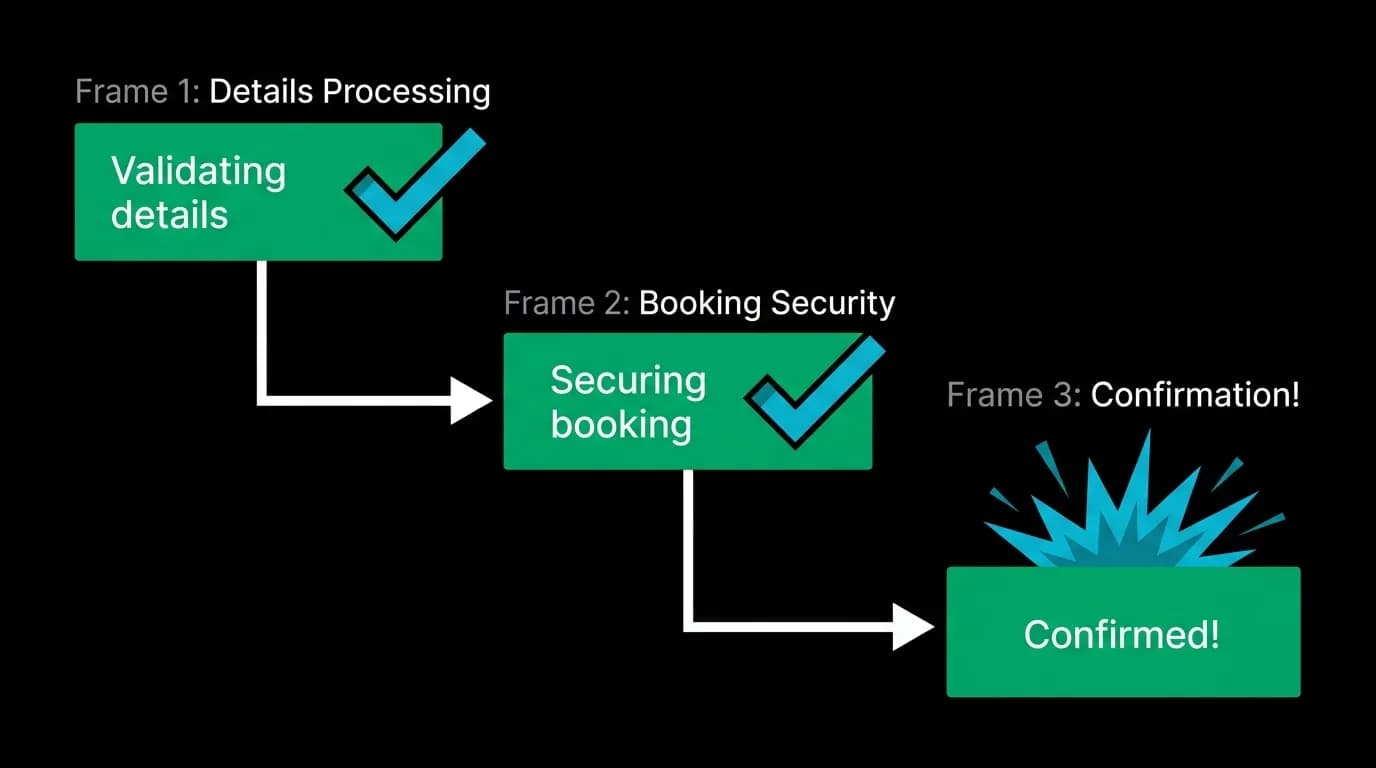
The confirmation burst does not appear instantly after payment. Between the payment authorization and the final confirmation, there is a processing sequence where the system validates the booking, secures the reservation with the provider, and generates the booking reference.
This processing takes one to five seconds. We fill it with a three-step progress indicator: "Validating details" (animated checkmark), "Securing your booking" (animated checkmark), "Confirmed!" (burst animation).
Each step appears sequentially with a one-to-two-second cadence. The sequential progression communicates that work is happening and progress is being made. This is psychologically important — the user just authorized a payment, and dead silence during processing would create anxiety.
The checkmarks for each step use a draw-on animation — the checkmark stroke draws itself in a single motion, from the short leg through the long leg. This animation takes approximately 300 milliseconds per checkmark and creates a satisfying "task complete" visual for each processing step.
The final step — "Confirmed!" — triggers the full burst animation and haptic. The build-up of two smaller checkmarks makes the final burst feel earned. The user watched the system work through three steps, and the conclusion is the payoff.
Next steps
The confirmation screen is not the end of the interaction. It is a transition point from "I booked" to "I am traveling." The design must bridge this gap by providing clear, immediate next-step actions.
Three buttons appear below the confirmation: "View your trip" opens the trip detail view with all booking information organized in tabs. "Share with travel partner" opens the platform share sheet, letting the user send the booking details to a companion via messaging, email, or any other sharing channel. "Add to calendar" creates a calendar event with the travel dates.
These actions acknowledge the user's likely immediate desires. They want to see what they booked (view trip). They want to tell someone (share). They want to remember when (calendar). The three options cover the most common post-booking actions without overwhelming with choices.
The "View your trip" button is styled as the primary action (accent green, full width). The other two buttons are secondary (outlined, smaller). The visual hierarchy guides the user toward the most useful action while making alternatives available.
The screenshot moment
The confirmation screen is the moment users screenshot and share. They post it to social media, send it to group chats, or save it for their own records. The design should be optimized for this behavior.
The confirmation screen includes the destination name in large, clear text. The dates are visible. The booking reference number is displayed. The background is the clean black of the app, which photographs well and is legible in screenshots.
We avoid cluttering the confirmation screen with disclaimers, fine print, or promotional content. This is the user's moment. The screen should contain exactly what they want to share: they are going somewhere, and the trip is confirmed.
Three seconds of animation. One haptic pulse. Three next-step buttons. A clean screenshot surface. The confirmation moment is small in duration and enormous in emotional impact. Design it with the care it deserves.
Nowah is an AI travel agent that searches and books real flights and hotels through conversation — no filters, no thirty open tabs. Plan your next trip.