Why Chat Is the Center Tab
The center position in a 5-tab bar has the highest thumb reachability, the strongest visual gravity, and signals that conversation is the hero — not a feature alongside others.
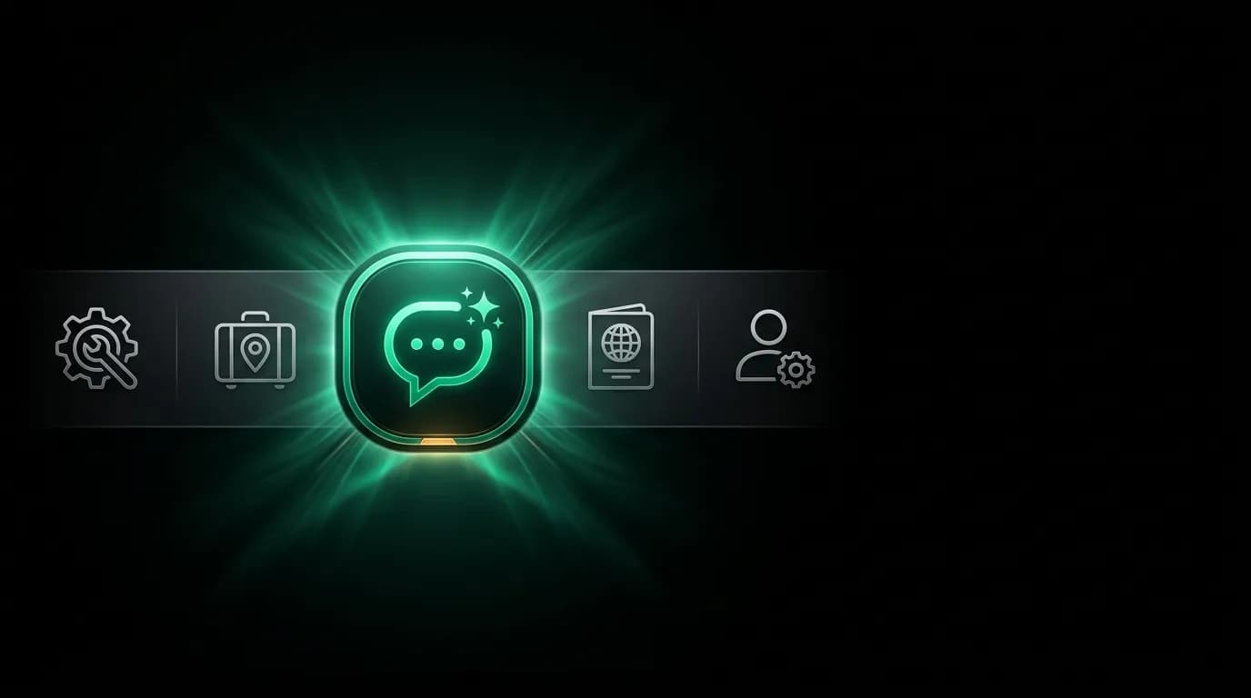
Five tabs sit at the bottom of the screen. Tools, Trips, Chat, Passport, Profile. The Chat icon is slightly larger than the others and accented in green. It occupies the center position — tab three of five.
This placement is not arbitrary. It is a structural declaration: conversation is the hero of this product. Not a feature. Not one of five equal options. The center.
Center gravity
The human eye is drawn to the center of a visual composition. In a horizontal row of five equally spaced elements, the center element receives disproportionate visual attention. This is a well-documented phenomenon in visual perception research — center items in horizontal arrays are fixated upon first and remembered best.
In a tab bar, this means the center tab is the first one the eye lands on when scanning the navigation. Before reading labels, before evaluating icons, the user's gaze goes to the middle. The tab that occupies the center is, by default, the tab the user perceives as most important.
We reinforce this natural gravity with two visual treatments. The Chat icon is slightly larger than the surrounding icons — not dramatically, but enough to create a subtle focal point. And the active state uses our accent green rather than the standard white, providing color differentiation that further emphasizes the center position.
The combined effect is a tab bar where the center element pulls visual weight naturally and the design treatments confirm what the eye already suspects: this is the main thing.
Thumb reachability
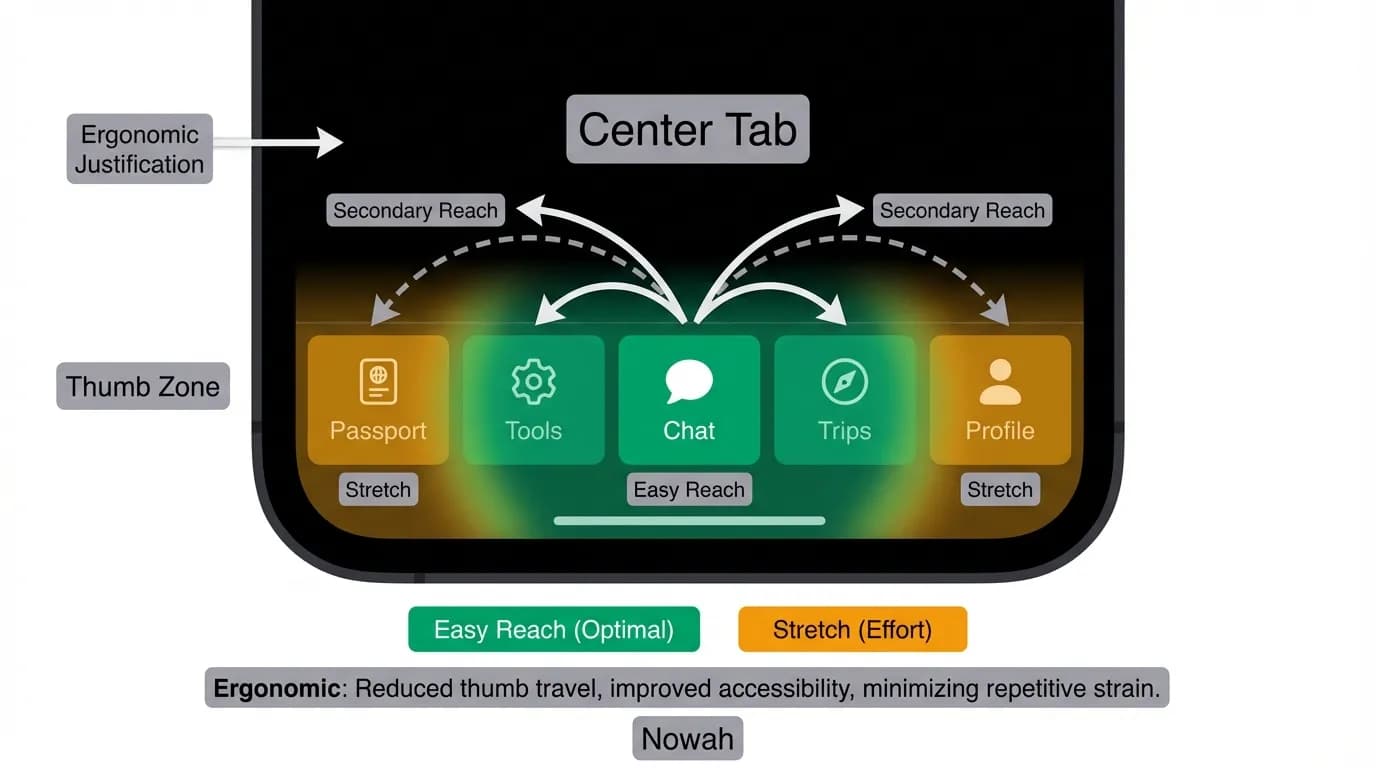
On a phone held in one hand, the thumb's comfortable range follows a predictable arc. The center-bottom of the screen is the easiest point to reach. The far-left and far-right edges require more thumb extension or hand adjustment.
This maps directly to a five-tab bar. The center tab (position three) is the most ergonomically accessible position. The adjacent tabs (positions two and four) require slightly more reach. The outer tabs (positions one and five) require the most.
By placing the primary interaction — the AI chat — in the most reachable position, we minimize the physical effort required to access it. The user's thumb falls naturally on the Chat tab. Switching to secondary features (Tools, Trips, Passport, Profile) requires intentional reach, which matches their lower interaction frequency.
This ergonomic logic compounds over time. A user who opens the app fifty times per week and navigates to chat forty of those times saves a measurable amount of thumb movement by having chat in the center versus an edge position. Small efficiencies, repeated hundreds of times, become meaningful.
What the other four tabs do
The four surrounding tabs provide structured access to functionality that complements the conversation without competing with it.
Position one (far left): Tools. Lightweight utilities — currency converter, tip calculator, bill splitter — that serve in-trip needs with instant, offline-capable results. These do not require AI and operate independently.
Position two: Trips. A structured list and detail view for all booked trips. This is where the conversation's outputs live in organized form. The user books through chat and manages through Trips.
Position four: Passport. The travel journal and document hub. Boarding passes, confirmations, visa documents, and travel memories. This tab stores the artifacts of travel.
Position five (far right): Profile. Account settings, preferences, security, and the preference management dashboard. This is the least frequently accessed tab, matching its peripheral position.
The four surrounding tabs orbit the center. They support the conversation by providing structured views of its outputs (Trips, Passport), non-conversational tools (Tools), and configuration (Profile). Each tab has a clear, distinct purpose that does not overlap with the chat.
Deep linking between chat and tabs
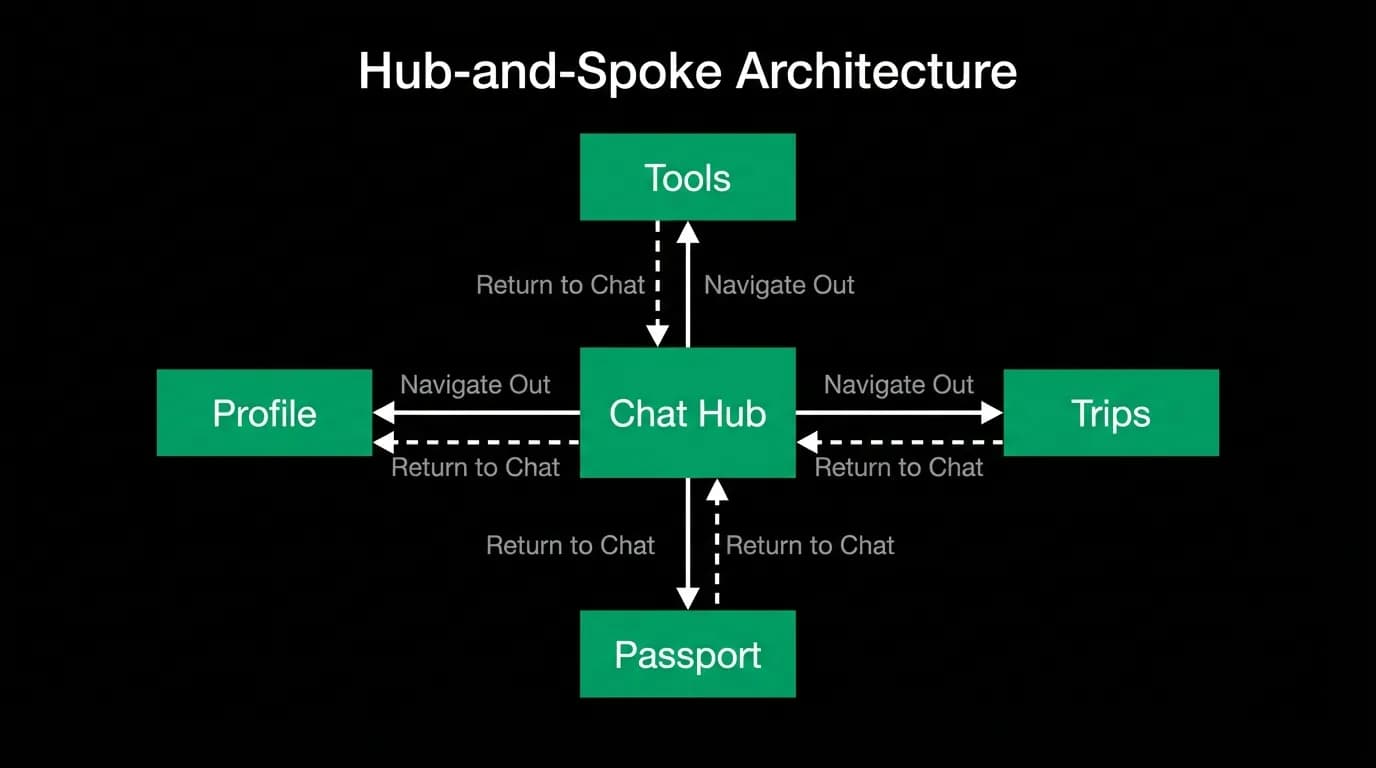
The center position does not mean isolation. The chat can send users to any other tab, and any tab can return users to chat. This hub-and-spoke navigation model keeps chat as the center while acknowledging that some information is better presented in structured views.
When the AI confirms a booking, it includes a "View your trip" button that navigates to the Trips tab and opens the relevant trip detail. When a user is viewing trip details and wants to modify something, a "Chat about this trip" action returns them to the conversation with the trip context already loaded.
This bidirectional linking means the user is never more than one tap from the chat, regardless of where they are in the app. The chat is home base. The other tabs are excursions that always have a return path.
Position as product statement
Tab placement is an information architecture decision that communicates product philosophy. Apps that place a search icon in the center are saying "search is our product." Apps that place a plus icon in the center are saying "creation is our product." Apps that place a feed in the center are saying "consumption is our product."
We place chat in the center because conversation is our product. The AI agent is not a feature of a travel app. The travel app is a feature of the AI agent. The center tab communicates this hierarchy to every user, on every visit, without words.
Five tabs. One center. The center is where your product's soul lives. Make it the conversation.
Nowah is an AI travel agent that searches and books real flights and hotels through conversation — no filters, no thirty open tabs. Plan your next trip.