Animation and Motion in AI Interfaces: When and Why Things Move
Streaming typewriter effects, card entrance animations, loading states, and state transitions — a motion design guide for AI products.
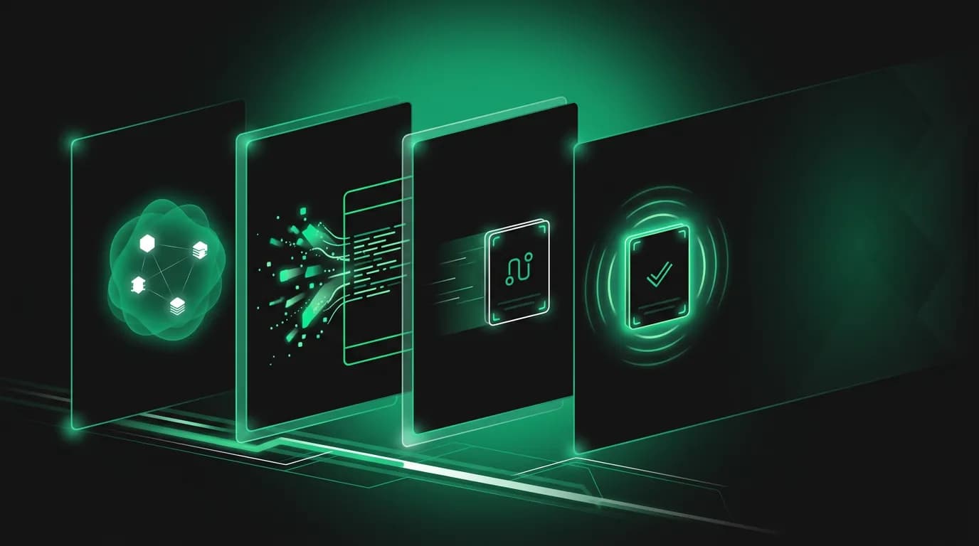
Every element in an AI interface can either appear instantly or animate into existence. The difference between these two approaches is the difference between an interface that feels mechanical and one that feels alive.
Motion in AI products is not decoration. It communicates state, builds trust, creates personality, and guides attention. When done right, users do not consciously notice the animations. They just feel that the product is responsive, intelligent, and pleasant to use. When done wrong, animations slow things down, create visual noise, and make the product feel like it is trying too hard.
We have developed a motion system for Nowah that is purpose-driven. Every animation answers the question: what is this movement communicating that stillness cannot?
Streaming text: the typewriter effect
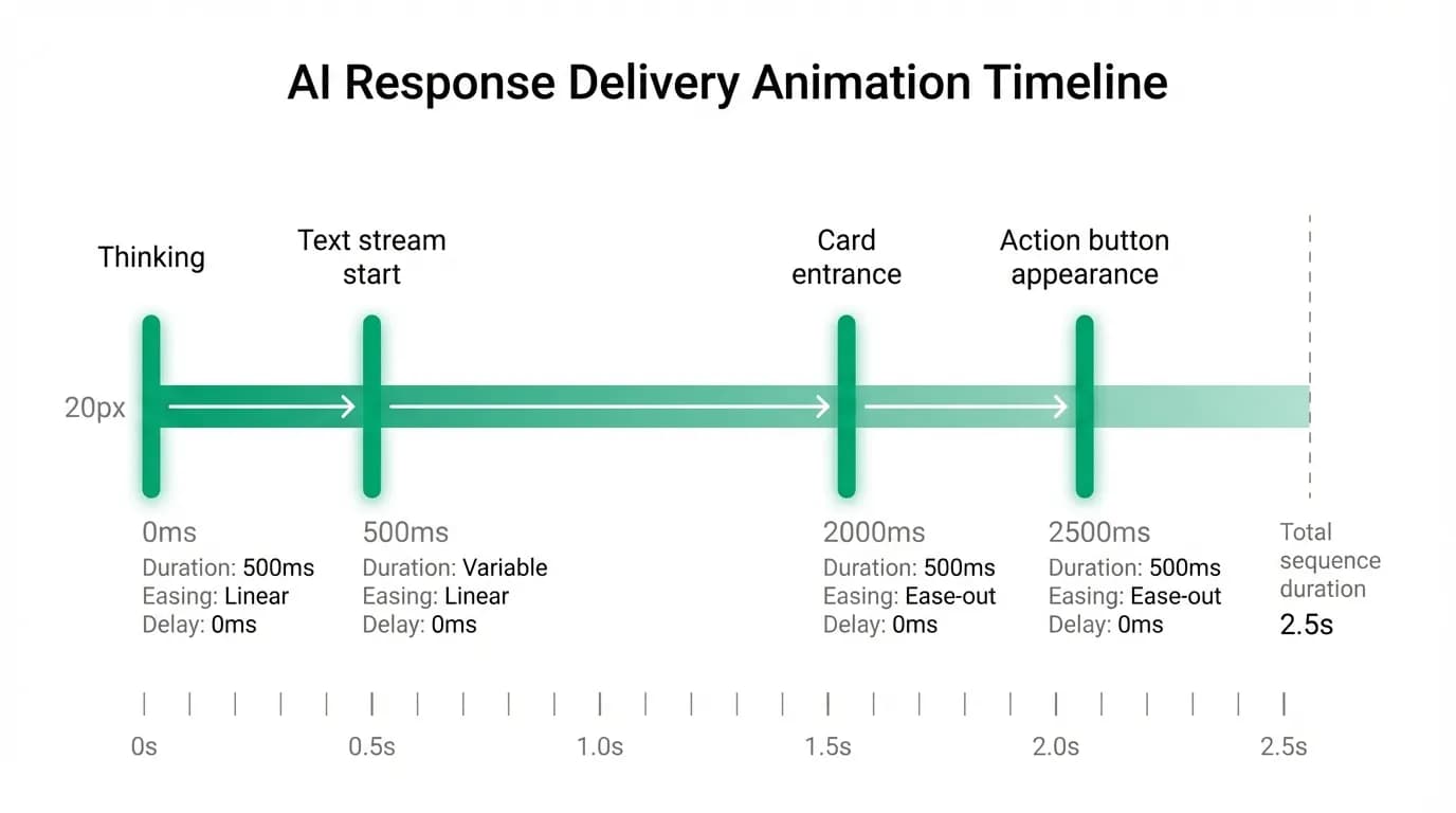
The most distinctive animation in any AI product is streaming text, the typewriter effect where the AI's response appears word by word rather than all at once. Every major AI product uses it. Most of them use it wrong.
The obvious purpose of streaming is technical: the AI generates tokens sequentially, and streaming shows each token as it is produced. But the design purpose is psychological. Streaming creates the perception that the AI is thinking and composing in real time. It suggests intelligence. A response that appears all at once feels pre-written, canned, retrieved from a database. A response that flows into existence feels generated, considered, created for you.
Streaming also increases engagement by two to three times compared to batch responses that appear after a delay. The user starts reading as the text appears. They are engaged from the first word. A batch response that appears after three seconds of nothing means three seconds of disengagement where the user might switch apps or lose focus.
The speed of streaming matters. Too fast and it looks like a pre-rendered reveal rather than real-time generation. Too slow and it feels sluggish. We calibrate streaming speed to roughly match natural reading speed, around 250-300 words per minute. The user can read along as the text appears without falling behind or waiting impatiently.
One nuance that most AI products miss: streaming speed should vary based on content type. Conversational text ("I found some great flights for you") streams at normal speed. Factual data ("Your flight departs at 8:15 AM from Terminal 7, Gate B12") streams slightly faster because the user wants the information, not the experience of watching it appear. Transitions to structured content ("Let me show you three options...") slow slightly to signal that the interface is about to change from text to cards.
Card entrance animations
When the AI presents flight or hotel options, the cards need to appear in the conversation. The transition from streaming text to structured cards is one of the most important animation moments in the interface.
If cards appear instantly after the text, the jump is jarring. The user is reading text, and suddenly three colorful rectangles pop into existence. The visual discontinuity breaks the reading flow and creates a moment of disorientation.
If cards animate in too slowly, the user waits impatiently. They already know results are coming (the text said so). The animation is delaying the thing they want to see.
We use a staggered entrance. The first card slides up and fades in over 200 milliseconds. The second card follows 100 milliseconds later. The third, 100 milliseconds after that. Total entrance time: 400 milliseconds for all three cards. Fast enough that it does not feel slow. Staggered enough that the user's eye can track each card as it appears rather than processing three objects simultaneously.
The direction matters. Cards slide up from below, which is the natural direction of new content in a chat (it appears at the bottom and pushes previous content up). Sliding from the side or fading in from nowhere would feel disconnected from the chat flow.
The stagger creates a subtle narrative: first option, second option, third option. Even though the user will compare all three, the sequential entrance gives each card a moment of individual attention. This is a micro-moment, barely conscious, but it contributes to the feeling that each option is distinct and deliberately chosen rather than dumped as a batch.
After entrance, the cards are static. They do not pulse, glow, bounce, or call attention to themselves. The animation served its purpose (introducing the cards into the conversation) and now the cards need to be calm objects that support comparison and decision-making. Ongoing animation would be distracting.
Loading states beyond the spinner
The generic loading spinner is the laziest element in interface design. It says "something is happening" without saying what. In an AI product where the agent might be searching flights, comparing prices, checking availability, or processing a payment, "something is happening" is not good enough.
We use descriptive loading states that tell the user what the agent is doing. These appear as animated status messages in the chat.
When the agent is searching flights: a status message says "Searching flights to Tokyo..." with a subtle pulsing animation. The text is specific. The user knows what is happening.
When the agent is comparing results: "Analyzing 47 flights, ranking by your preferences..." The number updates if the agent is still receiving results. The user sees that work is being done on their behalf.
When the agent is preparing to present options: "Found three options. Preparing your results..." This signals that the search is complete and the presentation is about to happen. The user shifts from waiting mode to decision-making mode.
Research on loading indicators shows that descriptive progress indicators significantly outperform generic spinners in perceived speed and user satisfaction. Users feel that the same wait time is shorter when they can see specific progress updates versus a generic spinning wheel.
The animation on loading states is intentional. A steady pulse (not a frantic spin) communicates calm, controlled progress. The pulse frequency is roughly 1 Hz, close to a resting heartbeat. This might sound like over-thinking, but the physiological effect of animation speed on perceived urgency is real. A fast animation says "hurry up." A slow animation says "everything is under control."
State transitions
AI conversations involve multiple state changes. Idle to searching. Searching to results. Results to selection. Selection to payment. Payment to confirmation. Each transition represents a mode shift, and the animation needs to communicate the shift without creating confusion.
The searching-to-results transition is the most complex. The loading state (status messages, pulsing animation) needs to gracefully exit as the results (text + cards) gracefully enter. We handle this with a cross-fade: the loading status message fades to lower opacity as the AI's response text begins streaming above the cards. The loading message does not disappear. It dims and becomes part of the conversation history. This preserves context: "I searched 47 flights, here is what I found" is a coherent narrative.
The selection-to-payment transition has a different emotional character. The user tapped a card. They committed to a selection. The expanded card detail view is visible. Now a price summary card appears. This transition needs to feel like a natural progression, not a mode change. We animate the price summary card with the same entrance pattern as other cards (slide up, fade in) but with a slightly longer duration (300ms vs 200ms). The extra 100 milliseconds signals: this is a bigger moment. Pay attention.
The payment-to-confirmation transition is celebratory. The payment sheet dismisses. A brief pause (500ms). Then the confirmation message appears with a subtle scale-up animation (starting at 95% size and growing to 100%) combined with a fade-in. The scale-up creates a feeling of arrival, of something landing. It is the most emotional animation in the flow because it marks the completion of a purchase.
When NOT to animate
Animation has diminishing returns. Past a certain point, more animation makes the product feel slower, more complex, and less reliable. Knowing when not to animate is as important as knowing when to.
We do not animate user messages. When the user sends a message, it appears instantly at the bottom of the chat. No entrance animation. No slide-in. The user initiated the action. They do not need an animation to confirm that their own message appeared. Instant appearance feels responsive. An animated entrance would feel sluggish.
We do not animate scroll-back content. When a user scrolls up through conversation history, past messages and cards are already positioned. They do not re-animate. Replaying entrance animations on scroll would be disorienting and would slow navigation.
We do not animate secondary state changes. When a card collapses after the user taps a different one, the collapse is near-instant (100ms). Drawing attention to the closing card with a dramatic animation would pull focus from the opening card, which is where the user's attention should be.
We respect the "reduce motion" accessibility setting on both iOS and Android. When this preference is enabled, all non-essential animations are either removed or simplified to basic fades. Streaming text still streams (this is functional, not decorative), but card entrances become simple fades, loading pulses become static indicators, and transition animations are eliminated. Users with vestibular disorders or motion sensitivity should never be penalized by our design choices.
Animation fatigue is a real concern for an app that users might use in multiple sessions per day for weeks while planning and taking a trip. An animation that delights on first use can irritate on the fiftieth use. We keep our animations brief (under 400ms for most elements), subtle (small movements, gentle fades), and purposeful (each one communicates something specific). No gratuitous bounces. No playful wiggles. No attention-seeking pulses on things that do not need attention.
How competitors use (and overuse) animation
Hopper uses animation aggressively. Their price prediction feature includes a dramatic "freezing" animation when you lock in a price, complete with ice crystal effects. Their loading states are animated with playful bunny characters. For Hopper's brand (fun, youthful, gamified), this works. But it would feel out of place in a product handling business travel bookings or $5,000 international trips. The animation style has to match the product's emotional register.
Google Flights uses almost no animation. Results appear. Cards expand. The experience is functional and fast. There is nothing wrong with this, but it also feels like a spreadsheet. The absence of motion contributes to Google Flights feeling like a tool rather than an experience.
Most chatbot implementations use the typing indicator (three bouncing dots) as their only animation. It is better than nothing, but it communicates only "the bot is generating a response." It says nothing about what the bot is doing, how long it will take, or what kind of response is coming. The three dots have become so ubiquitous that users have been trained to expect a few seconds of nothing followed by a wall of text. That expectation is what we are working to reset with our more detailed loading states.
Motion as personality
Animation style contributes to how users perceive the AI agent's personality. Fast, snappy animations feel efficient and businesslike. Slow, fluid animations feel calm and considered. Bouncy, elastic animations feel playful and informal.
Nowah's motion language is calm and precise. Animations use ease-out timing curves (fast start, gentle deceleration), which creates a feeling of natural deceleration like a ball rolling to a stop. We avoid elastic or spring-based animations (which overshoot and bounce), because they feel too playful for financial transactions. We avoid linear timing (constant speed), because it feels mechanical and robotic.
The agent's personality comes through in the timing as much as the text. A response that streams at a steady pace, followed by cards that enter with a gentle stagger, followed by action buttons that fade in calmly, creates a personality that is competent, unhurried, and in control. Compare this to an interface where everything pops in instantly: technically faster, but personality-free.
This is subtle work. No user will ever say "I love the ease-out timing curve on the card entrance." But they might say "the app feels really smooth" or "the AI feels really polished." Those impressions are built from dozens of animation decisions working together to create a consistent motion personality.
We think of motion design as the AI agent's body language. The words are what it says. The animation is how it says it. Both contribute to trust, personality, and the overall quality of the interaction. Getting the words right is necessary. Getting the motion right is what makes the experience feel alive.
Nowah is an AI travel agent that searches and books real flights and hotels through conversation — no filters, no thirty open tabs. Plan your next trip.