The Minimalist Travel App: Less UI, Better Trips
Every button, tab, and filter you remove is cognitive load eliminated. When AI handles complexity, the interface can be radically simple — and that simplicity is the feature.
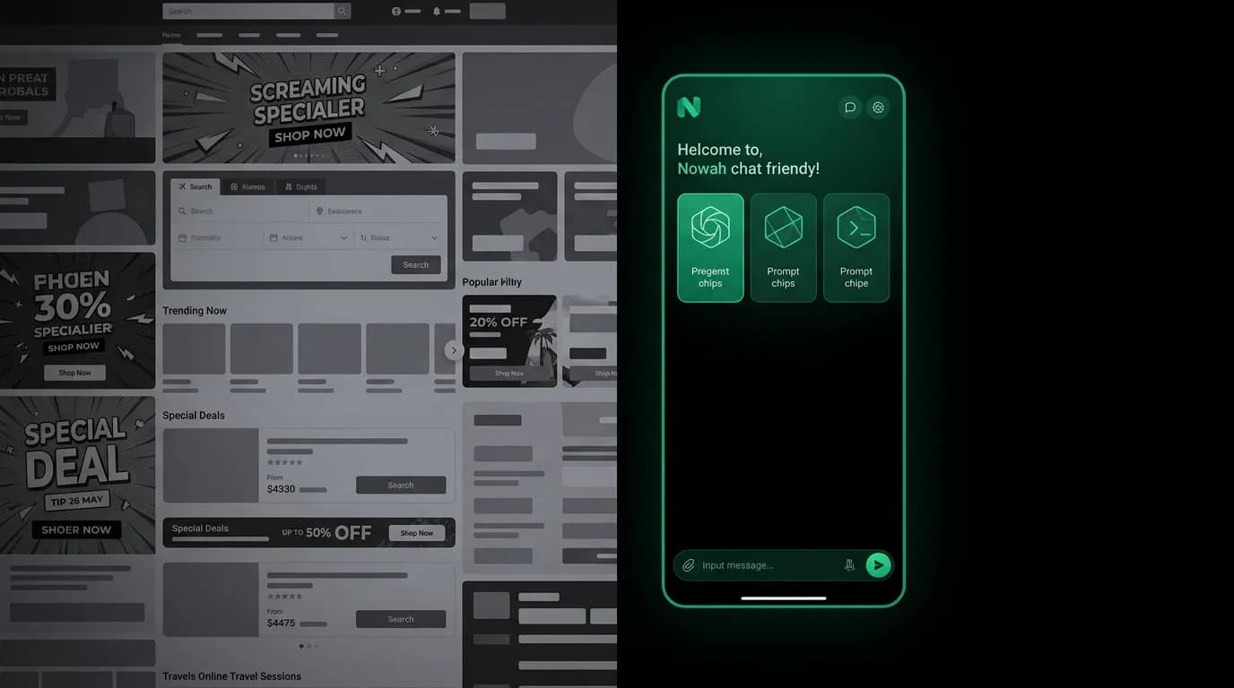
The most powerful feature in our product is what we do not show. No dashboard. No promotional banners. No trending destinations widget. No "deals of the day" carousel. No loyalty points tracker on the home screen. No weather widget. No currency converter on the first view. No inspirational travel photos fighting for attention.
The main screen is a conversation. An input bar at the bottom. The AI's greeting and a few suggested prompts. Negative space. That is it.
This minimalism is not laziness or a lack of features. The product has an extensive suite of capabilities, from flight and hotel search to visa requirements to currency conversion to itinerary generation. But none of these capabilities need a dedicated UI element cluttering the screen. They are all available through conversation. The AI surfaces them when they are relevant, not before.
Surface area reduction
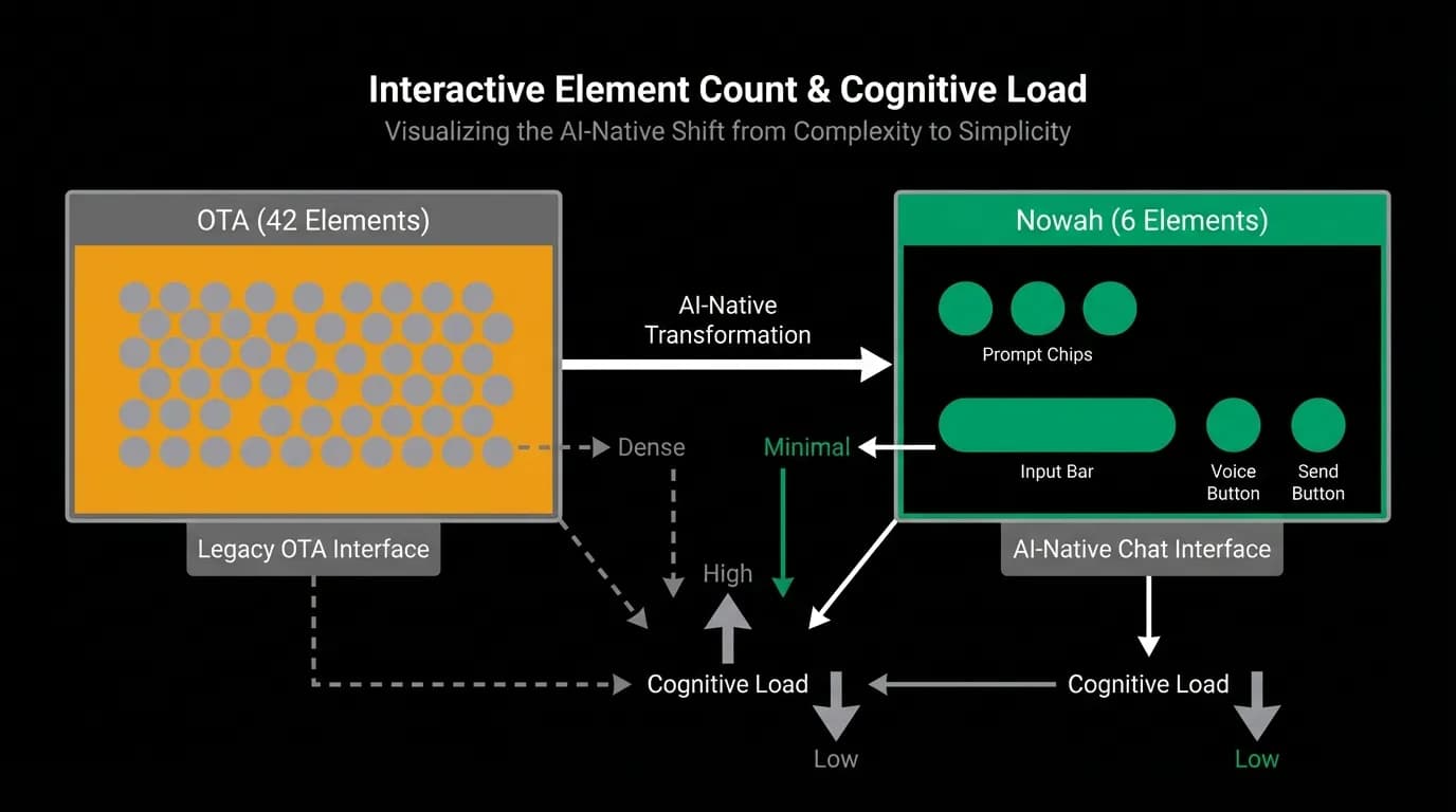
A typical online travel agency home screen contains 40 or more interactive elements: search form fields, promotional cards, trending destinations, deal banners, navigation tabs, filter shortcuts, recently viewed, and more. Each element competes for attention and demands cognitive processing. The user has to scan, evaluate, and dismiss dozens of things before they get to the one thing they came to do.
Our chat screen has six interactive elements: three suggested prompt chips, the text input, the voice button, and the send button. Six. That is an order-of-magnitude reduction in surface area, and it maps directly to an order-of-magnitude reduction in cognitive load.
This is not a trade-off where fewer elements means fewer capabilities. The capabilities are the same or greater. They are just accessed through conversation rather than through dedicated UI. When the user needs a currency converter, they say "convert 100 euros to yen" and the AI converts it. They do not need to navigate to a tools tab, find the converter widget, enter values, and select currencies.
Cognitive load math
Cognitive load theory identifies three types of load: intrinsic (the difficulty of the task itself), extraneous (the difficulty imposed by the interface), and germane (the effort of learning and understanding). Good design minimizes extraneous load so users can focus their cognitive resources on intrinsic and germane load.
Every UI element that is visible but not immediately relevant creates extraneous load. A promotional banner on the home screen is extraneous when the user is trying to search for flights. A deals carousel is extraneous when the user already knows where they want to go. A weather widget is extraneous until the user is actually planning activities at their destination.
By removing all of these elements and surfacing them only when conversation context demands them, we eliminate nearly all extraneous cognitive load. The user sees only what they need right now. Everything else exists but remains invisible until it is relevant.
Research on attention suggests an average eight-second attention span for initial screen evaluation. On a cluttered screen, those eight seconds are spent scanning and filtering noise. On our minimal screen, those eight seconds are spent reading the AI's greeting and deciding what to ask. The entire cognitive budget goes toward the user's actual goal.
Negative space as confidence signal
In luxury branding, negative space communicates confidence. A billboard with one word and vast white space signals that the brand does not need to shout. It is confident enough to be quiet.
The same principle applies to product design. Generous padding, clear margins, and uncluttered layouts communicate "we have this handled." The product does not need to cram features onto the screen to prove its value. The value is in the conversation, and the interface gets out of the way.
This is a deliberate contrast to the anxiety-driven design that dominates travel apps. Legacy platforms use urgency signals ("Only 2 seats left!"), information overload (every possible filter visible at once), and promotional density (banners, deals, cross-sells) because their conversion model depends on impulse and overwhelm.
Our conversion model depends on understanding and trust. The AI understands what you want and earns your trust through quality recommendations. That model works better with calm, spacious design that gives the user room to think.
Progressive disclosure: show nothing until needed
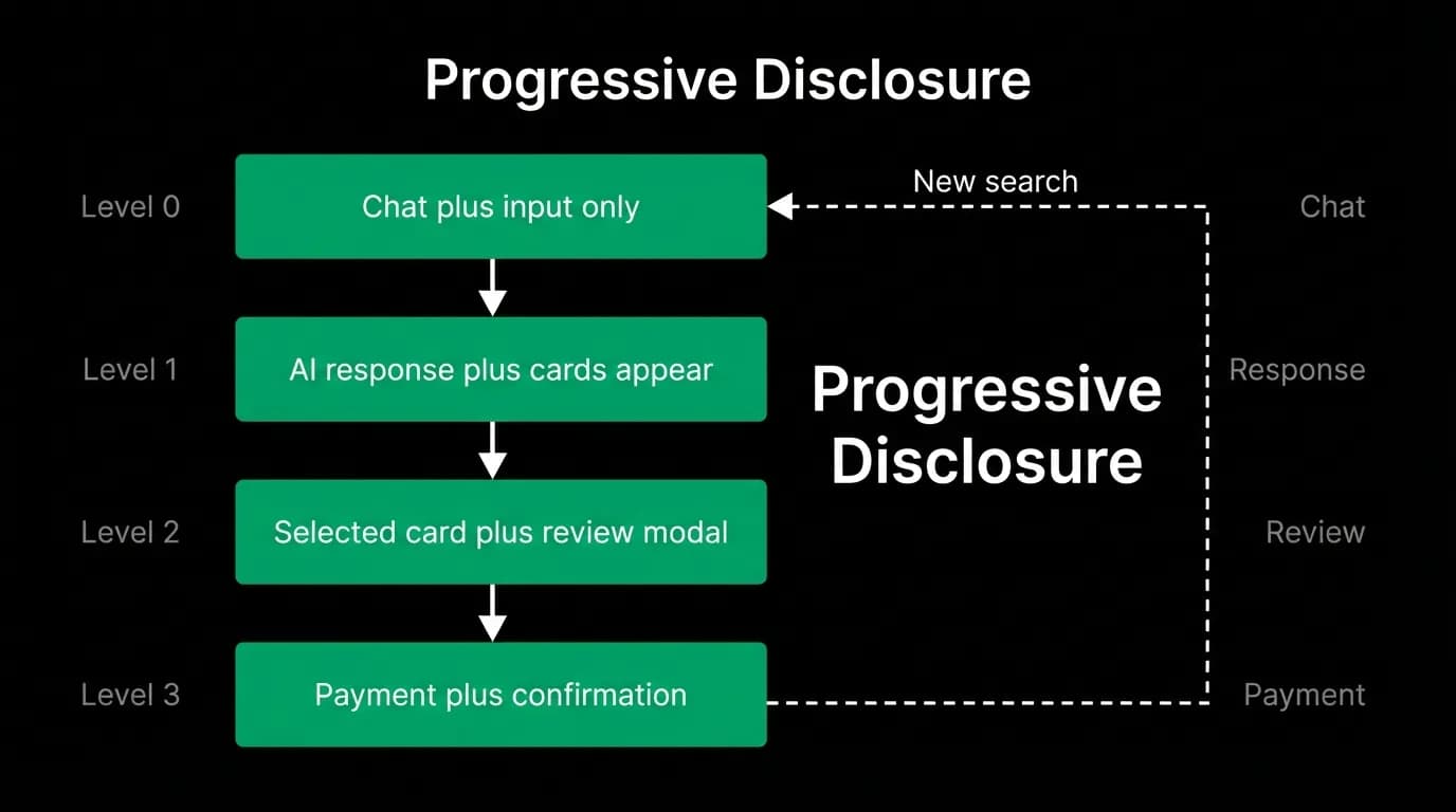
Progressive disclosure is the principle of revealing complexity only when the user needs it. In our product, the chat screen starts empty. The AI's first response reveals the first layer of interaction. The user's first message reveals the AI's capabilities. Flight cards appear only when the user asks about flights. Booking flows appear only when the user is ready to book.
At each level, only the immediately relevant information is visible:
Level zero: chat input and greeting. Level one: AI response with options. Level two: selected option with review details. Level three: payment and confirmation.
Each level appears only when the user's actions demand it. The interface never shows information preemptively. It never presents options the user has not asked about. It never clutters the conversation with features the user is not currently using.
Audit your app and remove three things
A practical exercise. Open your travel app and identify three UI elements on the home screen that could be accessed through conversation instead. A search form (the AI can ask where you want to go). A deals section (the AI can mention deals when relevant). A recent searches widget (the AI remembers your context).
Remove those three elements. Not forever, necessarily. But remove them and see what the screen looks like. See how it feels. Notice the breathing room. Notice how the remaining elements become more prominent and easier to find.
Minimalism in a travel app is not about having fewer features. It is about having the same features with less UI. The AI absorbs the complexity. The interface stays simple. And simplicity, for a product that people use while jet-lagged, stressed, and unfamiliar with their surroundings, is the feature that matters most.
Nowah is an AI travel agent that searches and books real flights and hotels through conversation — no filters, no thirty open tabs. Plan your next trip.